wefwef

4216 readers
1 users here now

wefwef is now Voyager! Subscribe to !voyagerapp@lemmy.world.

founded 1 year ago
MODERATORS
1


!voyagerapp@lemmy.world

Thank you! 💙

2


Hi there! First of all, I wanted to say thank you. Thanks for submitting bugs and PRs, sharing wefwef, and for the overwhelming kindness from everyone here. 💙 I would not be writing this post right now if it wasn’t for that.

I have a few important announcements in this thread, so please read on!

(TLDR subscribe to !voyagerapp@lemmy.world!)

The road to v1

Somehow, after only a few weeks, v1 is in reach! That being said, there are a few important features needed in order to get there:

  1. Blocking and unblocking users and communities
  2. Hide NSFW posts toggle
  3. Community favorites
  4. Better keyboard handling on comment and post dialogs
  5. Workaround for light mode status bar on iOS
  6. Direct connect to lemmy.world instead of proxy workaround

Keep in mind, v1 won’t be perfect. There will be bugs :) This is just the point at which we feel there is nothing critical outstanding.

Our new name: Voyager

Thanks so much for all of the really great and important points for either keeping wefwef or changing to Voyager. A recurring theme I heard is that while wefwef is a fun, unique name, Voyager is a more approachable name. To me, that’s important. I’ve decided on Voyager!

With that, I’m also happy to announce some new domain names!

(Don’t worry, wefwef.app will continue working for the foreseeable future!)

And our new Lemmy community, !voyagerapp@lemmy.world

We will be transitioning to this new name effective Monday July 10 when the old wefwef community will be locked. Subscribe to !voyagerapp@lemmy.world!

App icon contest

EDIT: SUBMISSIONS NOW OPEN! https://lemmy.world/post/1287799

As part of the v1 launch, I’m hoping to adopt a new community-driven app icon! 🥰 I can’t wait to see what you all come up with!

What do I win??

wefwef *ahem* Voyager is a free and open source project, so there isn't a cash prize or anything. But, credit to you will be officially in the app settings and the Github repo readme!

Submission deadline

On July 10th I will create a thread for submissions in !voyagerapp@lemmy.world. On July 16th, 10pm CT submissions will close (depending on submission volume, may be extended).

Selection process

I will lock the thread after the submission window and nominate 3 icons (see below tips for what I’m looking for). I’ll take into account votes and comments from people. :) If there are very few submissions, I may extend the window to submit. Shortly after, I’ll create another thread for the community to vote to choose one of the final three!

Tips

  • I encourage you to make the app icon FUN and colorful! Give the app a soul that reflects the community driven nature of Lemmy and the greater Fediverse. Icons using the display-p3 colorspace are encouraged. I love how an interconnected rainbow represents the Fediverse, and I’d love to see your personal artistic style :)
  • I am purposely allowing raster icons for this contest, because I think too many app icons look bland, generic and… well… corporate vector bleh. I love the fun style of these Fediverse illustrations by David Revoy: https://framablog.org/2022/12/08/framasoft-2022-a-casserole-cooked-up-thanks-to-you-thanks-to-your-donations/?print=print

Rules

  • 3 submissions max per artist
  • Please, no submissions resembling the Apollo icon (sorry!) to respect Apollo’s app icon branding
  • For each submission, required assets:
    • (For contest submission)
      • Single 512x512 square PNG designed for iOS should be in your comment. (If you have an iOS device, I recommend this site to test)
      • Optional sentence or two explaining your icon
    • (Upon being selected)
      • 1024x1024 PNG or SVG iOS app icon.
      • 1024x1024 PNG or SVG “maskable” variant for Android app icon. Tips here: https://web.dev/maskable-icon
      • BONUS/OPTIONAL Splash screen image - Design a full screen app launch screen that is maskable to fit various device aspect ratios. This is totally optional.
  • Your work should be licensed under CC-BY-SA 4.0, or less restrictive. :)

That's all! Thanks for reading this far! 💙

P.S. Did I mention subscribe to !voyagerapp@lemmy.world?

3


First of all, thank you so much for all your work! This is definitely a way better experience than the web client. And thanks for adding community blocking, so now I don't have to go back for that feature.

I like to keep pretty huge categories of communities out of my feed entirely. But, I also want to be aware of what other communities of interest might be out there, especially now while the Lemmy landscape is evolving so quickly. So the strategy of only ever browsing subs and foregoing All entirely doesn't really work.

But, as I've seen other people highlighting in other posts, federation also means that the number of redundant communities across instances is huge. I don't just have to block all the political communities, I have to block them everywhere we're federated with. My block-list is already gigantic and I don't anticipate the need to block communities going away soon.

It'd be a much smoother experience if Block Community was an option directly in the three-dot menu of an individual post, instead of having to leave my feed, go through another menu, and go back every time.

4
5
submitted 1 year ago* (last edited 1 year ago) by Deemo@lemmy.fmhy.ml to c/wefwef@lemmy.world


Was curious about how cors worked in general https://www.youtube.com/watch?v=PNtFSVU-YTI

5


Now that I got your attention with that clickbait title..

Subscribe to !voyagerapp@lemmy.world!

But it's also true. This is the last release of wefwef. Tonight the app will be renamed, and all future releases will be Voyager!

Note: you don't need to do anything if you have the app installed. The app will continue to be named 'wefwef' on your homescreen until you reinstall.

So what's new for 0.17.0?

Block communities and users

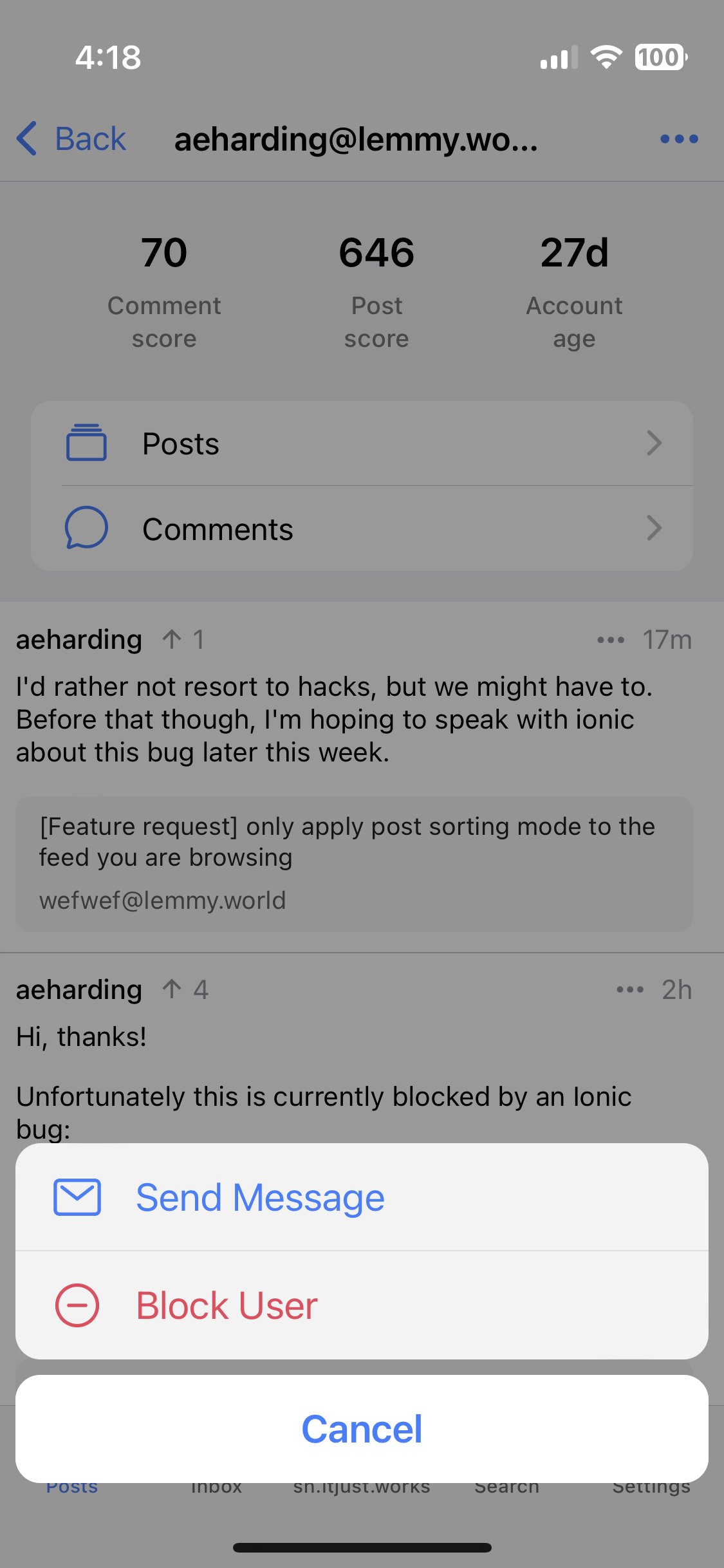
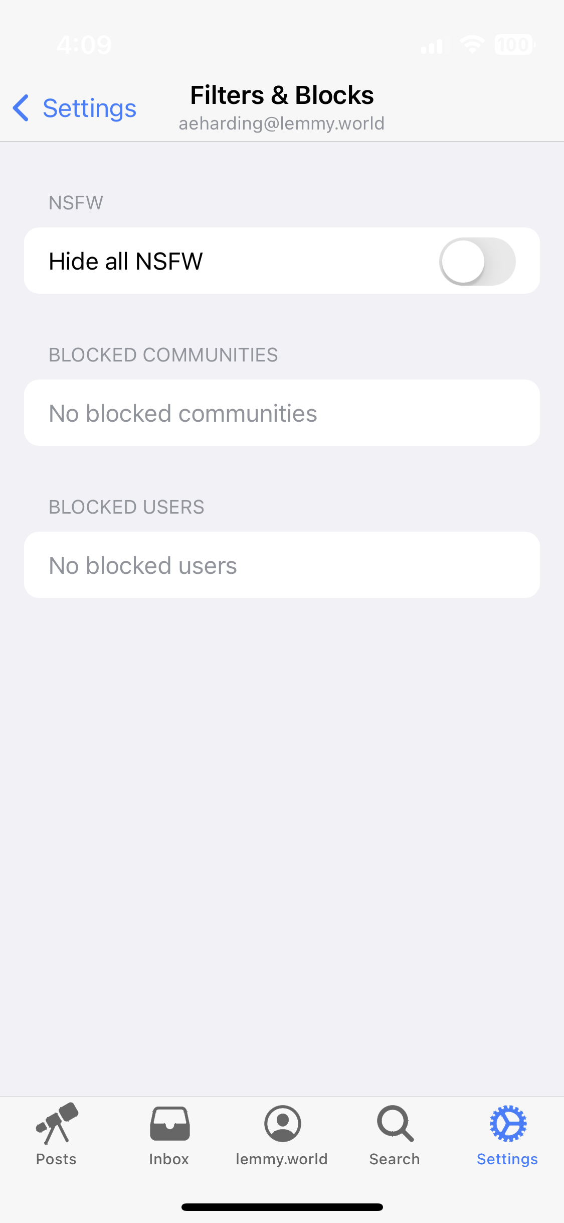
It's here! You can now block users and communities! Just go to their page and tap the ellipsis in the header. Additionally, there's a new "Filters & Blocks" section to settings (applied per user)!

There's also an option to hide all NSFW content for your account!

Finally, it's now much easier to message users. Just tap on their profile and "Send Message"!

Favorite communities

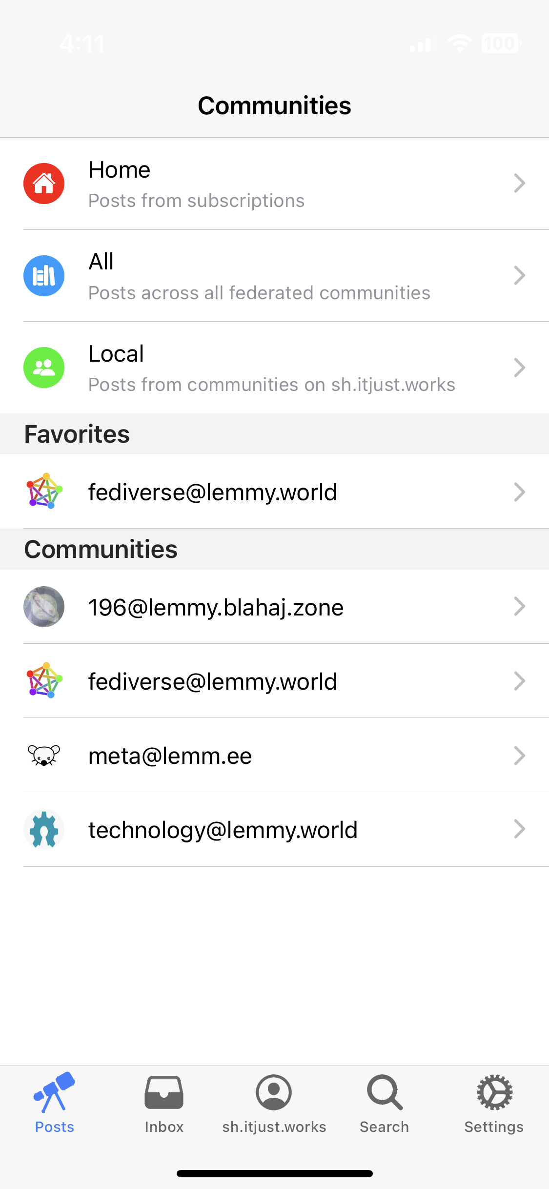
Favorite communities for them to be at the top of the community quick switcher and your communities list. So much easier than scrolling to find the communities you frequent most often! Thanks @httpjamesm for this feature that's been a long time coming.

To favorite (or unfavorite), just visit the community and tap the ellipse in the header.

Bugs and other small enhancements!

Thanks to everyone that has helped and contributed! Check out the github release for all the other stuff that was completed. https://github.com/aeharding/wefwef/releases/tag/0.17.0


Thanks, and see you on !voyagerapp@lemmy.world!

6
7


The font size on post comments keeps flipping back to the smaller default size and it's pretty annoying. I'm guessing this is a bug.

8


I think the soon-to-be-Voyager is near the top of my favorite Lemmy List--but I just tried to edit a post: couldn't find that option. Is it somewhere I didn't look? 🤔

9


Hi there. Thanks for making wefwef (soon to be Voyager!), I am loving it so far and you’ve done so well in such a short time.

I’ve got a feature request that I think would improve usability:

Currently, if I’m browsing all via Hot, and then find an interesting community and visit there and sort by Top (All Time), when I’m ready to go back to all, it keeps that Top (All Time) sort enabled and I lose my place and the post I was looking at. Sometimes I remember to reset it before I go back but not always. Often I end up having to scroll way back to the top to begin again looking at recent Hot posts as the order has changed and it’s kept me scrolled X amount through the post timeline.

I think it would be great if the sort option didn’t persist and instead reverted back to what you had selected when you were at that point originally.

Thank you, Obscura :)

10


Currently theres no way to scroll on and get past an embedded video (https://lemmy.world/c/publicfreakout is a good example to use) especially if its a vertical video you can just get stuck in the main all feed unless you give some extra momentum on the scroll.

Also maybe a option to disable auto playing video entirely would be nice.

11


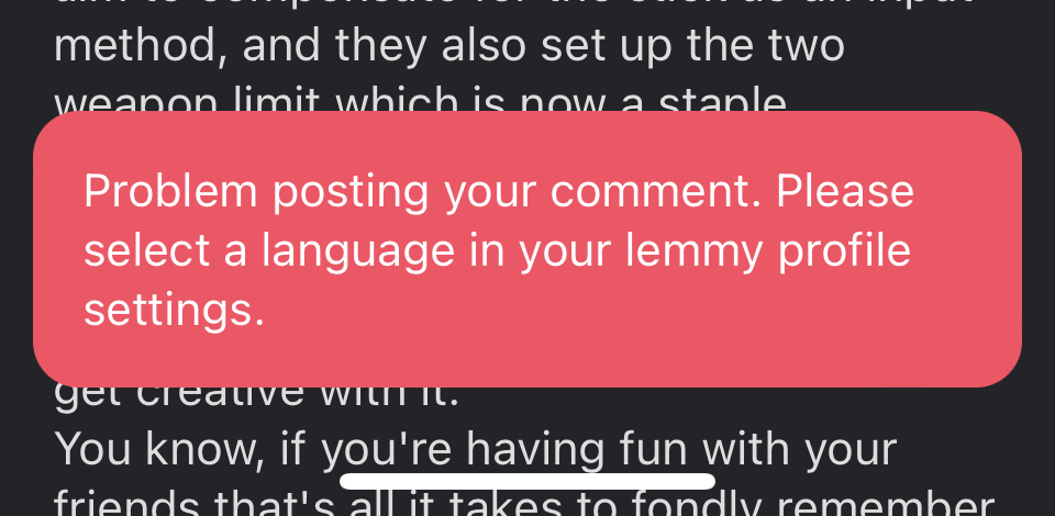
I get this error when trying to reply on kbin on communities hosted on Lemmy.world. I don’t know whether this is a wefwef problem or if it’s just the messenger to a problem with Lemmy world. For the record I do have a language set in my profile

12


I'm using the wefwef PWA with Firefox for Android.

Is there a way to receive notifications from a Webapp? Currently I have to open the app to see inbox notifications.

13


Title says it!

14


I quite love wefwef (ahem Voyager), building on the legacy of Apollo and filling the hole caused by the whole Reddit kerfuffle (obligatory fuck u/spez).

Due to being averse to everything Google, I only use Safari (FF if there is some kind of technical issue where Safari is causing issues). From what I gathered researching on the web, there doesn't seem to be any support for PWA in either of those browsers.

I'm currently running Voyager in a pinned tab, but if anyone has any suggestions to improve usability, I'd love to hear them. Thanks!

15


I have to force close the app and start a new session to get rid of the now blank link screen.

16


I'm using an Android (Pixel) phone, and I installed the PWA via Chrome, as it seems to work the best. Is there a way to change the icon easily?

17


Would it be possible to allow users to select an icon they preferred in settings of the PWA? Rather than settle on one icon, it would be cool to have a selection to choose from.

18


I sincerely hope this is OK to post here. If not, please accept my apologies and delete this post.

I just wanted to thank the devs of wefwef (soon to be Voyager) for their amazing work. I’m posting this from my own instance of wefwef. Aside from satisfying the nostalgia of Apollo (iOS Reddit client) to the incredibly polished experience (I find it hard to believe that wefwef is a PWA sometimes), I am really impressed.

Thank you, thank you, thank you!

19


As a person with low vision, I think wefwef would benefit from better support for large text.

It's really hard to see where any posts are from with larger text because it just gets cu...

Thanks for all your work!

Best regards!

20
 
 
21


I would like to change my nsfw settings for my profile but I'm unable to find those settings in wefwef, I have to use another app or web browser to do so.

Am i just missing the correct profile settings location in wefwef?

22


I don't have any software on my phone to round corners so please excuse the square.

The fediverse is a vast and beautiful place, just like our universe. I think our app icon should go deeper and represent more than just a simple spaceship or a mouse.

23


I'm confused! Before I uninstalled wefwef all of the browser interface was hidden. But now the address bar and "new tab" button plus other interface elements visible.

24


I would love to be able to see the user beside the community when viewing my home page / all / local pages. Right now we are only able to see the user who posted when we open the post or go right into the community.

25
 
 
view more: next ›