this post was submitted on 17 May 2024
677 points (97.6% liked)
Data Is Beautiful
8455 readers
1 users here now
A place to share and discuss data visualizations. #dataviz
founded 4 years ago
MODERATORS
you are viewing a single comment's thread
view the rest of the comments
view the rest of the comments

I mean… there is a LOT broken with the healthcare system in the US that you all know. However, in the US -granted you have the dime- you can get the best care in the world. If you can pay for that. If you have been to a hospital in the UK and to one in the US… you will exactly know what I mean.
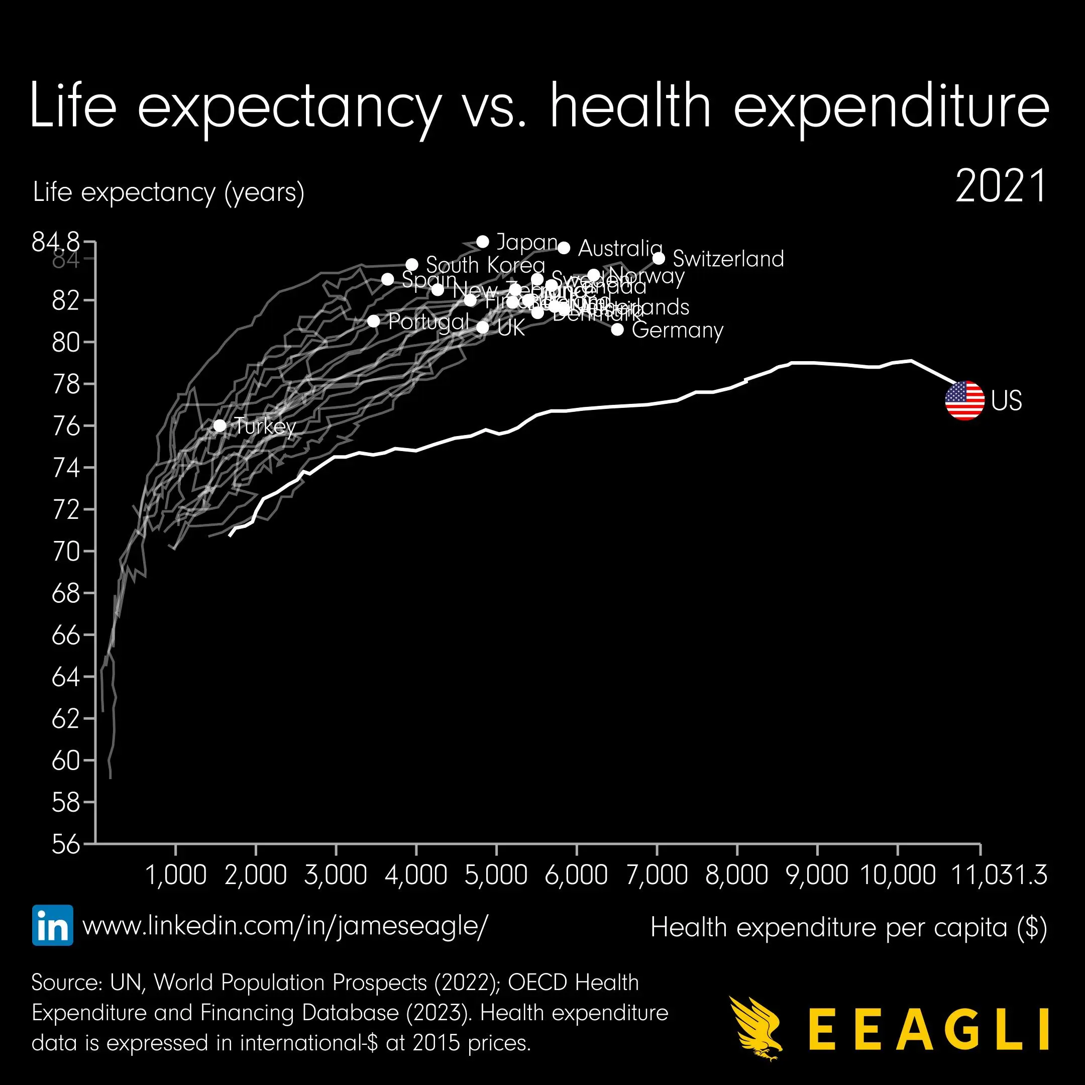
However, this specific graphic shows that there are likely other contributors for higher life-expectancy than only professional/paid healthcare. E.g. lifestyle aspects like dietary consideration (Italy, Japan…).
Does not mean, that there is no need to fix the System.
Actually Australia is pretty high up. High radiation (i.e. skin cancer), I dont expect a way better diet than in the US.
Sure, it is just not as one dimensional as this cherry picked graphic implies. Education is also a likely contributor.
The optimization would be : cost low, life expectancy at max… however… it is not that easy… ‚Let’s Just copy the system of Japan‘ just would not work… or maybe it would!
However, best healthcare will not help you if have a unhealthy lifestyle which is known to be a common issue in the US especially. Not sure how it is about Australia though!