this post was submitted on 18 Aug 2024
1504 points (99.1% liked)
Technology
59357 readers
3460 users here now
This is a most excellent place for technology news and articles.
Our Rules
- Follow the lemmy.world rules.
- Only tech related content.
- Be excellent to each another!
- Mod approved content bots can post up to 10 articles per day.
- Threads asking for personal tech support may be deleted.
- Politics threads may be removed.
- No memes allowed as posts, OK to post as comments.
- Only approved bots from the list below, to ask if your bot can be added please contact us.
- Check for duplicates before posting, duplicates may be removed
Approved Bots
founded 1 year ago
MODERATORS
you are viewing a single comment's thread
view the rest of the comments
view the rest of the comments

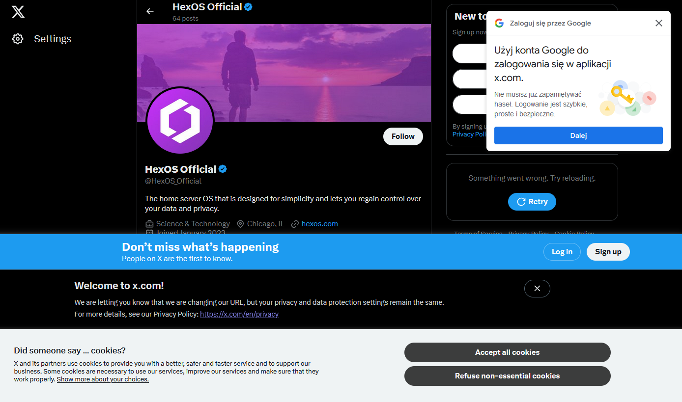
The absolute lack of any kind of consistency with layout or alignment makes me cringe too.
It's just shows how they're just glued onto the page with no care or planning. Especially no consideration to the user or user experience.
I've been saying the same for tv commercials. I've always hated them but they were built into the episodes, now they jump scare mid sentence and come back to another speaking.
I sail quite often but the wife likes the convenience, so.
It all sucks and getting suckier!