66
you are viewing a single comment's thread
view the rest of the comments
view the rest of the comments
this post was submitted on 10 Sep 2024
66 points (98.5% liked)
KDE
5053 readers
32 users here now
KDE is an international technology team creating user-friendly free and open source software for desktop and portable computing. KDE’s software runs on GNU/Linux, BSD and other operating systems, including Windows.
Plasma 6 Bugs
If you encounter a bug, proceed to https://bugs.kde.org, check whether it has been reported.
If it hasn't, report it yourself.
PLEASE THINK CAREFULLY BEFORE POSTING HERE.
Developers do not look for reports on social media, so they will not see it and all it does is clutter up the feed.
founded 1 year ago
MODERATORS
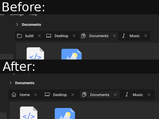
in what way is this an accessability issue, it just seems to be a minor visual stylization change?
Consider having just two of them. The one which is active actually seems like a button that demands attention. It's basic design stuff. Tabs denote choices between active viewports, it should be unambiguous always which one is active. These hovering tabs are more like buttons which intuitively ask to be clicked
https://github.com/black7375/Firefox-UI-Fix
Try looking at the comparison screenshots in this repo. Or look up some images of firefox australis. You'll see how tabs are actually behaving like tabs and are denoting clearly which one is active by linking itself naturally to the viewport
Edit: https://github.com/Glitchcode2447/Firefox-Australis-Theme
it seems more like a radio button describing where you are and where you can go, which is just slightly more abstract than tabs.
Because it works like that, but in the traditional way, not all corners are rounded, and there's no margin in the bottom.