[Meta] Looking for additional mods
(mander.xyz)
2
64
This chart ranks major Fortune Global 500 companies by the steepest percentage drop in market capitalization between the end of 2020 and mid‑2025, using USD‑denominated data from MarketCapWatch. Only publicly listed companies were included; state‑owned enterprises, private firms, and entities with frozen or unreliable market caps were excluded.
Key takeaway: Some of the world’s largest revenue‑generating companies have seen their market value collapse by 25%–95% in just three years. The steepest declines are concentrated in China’s real estate and internet sectors, U.S. retail and telecom, and select European industrials — reflecting a mix of sector‑specific headwinds, regulatory shifts, and macroeconomic pressures.

3
18

4
480
Comments
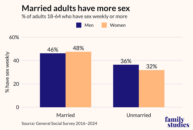
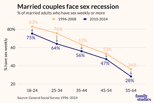
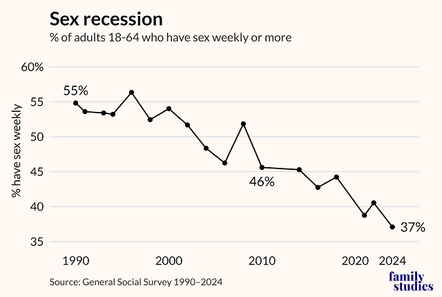
- Married adults have markedly more sex than their unmarried peers, but the sex recession is also making inroads among married couples.
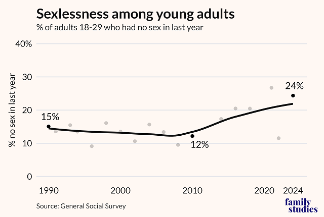
- When it comes to sexlessness (“no sex in the last year”) among young adults, the biggest change comes post-2010.
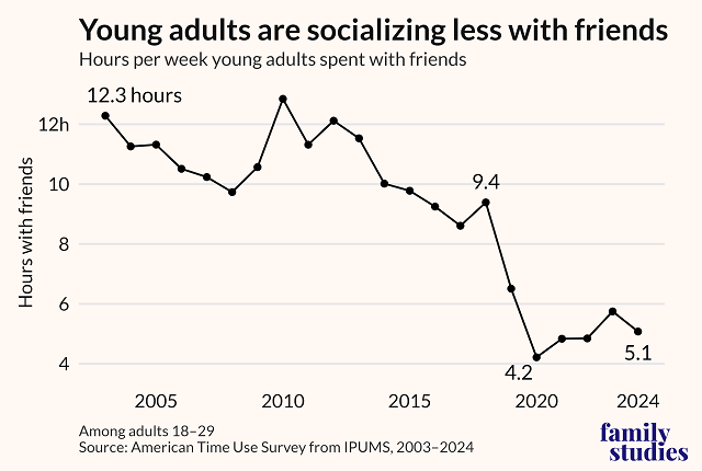
- Between 2010 and 2019, the average time young adults spent with friends in a given week fell by nearly 50%, from 12.8 hours to just 6.5 hours.
Source: Institute for Family Studies.
5
126
What's going to kill you? [US, 2018-2023]
(lemmy.world)
Not beautiful. More "interesting data set." Source: https://wonder.cdc.gov/ucd-icd10-expanded.html
edited to correct off-by-one error in 5-14 year old column

6
87
[OC] Full Taxonomy Tree according to GBIF
(mander.xyz)
Clusters are different kingdoms (can you guess which is which?), coloring applied by phylum.
4,452,270 taxa, made with Graphviz and Gephi Toolkit.


9
20
Republicans and Democrats differ drastically in which sources they trust and distrust
(www.pewresearch.org)

10
34
I recently installed an Emporia Vue with monitoring for the individual circuit my water heater is on. It captured the very significant difference in energy usage from replacing resistive heat with heat pump.


15
141

16
49
While being more than 9000 kilometers away, I can still see and hear what birds are currently singing in the Vondelpark - Amsterdam.
https://luistervink.nl/locations/vondelpark/live/
I hope the herons and the owls don't mind.


18
278

19
64
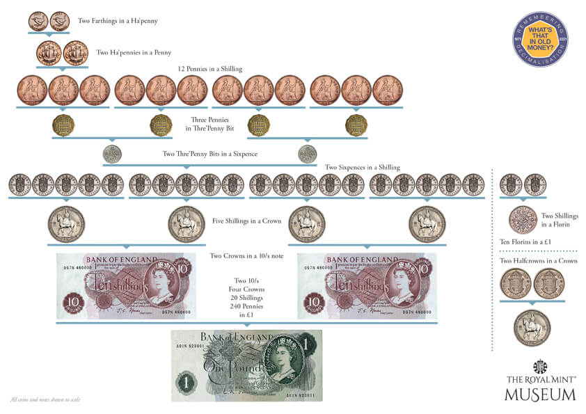
Pounds, shillings, and pence
(www.royalmintmuseum.org.uk)
Post inspired by this recent comment about how useful 120 is (or 240 in this case), because its can be evenly divided so many ways: https://sh.itjust.works/post/40842670/19379837
Source: https://www.royalmintmuseum.org.uk/journal/history/pounds-shillings-and-pence/

21
176
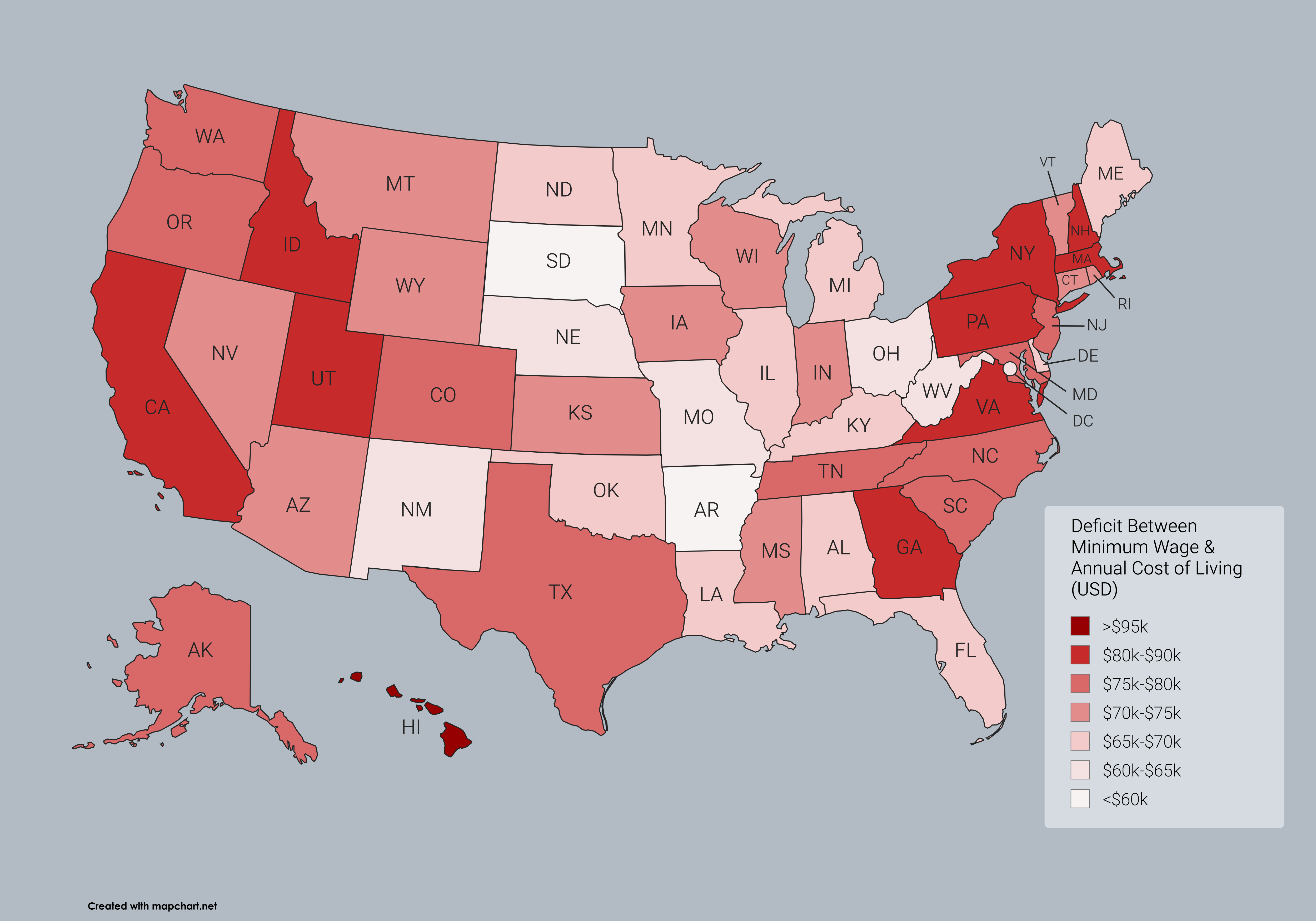
Minimum Wage Needed to Meet Cost of Living in US States (OC)
(midwest.social)
By popular demand, one last map to examine the absurdity of the American economy.
If you saw my map from yesterday that was up most of the day, please see the corrected version below. I done goofed hard on copying a column of state names. The original post has been corrected, but I will also post my previous two maps on this post for easy comparison.
Edit: the red map, for anyone unaware, is based on current individual state minimum wages and not the current federal minimum wage

22
170
Edit: the corrected map is now live
Out of curiosity, I wanted to see what a reasonable federal minimum wage might look like if implemented.
Looking at historical information from a time when a single individual’s income could support a family of four, I settled at the late 1950s.
The minimum wage in 1956 was finally raised to one whole dollar, the equivalent of about $12 today by raw inflation. However, its key to remember that this was an era when women were not paid on par with men, and when children younger than 13 commonly were in the workforce.
So instead I found average wage and salary numbers for 1958. In 1958, the average among all adult male wages was $4,888, and salaried men (doctors, lawyers, etc not included) averaged $6,514. Taking the salary figure and adjusting it for inflation gives you roughly $72k, or close to $35/hr.
If the average person had anywhere near the purchasing power of an individual in 1958, then no one could be making less than $35 per hour for their labor. Effectively, to return people to that level of financial security this is what it would take, while everything would simultaneously have to remain the same price. Meaning this wage increase would necessarily have to come out of the pockets of shareholders/owners.
The map shows quite clearly that even with such a high minimum wage, it would still be unaffordable in 100% of the country on 40 hours of work per week alone.
Trickle down economics have doomed this country on a path toward economic ruin, and have pushed most people in the US to such a precarious point financially that they have no hope of living as comfortably as the average worker in 1958. The average salaried worker today earns just $61k per year, over $10k shy of what the average worker made back in the day. Meanwhile, the cost of goods and services are astronomically higher.
$1 in 1956 bought you 4 gallons of gasoline. I pay $20 for that, even though by raw inflation the dollar is worth $12 today. Although gas is highly influenced by many factors that are unstable.
~~In the late 1950s, a cheap American car cost about $14k. The equivalent of over $168k today by inflation. By average salary, an individual could buy a car within 3-4 years easily by saving intentional for it. At modern wages, this would be impos. At $72k per year it becomes about as feasible as it was back then to reach that $168k mark.~~
These rough concepts are how I landed on $35 per hour as an appropriate measure. As well as the fact that wages today are almost entirely earned by adults, considering modern labor laws and the decline of the teenage workforce.
Edit: I just did the math for funsies, and 72,800 per year is about the appropriate income to afford the median rental price in the US (about $1900 in April 2025) or just shy of the median mortgage price of about $2,100 (also April)

23
100
Only semi-beautiful, but I tried
Annual cost of living data according to SmartAsset 2025 Report, except for DC which is not included in their reporting.
DC annual cost of living was estimated to be $99,424 per separate data, however it may be outdated. This would place DC as less expensive than 18 states by 2025 numbers, which is probably lower than it should be.
Minimum wage income assumes 40 hours per week by 52 weeks a year at the minimum wage rate.
view more: next ›
Data is Beautiful
2679 readers
70 users here now
Be respectful
founded 1 year ago
MODERATORS