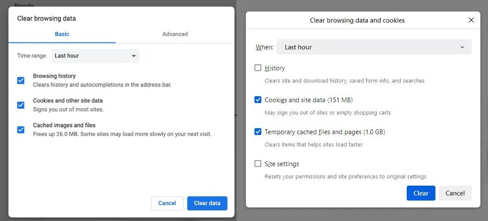
Personally I don't see an issue with it. What better way could there be to display clearing browsing history and etc
Firefox
A place to discuss the news and latest developments on the open-source browser Firefox
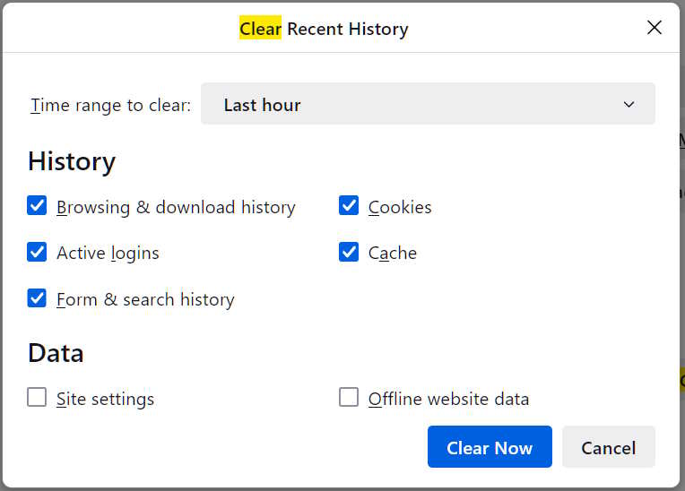
This new dialog obfuscates what can be deleted.
The old dialog gave you check boxes for:
Browsing & Download History
Active Logins
Form & Search History
Cookies
Cache
Site Settings
Offline Website Data
To see the difference, open about:config, search for privacy.sanitize.useOldClearHistoryDialog and set it to true
(Restart Firefox to see the difference)
Old dialog:

They could at least have a button/tab/something to enable seeing this view.
What’s the difference between active logins and cookies?
Are offline pages used much anymore?
I don’t think it obfuscates it, it describes each (most) of those items while grouping them more logically. It is just less granular.
Personally, I feel like more advanced use-cases are better covered by extensions.
This seems fine to me, too. Personally I want easier to disambiguate tabs. The sexy Australis curves were peak Firefox design. I really dislike the new tab bar
Jesus the monochromatic, shades-of-grey everything-looks-the-same low contrast UI bullshit today really pisses me off.
I feel bad for people with vision issues - some organization needs to sue all these companies for lack of accessibility.
Every time I see someone struggle with some UI, it really boils my blood that some asshole manager/tech bro somewhere decided to chase after fucking retention and engagement. And chose to make life more difficult and frustrating for some poor person who just wants to use the thing they paid for and own
Edit: Sorry for the rant, this doesn't really belong in the Firefox community. I feel like Mozilla has done a fairly decent job, it's just that I'm tired of all the tech BS and it pains me to see things being made so much worse
Even Firefox has this issue, which is what this post is about, really - obfuscating functionality.
Peak UI was about 15 years ago. Now it's all dark patterns to get you to do only what they want you to do.
agree with australis
I don't mind the idea of them having a go at improving it. What I want (and I don't think it's too unusual) is for history and site settings to be remembered when I close the browser, and most cookies + data to be deleted with the exception of a few sites where they're kept. Configuring this has been strangely complicated for a long time. To get it to work, I had to figure out this procedure:
- Select "delete cookies and site data when firefox is closed"
- Click on "manage exceptions" to add the exceptions. You'd think we'd be done, but...
- Scroll down to the "history" section
- Select both "clear history when firefox closes" and "remember history"
- Click history -> "settings"
- Select the chekboxes for cookies + data
- Unselect boxes for history and site settings
It is with some trepidation that I wait to see whether they will have broken my configuration, made things easier, or made it impossible to set things up this way when Debian stable eventually updates to the new ESR in the next few months.
Thank you for this comment; this is probably the setting that I would prefer but I don't remember seeing the option to have this when I was looking through settings. I suspect I didn't dig far enough — I agree, this is weirdly complicated
What's wrong with it? It's very clear in my opinion.
More detail is good for technical users, but extremely confusing for non-technical users. There needs to be a balance between what's good for both groups, and I think the current design is a good one.
Most users don't need that specificity.
I think most things in browsers got degraded thanks to Google, but also due to that specific way of thinking.
Dude, as someone who works in IT and has to regularly help software developers check their fucking email I can promise you that most people are dumber than you think.
I know. This is not about how dumb users are, it's about how dumb the software becomes with time.
It has to suit it's users... Why do you think iphones area so simple?
They are not.
They are.
You said there are too many stupid users, then you said the software has to suit them. I see this as a problem when software targets stupid users because then the rest suffer from it being less convenient for them.
Also I think it's hilarious how things become more complex for developers who should actually have the power to fork things in order to make them more suitable for advanced users. And apple is a good example of that. I would be a huge iphone fan if it wasn't a walled garden in software terms.
Advanced users are like 5% of the user base. Why would you cater to them?
Because that leads to the degradation of the software? Or because they provide most of the valid feedback? Or because that would help more users become more advanced?
As much as I hate google and chrome, I think chrome has superior ui/ux and firefox should really port the useful stuff
