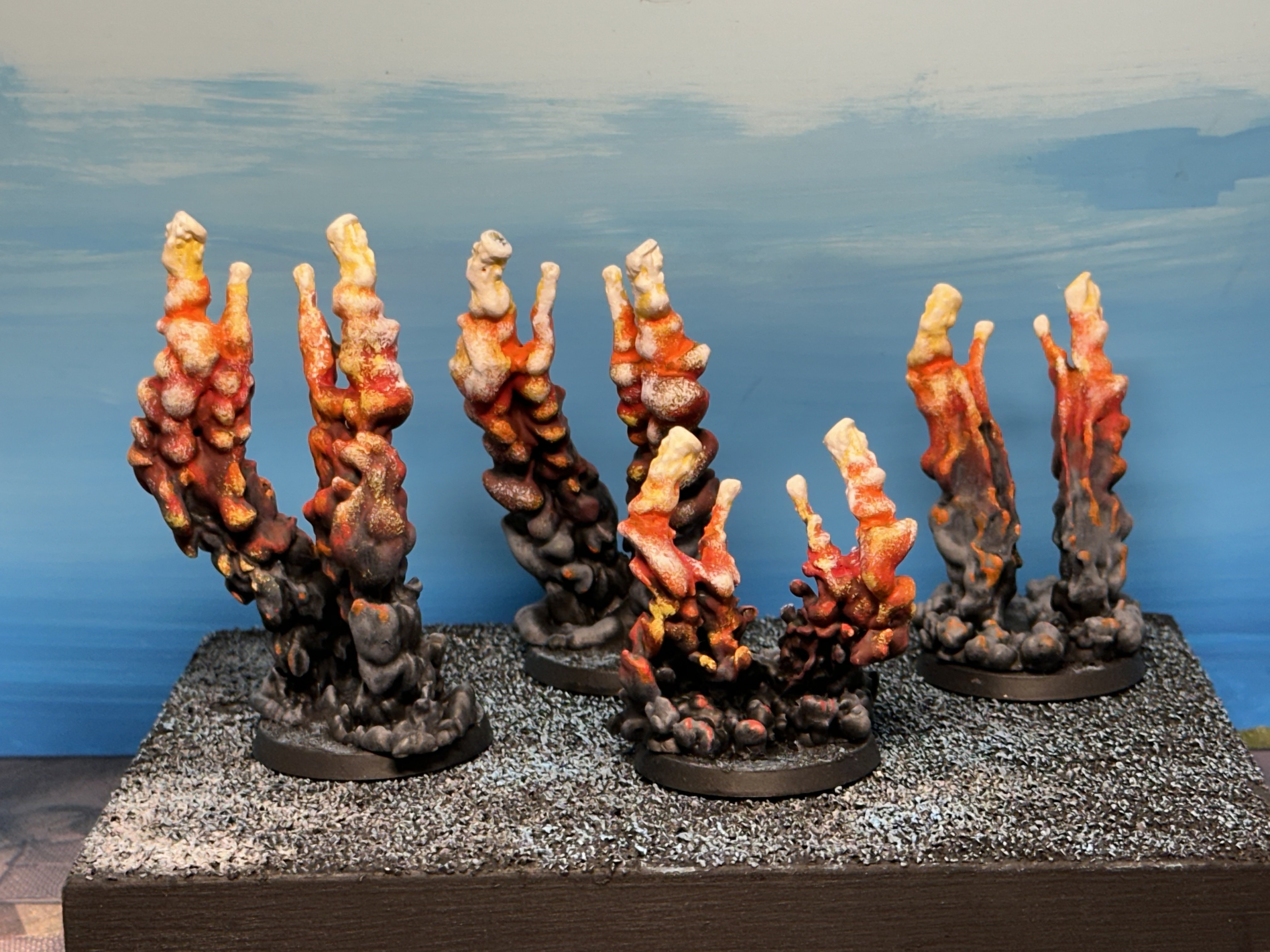
Bad Dragon double header.
Tabletop Miniatures
A community for all types of tabletop miniatures. Post to show off minis, ask for advice, and discuss all aspects of the mini painting hobby.
RULES
-
Keep it on topic. Non-miniatures related posts or comment chains will be removed.
-
Keep it civil.
Stand out threads:
Friends of TabletopMinis:
-
https://ttrpg.network/communities (an instance dedicated to TTRPGs)
Glad I wasn't the only one.
Wouldn't the light be the interior and the shadows deepen with density, instead (therefore being the higher surfaces)?
Realistically, yes. I started out trying that but because of the physical depth of the details I ended up with a lot of real shadows darkening those inner areas. It looked ok in photos where I was hitting everything with direct light, but when I set them down for normal tabletop light it was too muted.
I feel ya there. That's one of those facets of the hobby that still eludes me as well. 😅 All the same, these are looking great, though!
Finding the balance between realism and theatrics is tough, and I usually end up on the side of theatrics.
