this post was submitted on 03 Oct 2023
1014 points (98.3% liked)
Risa
6921 readers
30 users here now
Star Trek memes and shitposts
Come on'n get your jamaharon on! There are no real rules—just don't break the weather control network.
founded 1 year ago
MODERATORS
you are viewing a single comment's thread
view the rest of the comments
view the rest of the comments

XKCD, Oglaf and other webcomics have title text on mouseover (perhaps because that's the easiest implementation, not even requiring CSS or JS) but this does not work well on mobile (at best, long press reveals some of the title text), which is why some implement the clicking.
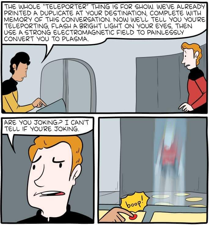
Also, the red button is in an obvious spot in landscape mode but too far down for most mobile users to scroll (and they might think it’s some kind of promo).
Yeah, alt text / clicking as bonus content in comics needs to die, majority of mobile users will miss it. Just make it clearly visible. And the red button just seemed like a link to something else.