this post was submitted on 19 Oct 2023
560 points (100.0% liked)
196
16488 readers
1528 users here now
Be sure to follow the rule before you head out.
Rule: You must post before you leave.
founded 1 year ago
MODERATORS
you are viewing a single comment's thread
view the rest of the comments
view the rest of the comments

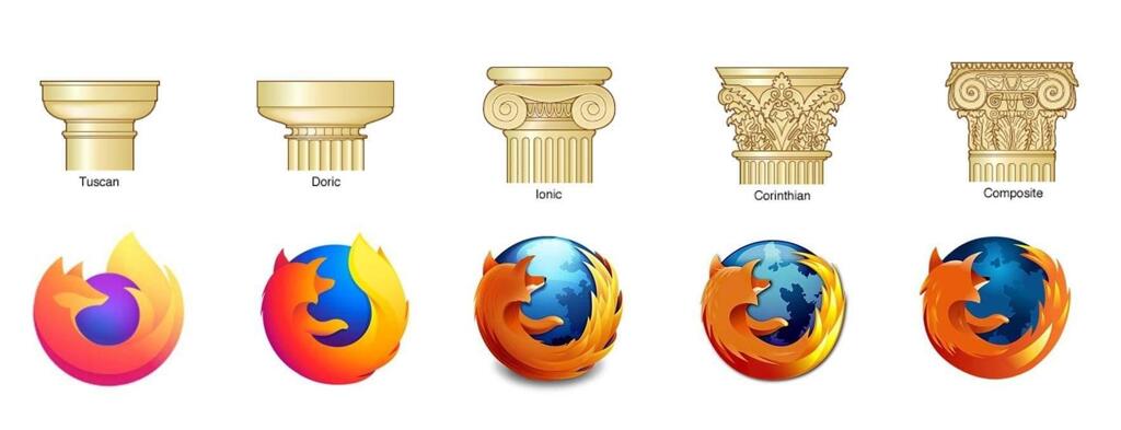
I know I'm completely butchering the color palette here, but I've finally realized what I felt was missing from the new logo. In the previous iterations, the head was always turned in such a way that you couldn't see the eyes. Now the head is at an angle where you should see the right eye. But you don't, the head is completely empty.
Here's an """"improvement"""" making the logo a bit more friendly I think:
Now it looks like it has a mole lol