this post was submitted on 29 Oct 2023
232 points (100.0% liked)
196
18091 readers
829 users here now
Be sure to follow the rule before you head out.
Rule: You must post before you leave.
Other rules
Behavior rules:
- No bigotry (transphobia, racism, etc…)
- No genocide denial
- No support for authoritarian behaviour (incl. Tankies)
- No namecalling
- Accounts from lemmygrad.ml, threads.net, or hexbear.net are held to higher standards
- Other things seen as cleary bad
Posting rules:
- No AI generated content (DALL-E etc…)
- No advertisements
- No gore / violence
- Mutual aid posts are not allowed
NSFW: NSFW content is permitted but it must be tagged and have content warnings. Anything that doesn't adhere to this will be removed. Content warnings should be added like: [penis], [explicit description of sex]. Non-sexualized breasts of any gender are not considered inappropriate and therefore do not need to be blurred/tagged.
If you have any questions, feel free to contact us on our matrix channel or email.
Other 196's:
founded 2 years ago
MODERATORS
you are viewing a single comment's thread
view the rest of the comments
view the rest of the comments
Ok but what is it?
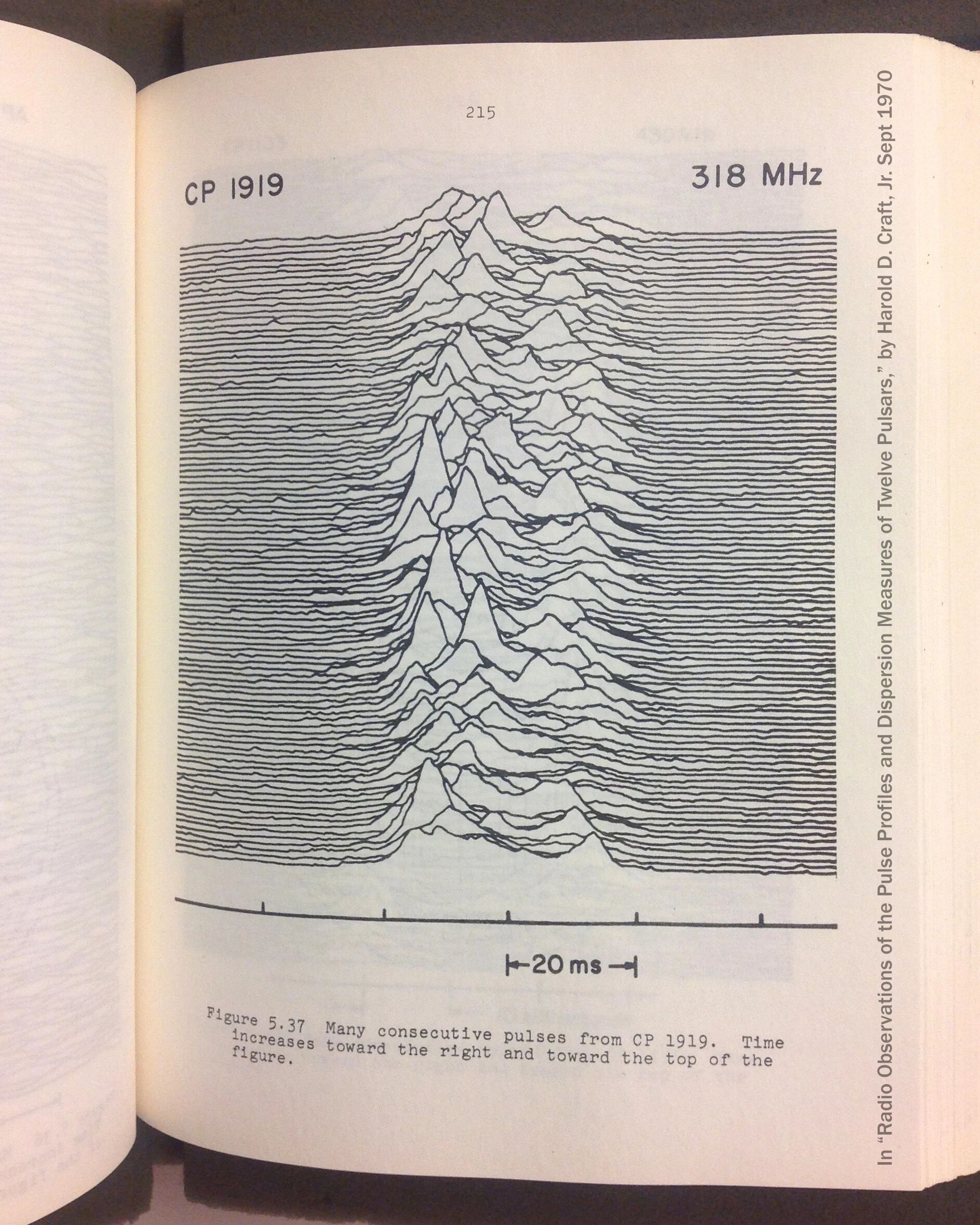
Like the other amigo said, it's detected emissions from a pulsar. For some more explanation, pulsars spin really fast and emit radio waves, think of it sorta like a lighthouse. So what the image is measuring is the intensity of the radio waves from this pulsar as it spins, with each period stacked in front of the last.
Visual aid from Wikipedia:
As you can see, this one has been simplified to demonstrate the concept, and the actual data is much more varied and interesting to look at; I do not know what causes the peak offsets and would also like an explanation
Yeah, that part is confusing because the description says
Which would mean the oldest pulse is in the foreground.
ahh you're right, I see, a little counter intuitive since going front-to-back would obscure newer data that wont be seen at all, while going back-to-front would only obscure older data
I didn’t know either so I looked it up, apparently it was the first detected radio pulsar, briefly thought to be an extra terrestrial transmission…and later used on Joy Division album cover: https://en.m.wikipedia.org/wiki/PSR_B1919%2B21