this post was submitted on 30 Oct 2023
408 points (96.6% liked)
Data Is Beautiful
7228 readers
6 users here now
A place to share and discuss data visualizations. #dataviz
founded 4 years ago
MODERATORS
you are viewing a single comment's thread
view the rest of the comments
view the rest of the comments

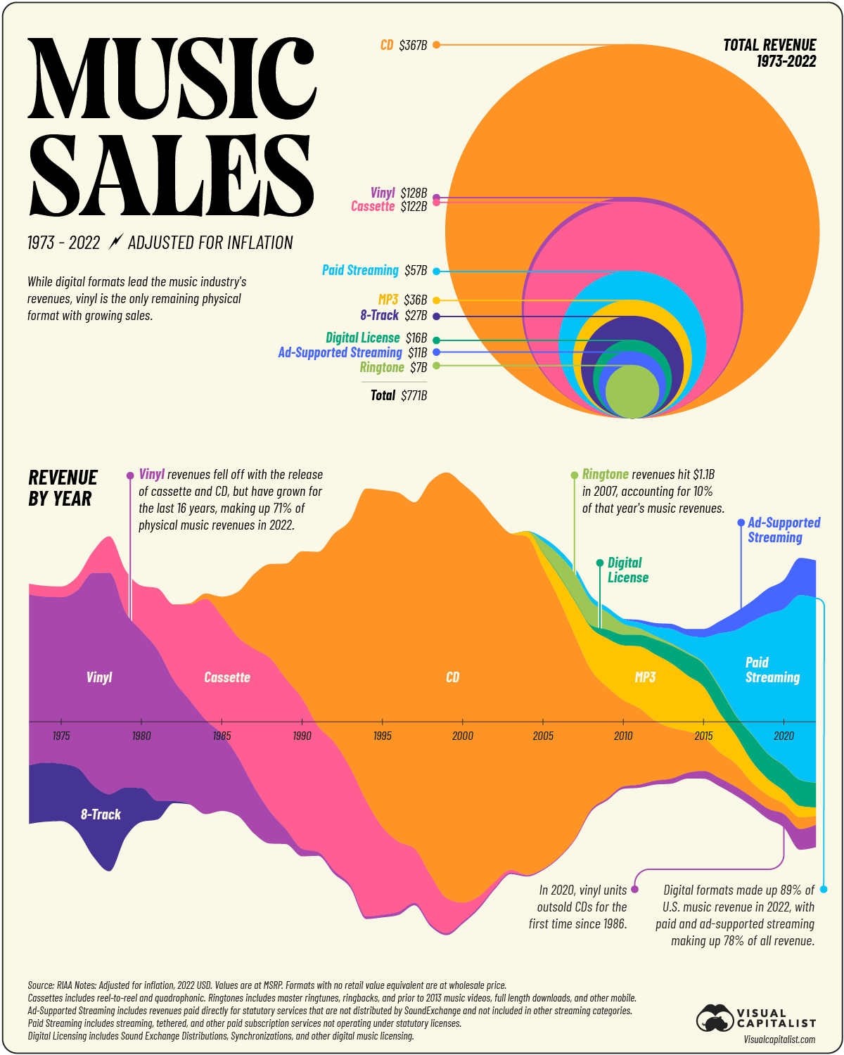
Probably because they wanted to show the variance over time which one pie chart cannot visually show. And it's easier to compare a circle vs a circle than a pie chart.