this post was submitted on 30 Oct 2023
408 points (96.6% liked)
Data Is Beautiful
7228 readers
6 users here now
A place to share and discuss data visualizations. #dataviz
founded 4 years ago
MODERATORS
you are viewing a single comment's thread
view the rest of the comments
view the rest of the comments

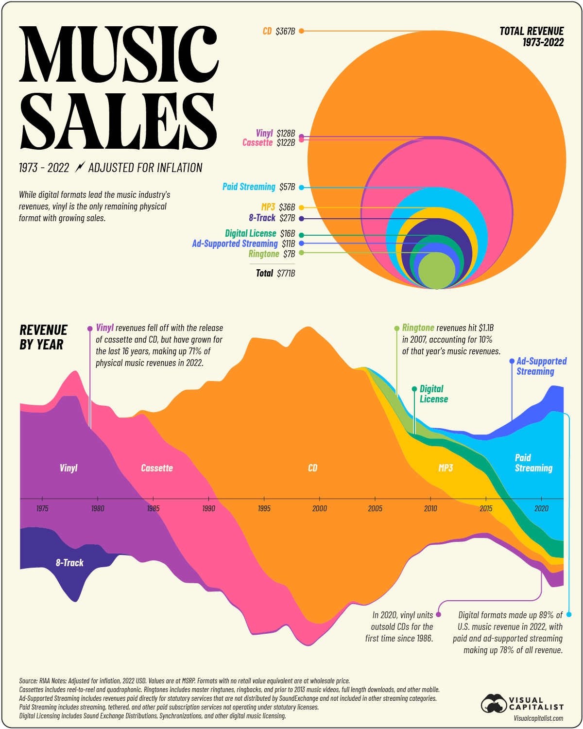
Circle area's are really hard to compare. A circle with double the area of another barely looks bigger.
While I agree that comparing them by eye is difficult compared to rectangles of equal width (i.e., a bar chart), it’s a bit of a stretch to say that it barely looks bigger. The radius to get double area is sqrt (2), or almost half as large again. The same ratio as used in standard A series paper. You wouldn’t say that the long side of paper "barely looks bigger" than the short side.