this post was submitted on 01 Nov 2023
258 points (97.1% liked)
Data Is Beautiful
8473 readers
1 users here now
A place to share and discuss data visualizations. #dataviz
founded 4 years ago
MODERATORS
you are viewing a single comment's thread
view the rest of the comments
view the rest of the comments

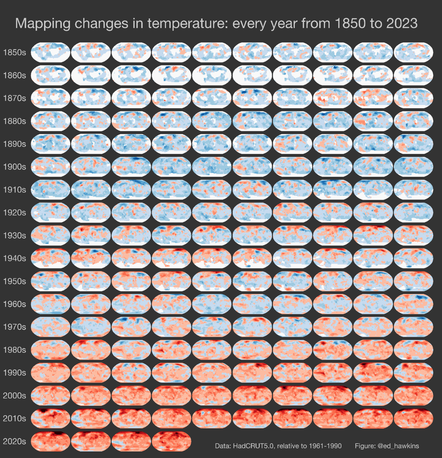
Oh no, I hope you didn't think my criticism was directed at you! You linked the source....most others would not. I'm mad at the writers who include these images and graphs without a key.
/image of Bush pointing at graph with no marked axis