It's in the "Fingerprinting resistance tests" section so it would be one of the ways of preventing a browser from being uniquely identified by various reported variables, screen height, width etc. It's worth taking a look at this site that someone else here mentioned to see what information your browser is giving up about itself: https://www.amiunique.org/
Sure, you can get fingerprinted if you have a unique window size, but do you really want to disable that at the cost of disabling all responsive websites?
I am using Librewolf and Mullvad Browser as daily drivers, both of which pass the fingerprinting resistance tests, and the only problem I have experienced was with Twitch and that was solved by changing the user agent.
That's not what I mean by responsive. Look at the first image in the article, and now resize the window. By disabling media queries, that probably doesn't happen anymore.
That image is responsive on both my browsers. I used the Twitch example only to make the point that that was the only problem I'd experienced, not that it was necessarily related to responsiveness.
The browser window size is an easy way to fingerprint. You might be the only person viewing web content in a 1916x988 window who also has a certain font installed.
So, I haven't done any html or css since around when the mobile web was in its infancy but by my understanding responsive websites don't need to know the exact screen resolution to be responsive. You anchor elements to certain parts of other elements and some are anchored to certain regions of the screen and change the arrangement if there's not enough space to fit them all on that axis
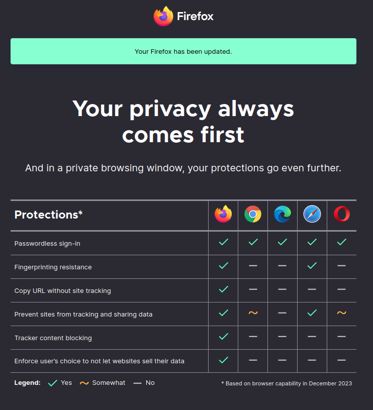
Looking at that, why do some browsers block media query screen size by default??
It's in the "Fingerprinting resistance tests" section so it would be one of the ways of preventing a browser from being uniquely identified by various reported variables, screen height, width etc. It's worth taking a look at this site that someone else here mentioned to see what information your browser is giving up about itself: https://www.amiunique.org/
Sure, you can get fingerprinted if you have a unique window size, but do you really want to disable that at the cost of disabling all responsive websites?
I am using Librewolf and Mullvad Browser as daily drivers, both of which pass the fingerprinting resistance tests, and the only problem I have experienced was with Twitch and that was solved by changing the user agent.
That's not what I mean by responsive. Look at the first image in the article, and now resize the window. By disabling media queries, that probably doesn't happen anymore.
That image is responsive on both my browsers. I used the Twitch example only to make the point that that was the only problem I'd experienced, not that it was necessarily related to responsiveness.
Saying that "that image is responsive" confuses me. Do you mean the resized website behaves like the image?
The browser window size is an easy way to fingerprint. You might be the only person viewing web content in a 1916x988 window who also has a certain font installed.
Yes, but that probably also prevents websites from adapting to your window size better.
So, I haven't done any html or css since around when the mobile web was in its infancy but by my understanding responsive websites don't need to know the exact screen resolution to be responsive. You anchor elements to certain parts of other elements and some are anchored to certain regions of the screen and change the arrangement if there's not enough space to fit them all on that axis
For layouts that change quite a bit, that sounds like quite a hassle compared to if screen small arrange like dis.