this post was submitted on 11 Feb 2024
31 points (73.8% liked)

Data Is Beautiful

6989 readers
1 users here now

A place to share and discuss data visualizations. #dataviz


(under new moderation as of 2024-01, please let me know if there are any changes you want to see!)

founded 3 years ago
MODERATORS
 

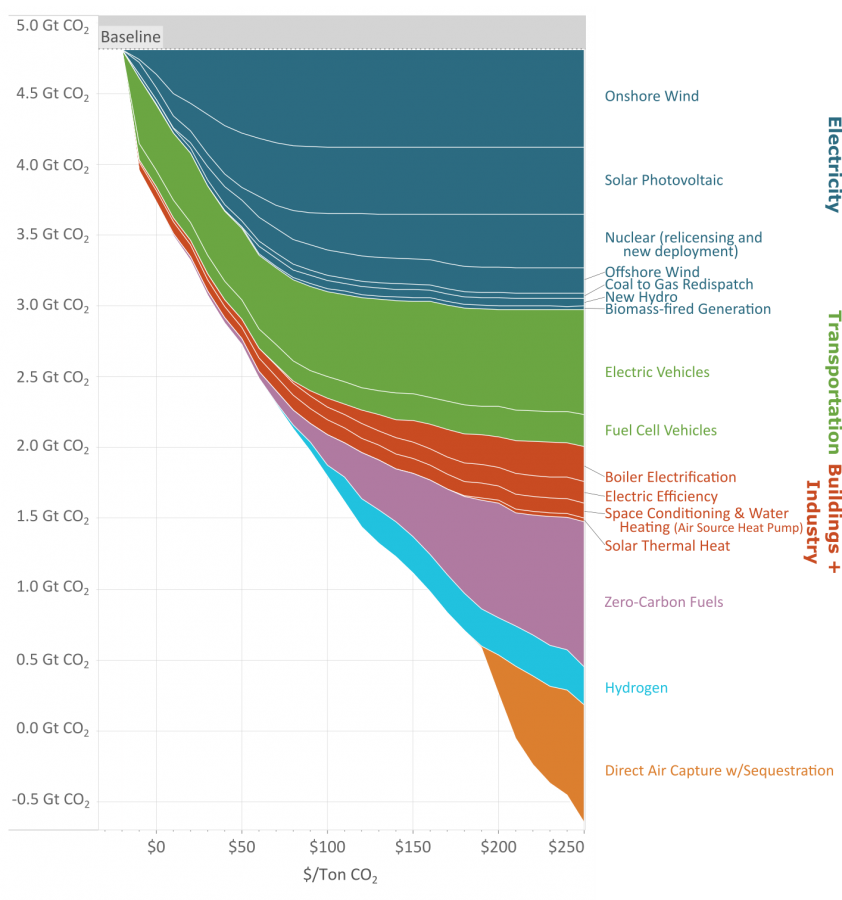
As you reduce the amount of carbon emissions (the y axis) the methods to keep reducing carbon cost more (the x axis.)

This great graph came to my attention from this video from vlogbrothers. It also has some good explanations of what it means.

Note that carbon capture doesn't really make sense till you've exhausted all the other emission minimizing methods.

Source: https://www.edf.org/revamped-cost-curve-reaching-net-zero-emissions

you are viewing a single comment's thread
view the rest of the comments
[–] JohnDClay@sh.itjust.works 1 points 11 months ago* (last edited 11 months ago)

It might be included in carbon capture and sequestration.