365
you are viewing a single comment's thread
view the rest of the comments
view the rest of the comments
this post was submitted on 03 Mar 2024
365 points (91.2% liked)
Climate - truthful information about climate, related activism and politics.
5053 readers
449 users here now
Discussion of climate, how it is changing, activism around that, the politics, and the energy systems change we need in order to stabilize things.
As a starting point, the burning of fossil fuels, and to a lesser extent deforestation and release of methane are responsible for the warming in recent decades:

How much each change to the atmosphere has warmed the world:

Recommended actions to cut greenhouse gas emissions in the near future:

Anti-science, inactivism, and unsupported conspiracy theories are not ok here.
founded 1 year ago
MODERATORS
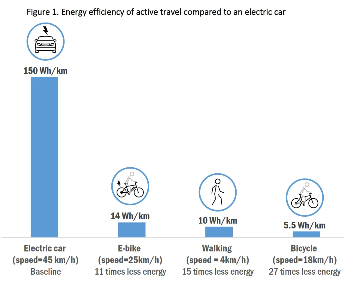
I get what you are trying to ask, and why, but unfortunately, such a comparison is not so trivial:
Setting aside load (weight) and age differences, various transportation means use gear shifting in order to adapt the power output to the characteristics of the current load (as in "system load" this time). This adds a dimension of dynamism to the comparison, and most vehicles do not automatically and systematically impose an ideal efficiency constraint on the power output.
To illustrate, using a single speed bike requires vastly different power than using a 7 speed bike. And different driving styles will radically change the efficiency of combustion engines.
So, in addition to mapping the efficiency to various speeds, it should be mapped to various use cases (hence why combustion engines have different fuel economy in "urban" and "extra urban" situations).
In the end, the graphic would not be 2D like this one, or 3D like it would be with "time per km" (or mile) vs energy requirement, and per type of vehicle, but there would be several 3D graphics, one per vehicle type, with time per km vs environment vs energy consumption.
TBH I was gonna try and do that, but even with ADHD, I can see this is going to be mad time consuming. So yeah, no, I think I'll pass. Good idea tho. "Someone" should do it. 😇