this post was submitted on 21 Jul 2023
44 points (97.8% liked)
Warhammer 40k
3897 readers
18 users here now
A community dedicated to the universe of Warhammer 40k, a tabletop setting in the far, distant future.
This is a general community for 40k miniatures, art, lore discussion, and gameplay discussion.
Rules
- Keep it civil.
- No memeposts/shitposts. Memes are great but direct them to grimdank.
- Please mark any posts containing realistic nudity or realistic excessive gore/violence as NSFW; this rule mainly applies to cosplay and realistic drawings rather than miniatures. Being that 40k is inherently violent, this is a judgement call, and mods may occasionally request posters add tags.
- No political or social cause agenda pushing.
Helpful Links
- 10th Edition Rules
- iOS Warhammer 40k App
- Android Warhammer 40k App
- 3rd party site for running Kill Team games
Related 40K Communities:
!imaginarywarhammer@lemmy.world
Other tabletop hobby communities:
founded 1 year ago
MODERATORS
you are viewing a single comment's thread
view the rest of the comments
view the rest of the comments

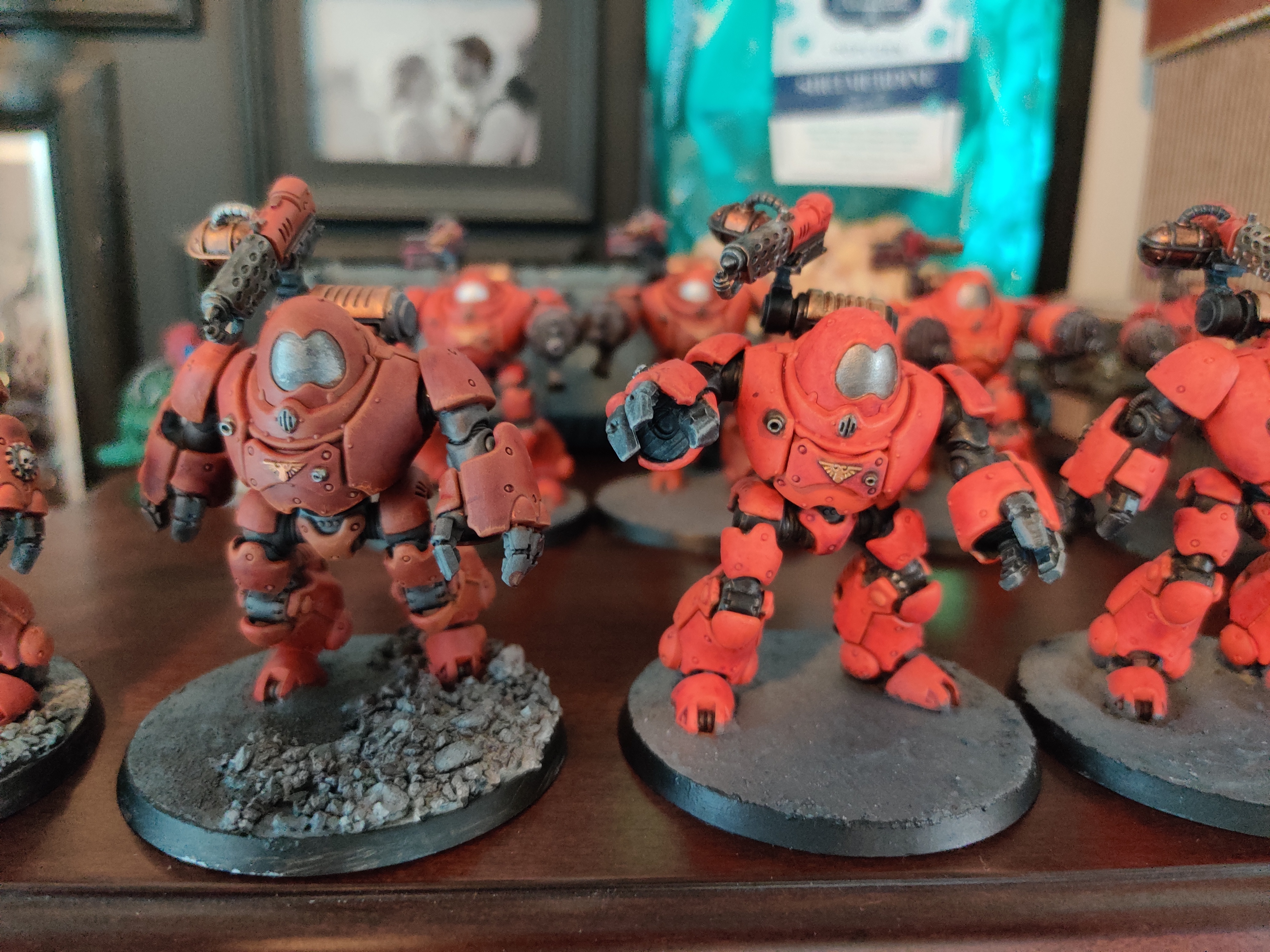
With respect, I feel that both are halves of very similar end goals. For example, the model on the left (A) has edge highlighting, but lacks much contrast. Whereas, it's counterpart (B) has an abundance of contrast, the larger pieces seem to lack the definition that edge highlighting can produce. While it might be a bit of work to get A & B to each resemble the same C, there are a number of things they don't have in common that their neighbor could benefit from. 🤙🏼