this post was submitted on 17 Mar 2024
128 points (93.8% liked)
Unixporn
15368 readers
1 users here now
Unixporn
Submit screenshots of all your *NIX desktops, themes, and nifty configurations, or submit anything else that will make themers happy. Maybe a server running on an Amiga, or a Thinkpad signed by Bjarne Stroustrup? Show the world how pretty your computer can be!
Rules
- Post On-Topic
- No Defaults
- Busy Screenshots
- Use High-Quality Images
- Include a Details Comment
- No NSFW
- No Racism or use of racist terms
founded 5 years ago
MODERATORS
you are viewing a single comment's thread
view the rest of the comments
view the rest of the comments

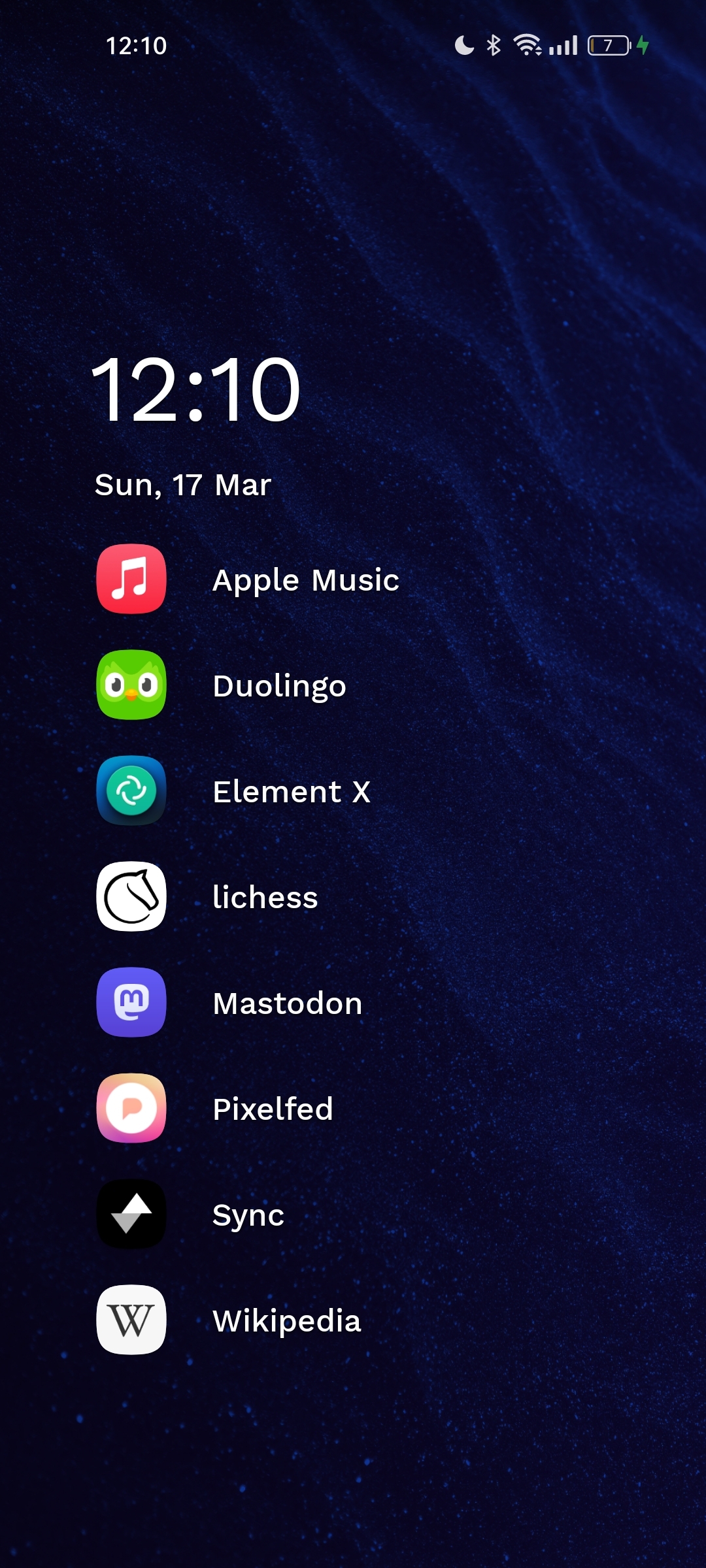
I tried both (and a bunch of other options) when Nova broke from an update. They were my two favorites, but ultimately I found I prefer Niagara's navigation I think.
I find it gets cluttered with too many apps. After like 40 apps Niagara can become a bit long to scroll through, especially when i can't remember an apps names half the time lol
Remembering app names is a must. Generally jumping straight to the right letter will let me open the right app with one click, it's only my "S" named apps that have enough apps to require additional any notable scrolling after jumping to the letter (I have 24 apps starting with S, and my screen only shows 15 apps max at once in the Niagara app list).
For all my most used apps, I put them in folders on the Niagara home screen for quick access. I also do this for apps like games where I want to view multiple options at once to decide between them. Anything I'm not accessing often needs some searching to find anyways.
That's why Niagara introduced pop-up folders a while back.
I access about 80% of my daily apps through these instead of scrolling down the entire list.