Alt text:
𝓘 𝓽𝓱𝓲𝓷𝓴 𝓬𝓪𝓹𝓲𝓽𝓪𝓵 𝓛 𝓲𝓼 𝓹𝓻𝓸𝓫𝓪𝓫𝓵𝔂 𝓽𝓱𝓮 𝓶𝓸𝓼𝓽 𝓯𝓾𝓷 𝓽𝓸 𝔀𝓻𝓲𝓽𝓮, 𝓽𝓱𝓸𝓾𝓰𝓱 𝓵𝓸𝔀𝓮𝓻𝓬𝓪𝓼𝓮 𝓺 𝓲𝓼 𝓪𝓵𝓼𝓸 𝓪 𝓼𝓽𝓻𝓸𝓷𝓰 𝓬𝓸𝓷𝓽𝓮𝓷𝓭𝓮𝓻.
A community for a webcomic of romance, sarcasm, math, and language.
Alt text:
𝓘 𝓽𝓱𝓲𝓷𝓴 𝓬𝓪𝓹𝓲𝓽𝓪𝓵 𝓛 𝓲𝓼 𝓹𝓻𝓸𝓫𝓪𝓫𝓵𝔂 𝓽𝓱𝓮 𝓶𝓸𝓼𝓽 𝓯𝓾𝓷 𝓽𝓸 𝔀𝓻𝓲𝓽𝓮, 𝓽𝓱𝓸𝓾𝓰𝓱 𝓵𝓸𝔀𝓮𝓻𝓬𝓪𝓼𝓮 𝓺 𝓲𝓼 𝓪𝓵𝓼𝓸 𝓪 𝓼𝓽𝓻𝓸𝓷𝓰 𝓬𝓸𝓷𝓽𝓮𝓷𝓭𝓮𝓻.
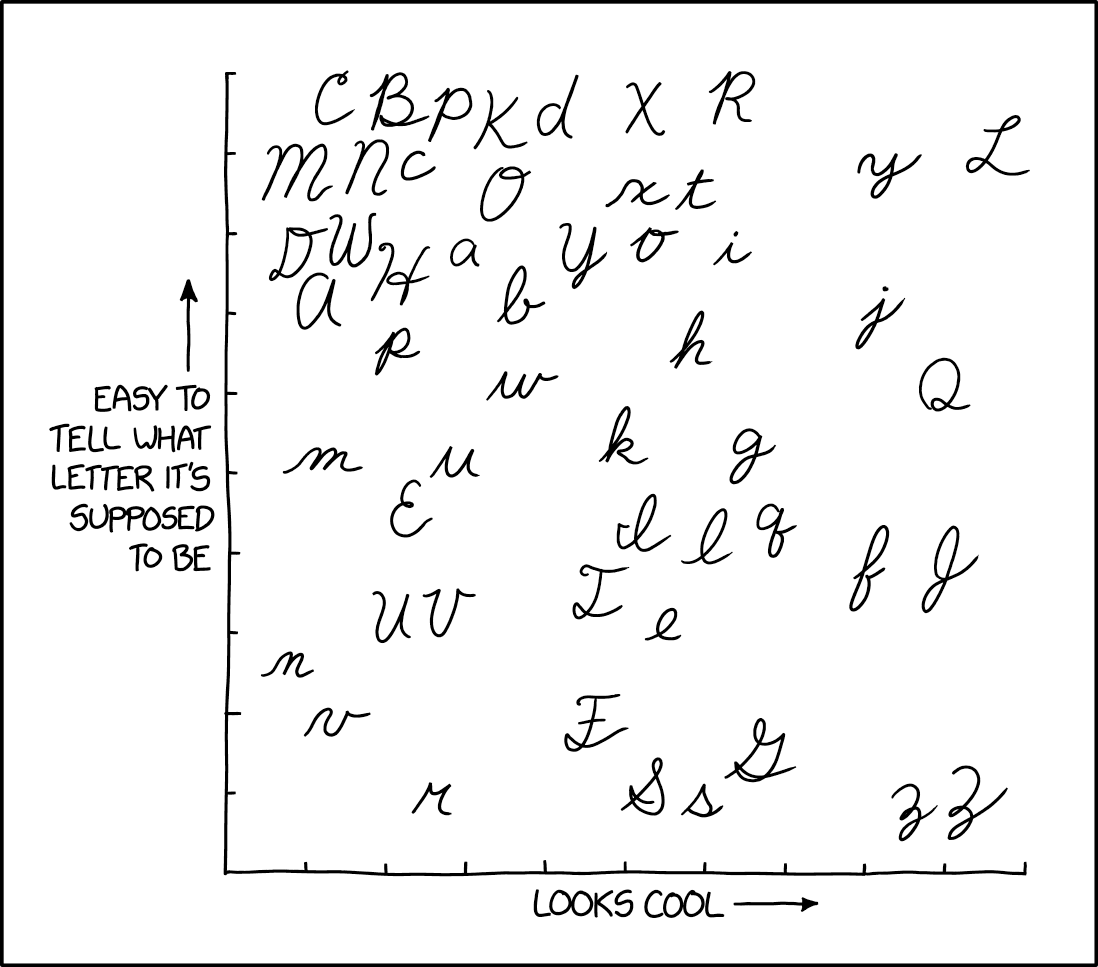
Cursive f is actually way to high the whole point of cursive is to learn to write fast and cursive f is slower. I'm sure a large amount of people aren't even aware it's an f ( the middle right two)
It's really no more time consuming than any other letter. It might look a bit bigger, bit it's just two loops, which is a very quick and natural movement that you'll be doing a lot if you write in cursive.
It's more about following the flow of the lines than the size of the letters. Each letter should feed into the next one, so you'll barely need to take your hand off the paper for the same word. Even if you choose to make an especially "high f", that'd still take less than a second of you know what you're doing.
(Also, as has already been pointed out, second one is a J)
The one furthest to the right is a "J"
Which one? The bottom one to the right is a ,,z" (the thing looking like a 3).
Far right, second one from the bottom.