142
you are viewing a single comment's thread
view the rest of the comments
view the rest of the comments
this post was submitted on 04 Apr 2024
142 points (92.8% liked)
AssholeDesign
7423 readers
1 users here now
This is a community for designs specifically crafted to make the experience worse for the user. This can be due to greed, apathy, laziness or just downright scumbaggery.
founded 1 year ago
MODERATORS
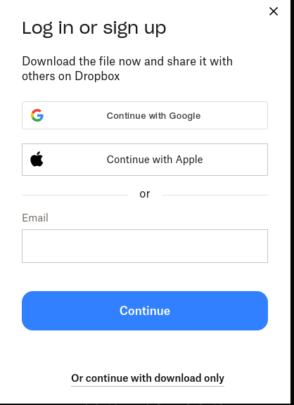
The problem is that they needed to have that big blue button be the download, and the "log in or sign up" should be that small, black text below it.
Better for the UX, and less of a dark pattern.