this post was submitted on 22 Jun 2023
35 points (100.0% liked)

Technology

37712 readers
145 users here now

A nice place to discuss rumors, happenings, innovations, and challenges in the technology sphere. We also welcome discussions on the intersections of technology and society. If it’s technological news or discussion of technology, it probably belongs here.

Remember the overriding ethos on Beehaw: Be(e) Nice. Each user you encounter here is a person, and should be treated with kindness (even if they’re wrong, or use a Linux distro you don’t like). Personal attacks will not be tolerated.

Subcommunities on Beehaw:


This community's icon was made by Aaron Schneider, under the CC-BY-NC-SA 4.0 license.

founded 2 years ago
MODERATORS
 

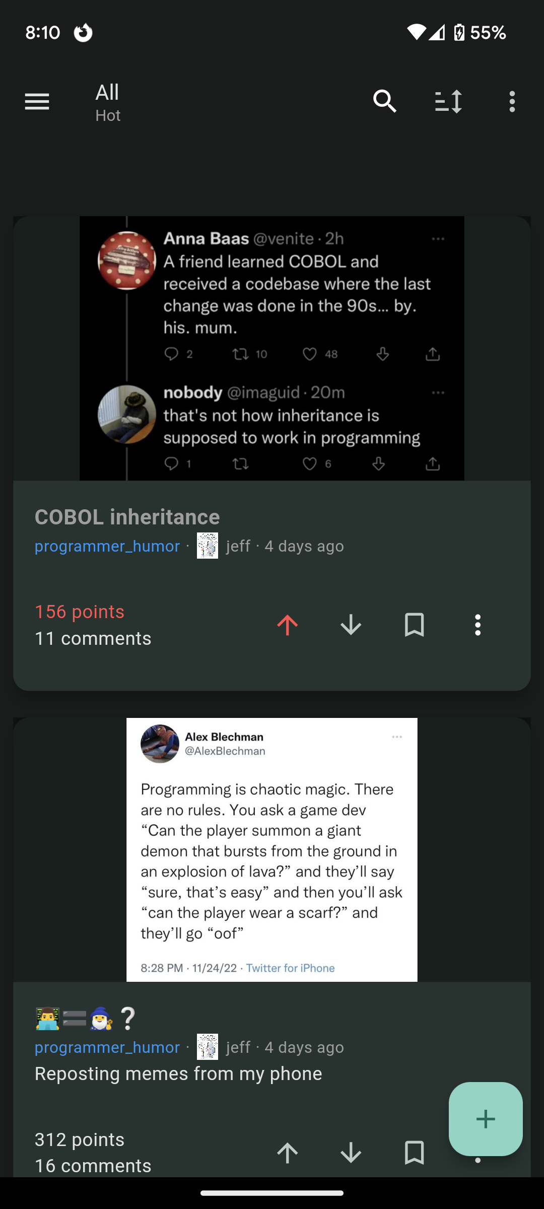
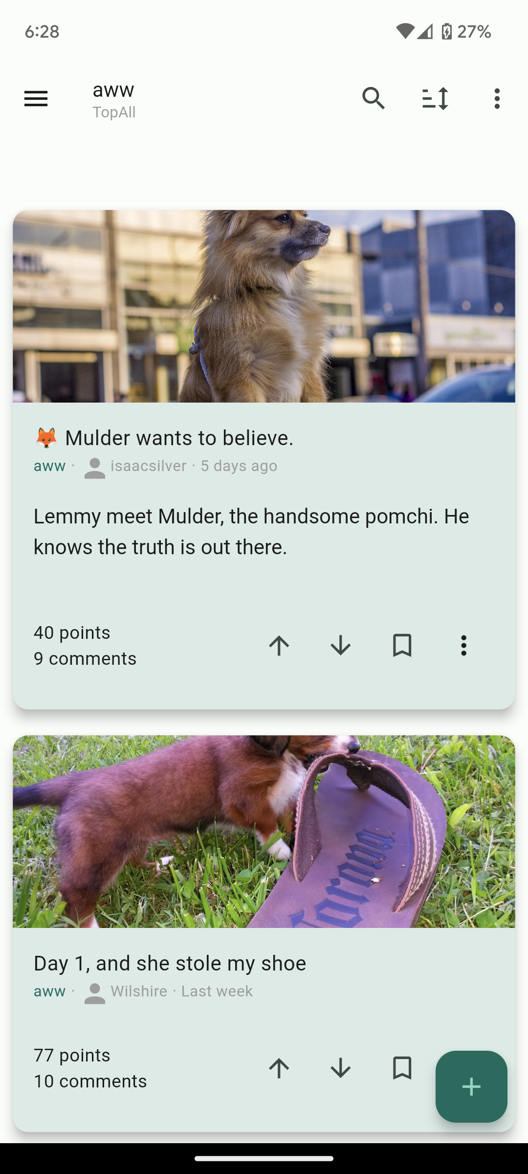
Hi lemmings, I switched over from Reddit 10 days ago now but I couldn't find a mobile client that I was happy with with an experience similar to the Reddit experience I was used to. So I decided to build my own and I hope you will like it as well!

Play store link: https://play.google.com/store/apps/details?id=com.kuroneko.lemmy_connect

Features:

  • Material U
  • Dark and Light themes
  • List view / Card view / Fullwidth view
  • Filter lists for hiding posts
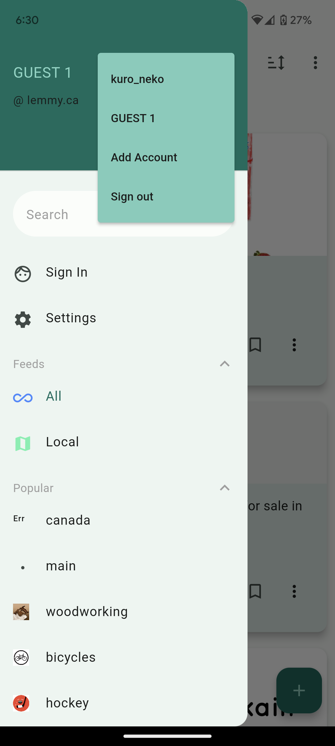
  • Multiple accounts + switcher across multiple instances
  • Guest accounts for viewing an instance without signup
  • Search and community autofill
  • Markdown support + attempt to navigate links correctly (/u/foo will open that user instead of browser kickout. Same for /c/, !, and @)
  • Saving posts
  • full sort types
  • NSFW view options (hide, blur, show)
  • copy text and url on all posts and comments
  • add comments, replies, and new posts
  • comment replies with line indicators

Here's other screenshots:

Future plans:

  • Improving the inbox
  • Swipe actions
  • Multi-~~reddit ~~communities

Thank you for taking a look. I hope others who are migrating from Reddit like me will find the app useful and I'd love to know your thoughts!

Edit: Community for the app is here: https://lemmy.ca/c/lemmyconnect

you are viewing a single comment's thread
view the rest of the comments
[–] redcalcium@c.calciumlabs.com 3 points 1 year ago* (last edited 1 year ago) (1 children)

Congrats for the release! I finally have alternative to Jerboa!

Some feedback if you don't mind:

  • Full Height view. It's like the full width view, but display the image without any cropping.
  • Tap and hold to show image in full screen, release to close. Very useful for compact views. Also should works for articles thumbnails.
  • Native imgur support. Right now it's treated as a web page. If it'll require using paid API, just disregard this until you have some funding.
  • Preload images when on wifi (optional setting). Basically preload the next N images in the list so they'll appear instantly.
  • Show full community names and user name. Right now it only show the community name and user name, but not the instance name. This is confusing if you subscribed to multiple communities with the same name from multiple instances. Same for usernames.
  • option to toggle denser comments views with minimal whitespace.
  • (possible bug?) The community list on the side menu doesn't show all my subscribed communities.
[–] CreepyRainbow@beehaw.org 3 points 1 year ago

These are very good suggestions! would also like for it to show the instance name of a post as well as the hold-to-show-image