this post was submitted on 03 Aug 2023
94 points (75.0% liked)
AssholeDesign
7553 readers
2 users here now
This is a community for designs specifically crafted to make the experience worse for the user. This can be due to greed, apathy, laziness or just downright scumbaggery.
founded 1 year ago
MODERATORS
you are viewing a single comment's thread
view the rest of the comments
view the rest of the comments

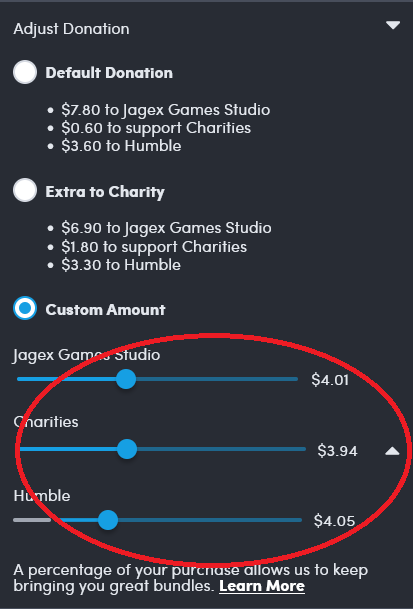
Regardless of if this is intentionally designed to be misleading, a stack of sliders is the wrong way to show portions of a whole. I wonder what a better way would be for the web? A single slider with multiple knobs? Or like a single stacked bar with draggable boundaries between sections? I bet you could accomplish that with multiple sliders and some CSS to make them look like a single thing
Just checked the website. Your interpretation (and nine) was incorrect.
The publishers and charities sliders and connected, so they split up a total between the two. The Humble slider is independent (or connected to a referral in a similar way).
There should be some kind of separation here. I’d go so far as to say there should be a text explanation.
The other issue is that they’re absolutely no indication that spiders can affect each other, when using a screen reader. There’s no feedback for a slider you’re not adjusting.
All 3 are connected. If you have Humble at minimum and lower one of the other 2, the humble slider increases along with the one you didn't slide. Keeping humble at minimum while fine tuning the other 2 is really fiddly.
I set up a monthly donation to charity:water when IGN first added the sliders, before they lowered the humble minimum. It used to be 50%. So now a charity gets a bit more than I was donating through humble, and I spend roughly the same amount buying games elsewhere. I get a bit fewer games, but I play all the ones I buy. /shrug
Sorry, kind missed this. Yeah, there’s some weird stuff going on.
It’s more than fair to focus your perspective on Humble on how they deal with charity and move your resources elsewhere.
Now you've got me wondering whether a client-side change would work to unlink the sliders and set them all independently. Could just be sending one value (the Humble slider's position with the other two determined by splitting the remaining percentage) but if all three values are submitted and pass whatever validation takes place on the server, this could be fixable. No argument that it's a shitty design though.
You could check your browser’s dev tools network tab and inspect the request. There isn’t much “hacking” you can do here though. If you send a low enough total amount, you just won’t get the games. If you send a higher total amount, you’ll get charged for it. This interface comes before the checkout proper.
It would still be interesting to get some insight on how this works though.