this post was submitted on 18 Aug 2024
1508 points (99.1% liked)
Technology
70268 readers
4032 users here now
This is a most excellent place for technology news and articles.
Our Rules
- Follow the lemmy.world rules.
- Only tech related news or articles.
- Be excellent to each other!
- Mod approved content bots can post up to 10 articles per day.
- Threads asking for personal tech support may be deleted.
- Politics threads may be removed.
- No memes allowed as posts, OK to post as comments.
- Only approved bots from the list below, this includes using AI responses and summaries. To ask if your bot can be added please contact a mod.
- Check for duplicates before posting, duplicates may be removed
- Accounts 7 days and younger will have their posts automatically removed.
Approved Bots
founded 2 years ago
MODERATORS
you are viewing a single comment's thread
view the rest of the comments
view the rest of the comments

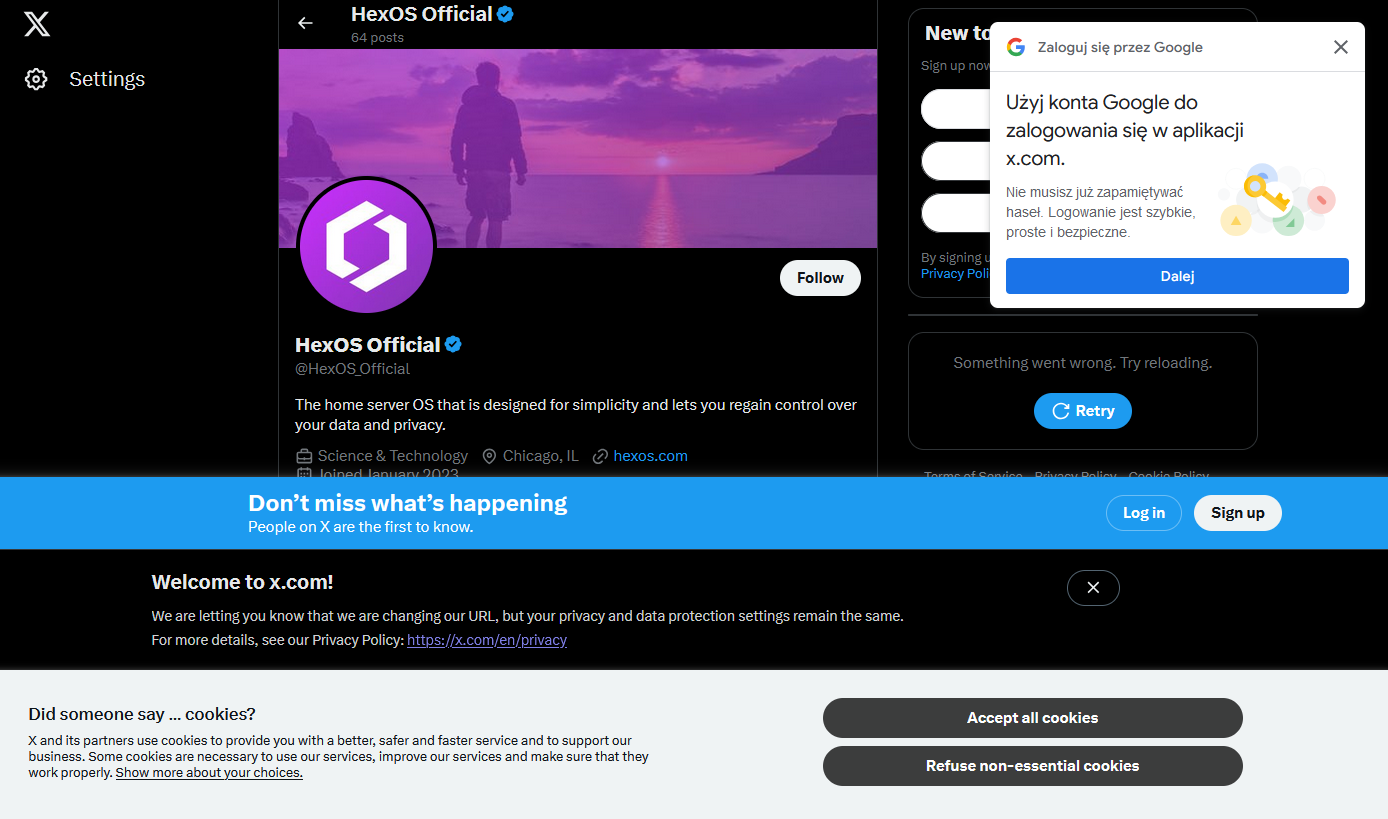
It'd be fun if the EU started policing any use of the phrase "We are required to show this dialog".
They're not. They choose to show that dialog so that they can try to apply commercial tracking cookies. Anything for website function is already covered by EU laws.
There have been a couple of changes to the rule since it came into effect. Originally, the pop up could effectively occlude the "Do Not Enable Cookies" button behind a maze of "Optional" settings. The end result was a big colorful "I Consent" button and a tiny little gear button with a thousand manual checkboxes to uncheck every time you visited the site.
The regulations were updated since. Now these annoying pop-ups at least tend to have a clearly defined "Yes, I Consent" / "No, I Do Not" at equal scale and opposite color, allowing you to bypass it without going into the weeds on a configuration screen.