301
this post was submitted on 29 Aug 2024
301 points (97.8% liked)
Data Is Beautiful
7097 readers
3 users here now
A place to share and discuss data visualizations. #dataviz
(under new moderation as of 2024-01, please let me know if there are any changes you want to see!)
founded 4 years ago
MODERATORS
you are viewing a single comment's thread
view the rest of the comments
view the rest of the comments
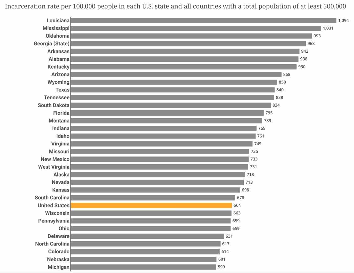
I don’t get this graph. So all of US has a smaller incarceration rate than just Louisiana? What?
Yes, look up what per capita means.
i have 4 boxes labeled A to D, and 10 rocks.
i put 1 rock in A, 2 in B, 3 in C and 4 in D.
i then paint 1 rock in B, 2 rocks in C and 1 rock in D.
then i put the boxes in a bigger box called the united boxes.
here's the rate of painted rocks:
Thats how averages work, unlike eg maximums.
But Im sure reversing that chart would correlate with math test scores.
The US average falls in the middle of the list of states, yes. This is a chart of per capita rates.
The entire US would have the average of all the states' incarceration rates.