228
you are viewing a single comment's thread
view the rest of the comments
view the rest of the comments
this post was submitted on 01 Sep 2024
228 points (96.0% liked)
Data is Beautiful
1079 readers
1 users here now
Be respectful
founded 3 months ago
MODERATORS
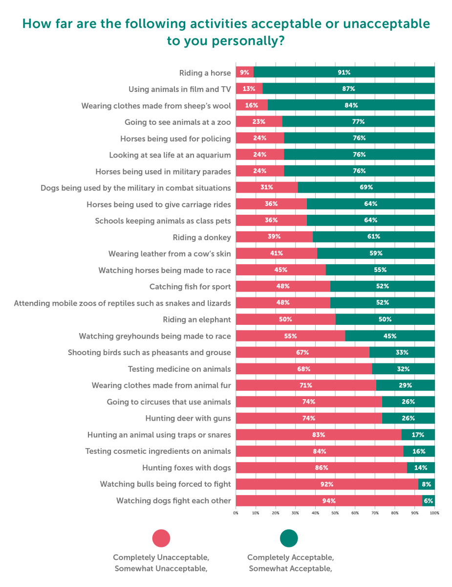
I don't like how they had four data points, but combined them into only two.
This kind of graphics is easily read with only two options.
Yes, but I didn't think having four options would greatly detract from it either. In fact, I'm very curious about the line between somewhat acceptable and completely acceptable. Like, how clear is that divide? Was there a neutral option between the two, or were they forced to choose for or against?