Bonus: the app is just an Electron wrapper to their website.
Memes
Rules:
- Be civil and nice.
- Try not to excessively repost, as a rule of thumb, wait at least 2 months to do it if you have to.
Ah yes enslaved chromium
Discord: I'm in danger
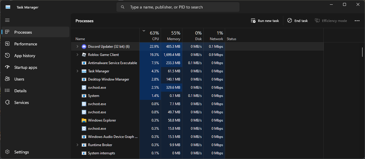
It literally takes 20% of the CPU of my i5-10400 randomly, and even 40%

The app
But the name is Discord Updater. Is the app using that name in the task manager?
Despite your platform having a common webview.
You linked to the particle
"It'S bEtTeR iN ThE aPp"
The app: Last updated January 2023
App permissions required:
- name
- address
- contacts
- financials
- life history
- kinks
- current relationship status
...Is the app trying to fuck me?
It's probably trying to get you to fuck yourself
I regularly use apps that haven't been updated for longer, and 20-year-old PC programs. The worse thing is if old versions are purposefully deprecated too early, I don't have Play Store.
This is fine for apps that don't use remote APIs and aren't actively having breaking changes made to them on a regular basis, but that doesn't apply to most of these nagging "use our app!" companies.
Side rant: I refuse to download the McDonald's app. That's the first question they ask (and increasingly, any fast food joint asks) when you roll through the drive through. "Are you using the app today?"
No I'm not fucking using the app today. I just want an ice cream cone. Ok!? I don't need or want to download another goddamned app and manage another set of credentials when it takes me less time to say, "Can I please have an ice cream cone?" And for you to respond with, "I'm sorry but our ice cream machine is broken." than it does for me to order a fucking ice cream cone on the stupid app.
I mean hells bells I'm a software engineer. I make my living designing [often unnecessary] software [which provides little tangible benefit]. But I'll be damned if I'm going to have an app to go through a fast food drive through or use household appliances. I will die on this hill. Ok, maybe not die, but I will be severely wounded on this hill.
My view as a sys admin is I'm not going to risk the security of my mobile device just so they can scour my personal information and collect marketing data on me and send it god knows where and claim its to "make ordering easier". I just want to order my fucking food, not have my fucking identity stolen because I wanted a cheeseburger.
Ironically, I find McDonald's has one of the better reward systems in their app. I also enjoy being able to punch in my order on a screen with any modifications I want such as extra pickle, no lettuce, etc.. instead of relying on the shitty speaker to pick it up only to hear a guy be like "Did you say cherry coke?" "No, diet coke" ugh
Also free fries on Friday.
My doctor’s office has done this to me when I’ve called in to get help with a prescription issue I was having. Literally just gave me instructions for how to message my doctor through the app. 🫠 Mfer I’m calling because I don’t want to use it! It sucks ass too because it always takes like a week to get a one sentence reply that only addresses half of what I asked.
Building a great mobile website is much harder than building a great mobile app, so I understand when they just don't build a great website to begin with, but taking away an existing website, yeah, that sucks.
You need one anyway for desktop users. A desktop-first website will usually be more accessible and easier to onboard, especially for infrequent users.
Example: To track a package, a certain store emailed me a button whose destination is this monster of a URL:
https://labia.page.link/?link=https://order.fart.cum/cz/history/%23/lookup?orderId%3D4206913372%26lid%3DAE91DCC0397DEADBEEF42069ACAB707BE6A1800B5ACEFAC3AAC3C14159265359&apn=com.labia.fart.app&afl=https://order.fart.cum/cz/cs/purchases/4206913372/?lid=AE91DCC0397DEADBEEF42069ACAB707BE6A1800B5ACEFAC3AAC3C14159265359&ibi=cum.labia.fart.app&ifl=https://order.fart.cum/cz/cs/purchases/4206913372/?lid=AE91DCC0397DEADBEEF42069ACAB707BE6A1800B5ACEFAC3AAC3C14159265359&ofl=https://order.fart.cum/cz/cs/purchases/4206913372/?lid=AE91DCC0397DEADBEEF42069ACAB707BE6A1800B5ACEFAC3AAC3C14159265359&imv=1.24.0&amv=2915
(Numbers and some strings were changed but the gist and 604-character length remains.)
The main function of such a long URL is to redirect desktop users to https://order.fart.cum/cz/cs/purchases/4206913372/ to see the tracking info while mobile users get directed to the app store to get an app (or view the link in the app if they have it). These are (probably) Google Firebase links and they're absolutely terrible. While they make life slightly easier for existing app users (saves one click but only if they go through the email), this implementation makes it way harder for others to reach the content. Either you get the app, log in there and part with fucking 300 MB of storage, or if you have no mainstream App Store, storage or time, you are forced to do a workaround: Desktop Mode (that may or may not work), rewriting the URL (difficult because it’s so long and includes https: several times, may require hex-decoding), or finding a computer. All this just to check one order from a store you’ll forget about next week.
I have demonstrated that instead of just getting sent the desktop-friendly URL (and perhaps seeing a floating “Open in app” button at the destination), most users are put through extra nuisance that took effort to implement. Sure, some customers are frequent enough to use the app while most are happy with a website but once the business invests in the app, they will absolutely make sure everyone is pushed there despite it being less convenient for both parties.
extra nuisance that took effort to implement
I think this point needs to be stressed more. It is dead simple to write a website that works well on mobile phones. In fact, the first ever website, without CSS, without any JS, without fancy HTML5 features, is mobile friendly: http://info.cern.ch/hypertext/WWW/TheProject.html
It’s only when you start adding useless bells and whistles like floating shit in from left and right, tons of animations, side-by-side displays, overlays and whatnot that you need to start being competent to make it work on mobile.
(Numbers and some strings were changed but the gist and 604-character length remains.)
Sooooo... were "labia.fart.cum" parts that were changed, or...??
Sure, go to labia.fart.cum. But you’ll only get the full Fart.cum^®^ experience with the Fart Labia™ app!
Building a great mobile website is much harder than building a great mobile app
Are you a web developer and an equally good app developer to make such a statement?
Yes.
I have doubts. Great website developers often make a half-assed app by wrapping the website in a crippled browser. The T-Mobile app is not even subtle about this, there was a URL bar in the version I last used.
If all I did was inspire Lemmy meme community to make stock photo memes, I'm happy
If you download the app anyway, make sure that the first thing you do is to disable the notifications. Many apps have that as their sole purpose.
Thankfully there aren't as many great mobile webpages left anymore that I would really care about if they made me use their app. Pre-Edit: I think thankfully is the wrong word.
Still, it’s storage and heckin' executables on your device. Everyone should get an option to use a website, even if just a poorly laid-out one, unless the vast majority of users only interact in a way that only works with local executables (like video calls). You should not need an app to check an IKEA order status on your phone (yes, they do that, see my other comment).
And I'm aware that video calls on some platforms can - and do - work in browsers but I won't blame anyone who rejects their boss's proposal to create a video call app in HTML/CSS/JS.
Most of us would probably just be fine with PWAs, but the marketing branch says no... They need everything possible about you, need the app to run at startup and send you notifications at least every 4 hours...
Amazon
Ebay Kleinanzeigen
Splitwise
Idk Amazon web works fine, I usually use the app but I don't remember having issues with the web.
I am the head of a large banking app / web in Europe. We have about 40 MiO logins per month, 39 (edit: millions) are done with the app.
Personally I would prefer the web version of everything important like banking always - but the customers are all preferring apps. So yea guess where I allocate my budget.
It sucks but that's how people operate these days
39 out of 40 000 000? That's not a lot of app users.
;) millions .. 39 millions ;)
I blame the Lemmy app of my choice for my typing shortcomings
Dont worry, the Lemmy website is better (unlike your bank's)
App takes up 300 mb despite being clearly just the mobile site wrapped in a webview.
For me the hierarchy goes something like this: Floss native app (dt & mobile) > floss electron app (dt & mobile) > website > non-floss app
