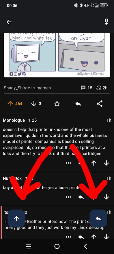
I like the animation when I open a post and the buttons slide around, but I dislike that they persistently cover comments. Plus, the reply button is totally redundant when viewing a post so it's just wasted space.
Thunder App
An open-source, cross-platform Lemmy client for iOS and Android.
This community is intended to discuss features and feature suggestions for Thunder; as well as friendly, respectful talks about Lemmy in general.
Please use the GitHub repository linked below to submit bug reports, so keeping track of them is easier, and make sure to search first if you already can find an issue for your report.
If there are any developers who would like to contribute, feel free to reach out on GitHub!
General Links
Website: Link
GitHub Repository: Link
Matrix Space: Link
Android Releases
IzzyOnDroid: Link
Google Play: Link
iOS Releases
Apple App Store: Link
TestFlight Beta: Link
Related Communities
Nightly Community: Link
Mentioned this in another comment, but this will be addressed in the future! Functionality is being worked on to reduce or remove Floating Action Buttons from where they're currently used, and getting down to no more than one per page is in the works :) you can follow progress on this on the GitHub page if you're so inclined!
New nightly release from today has options for removing floating buttons from the feed and also from post views :)
Nice, thanks for the heads-up!
