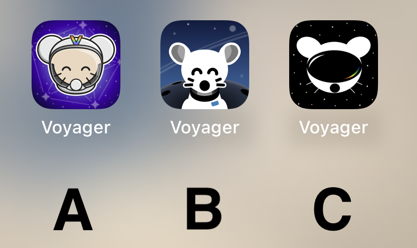
C is my favorite, however, I have grown fond of the original icon, will we be able to choose? Thanks for all you do! Voyager is the BOMB!
Voyager
The official lemmy community for Voyager, an open source, mobile-first client for lemmy.
Rules
- Be nice.
- lemmy.world instance policy
Sponsor development! 👇
💙
B
B by a large margin.
B!! :D
Current icon
It’s really cool to have such talent in this community to go along with such an amazing app. The 3 finalists are really good. I don’t usually use dark icons but I love C so much. I hope to see variations of it as the app grows. Congratulations to all who made it to the top 3! That in itself is an accomplishment. I can’t wait to see the results of the final! This community is awesome!
I like the idea of A, but as a Designer, B’s execution is way better and cleaner. Cohesive style, and very fitting for iOS. Sad that A is too cartoony. C is weird, the mouse is flat, and the “visor” (that looks like a huge mouth) is very detailed… don’t like it.
So, B, definitely.
B my lord
C mouse with A background please
B. A is also good. Don't like C at all.
All are very good, but B takes the cake for me personally.
Definitely B
Voted C. It's by far the most robust option. It looks stylish, professional, and could easily accommodate a flat, 1-color design.
C looks like Daft Punk mouse
B
C
C
🅱️
I like the background of B the best. But it looks more like a dog and it's throwing me off. I like the character of the first one better, especially with the V on the helmet.
So I think I'm voting for A
B
Initially I liked the background on A and the lemmy on B....
....but I think C has my vote just for the sheer symbolism it projects - a confident lemmy ready to boldly venture into the future fediverse.
A looks like something an elementary school aged kid would have on their iPad for help learning to add.
B's got my vote.
C
I will be happy with either b or c
I like B the best.
Really like A! Good job to all participants though!
I’m just here to say: CHARGE YOUR PHONE!
Also, C A B is my ordered preference.
i vote for B cuz i think it's the cutest 🐭
I liked C best at first glance, but after looking at the screenshots my choice is A.
C
B with the helmet of A (minus the “V”)
I can't decide between A and C... I am gonna go for C I guess.
BTW can we have different icons like Apollo had?
B, good middle ground of clean design yet still has personality
C
I prefer what we already have but if we have to change then go with A


