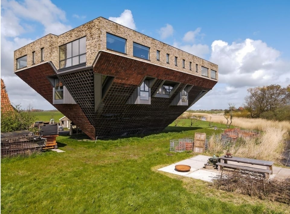
This is not a terrible photo... It's intentionally strange architecture.
I think the up votes this post has are all from people who haven't noticed the name of the community 😅
Per the sidebar, terrible photos are one of several reasons for something to be “bad real estate”. Another reason is terrible property and layout. While the architecture is interesting, it looks awful to live in to me.
I stand corrected 😅
I think I have Reddit PTSD. I saw you replied and thought “oh god, they’re going to say something rude/hateful/etc.”
Nope, it’s a polite, human response. Thanks! Have a good one!
I agree. In my opinion it fits "weird layout", second bulletpoint in the sidebar.
In German we have a word for this sort of things „Kopfkino“ - literally translated it’s head movie. It means if you think it’s funny, a good idea, a strong concept but in real life it’s just ridiculously stupid. Too much thinking behind it. You are stuck in your minds movie.
This is how you take a 1/16th acre property and turn it into a 1/4 acre property.
Fuck floorspace, all my homies hate floorspace
I would say, have fun with the flat roof that's going to be prone to leaking but if you can afford to build that stupid thing you're not going to be worried about that.
It's pretty impressive, I'm interested in how the low levels are layed out.
It's divided into apartments. The pictures in the listing are from the apartment for sale on the first floor. The ground floor seems to be just entrance and staircase.
I would love this for a tree house or something. Something where practicality isn't needed
Wonder how this thing holds up against strong winds
Reading the description it's a fully steel framed building. It'll hold up just fine.
My favourite part is how there's so many walls and objects clipping into each other, the bed clipping into the slanted wall is great.
The Feng shui in that bedroom is awful awful awful
How do you get in? I don't see a door anywhere lol
I'm assuming that the building is asymmetrical and appears more conventional from the other side, as it would seem to need to to have proper support, so probably on that side
Hey, I played on this Teardown map!
I like it lol
"dinnerbone"
Terrible Estate Agent Photos
Terrible photos listed by estate agents/realtors that are so bad they’re funny.
Posting guidelines.
Posts in this community must be of property (inside or out) listed for sale which contains a terrible element. “Terrible” can refer to:
-
the photo itself (finger over the lens, too far away, people in the shot, bad Photoshop, etc.)
-
the property (weird layout, questionable plumbing, unsound structure, etc.)
-
the interior (carpeted bathrooms, awful taste interiors, weird mannequins/taxidermies/art, inflatable pools indoors, etc.)
-
the actual listing itself including unusual descriptions and unrealistic pricing. However, this isn’t a community to discuss the housing market in general. This is a comedic community - let’s keep it light.
-
Photos can be sourced from anywhere and be any age, but please check they haven’t already been posted.
-
Censor any names/contact details of private individuals.
-
Mark the post NSFW if it includes nudity or sensitive content
Rules.
This community follows the rules of the feddit.uk instance and the lemmy.org code of conduct. I’ve summarised them here:
- Be civil, remember the human.
- No insulting or harassing other members. That includes name-calling.
- Respect differences of opinion. Civil discussion/debate is fine, arguing is not. Criticise ideas, not people.
- Keep unrequested/unstructured critique to a minimum.
- Remember we have all chosen to be here voluntarily. Respect the spent time and effort people have spent creating posts in order to share something they find amusing with you.
- Swearing in general is fine, swearing to insult another commenter isn’t.
- No racism, sexism, homophobia, transphobia, xenophobia or any other type of bigotry.
- No incitement of violence or promotion of violent ideologies.
