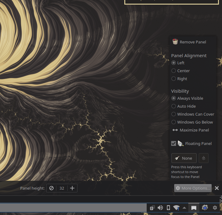
Ohh. That is really pretty. How did you achieve the floating bottom bar?
Unixporn
Unixporn
Submit screenshots of all your *NIX desktops, themes, and nifty configurations, or submit anything else that will make themers happy. Maybe a server running on an Amiga, or a Thinkpad signed by Bjarne Stroustrup? Show the world how pretty your computer can be!
Rules
- Post On-Topic
- No Defaults
- Busy Screenshots
- Use High-Quality Images
- Include a Details Comment
- No NSFW
- No Racism or use of racist terms
That is really pretty. Thank you.
How did you achieve the floating bottom bar?
If you edit the bottom bar, under more options you can enable "Floating panel" to achieve this effect.

Love it!
Nice wallpaper! Could you share a link for it?

Of course! This is the original one. I used Photopea for it to meet my mood.
I love everything I see here. Wallpaper, blur, the bg. How do you like zsh? Been on fish now for a year or so and have been curious of zsh
I am not really into shells, so my experience is very novice when it comes to shell scripting, but I'll let you know that I went from bash to zsh, and then I also tried fish but went back to zsh because I felt that it was superior. Generally I find zsh to be little easier than Bash, but bash isn't bad in itself too. I disliked having to learn new syntax for basic shell scripting for fish the most I think.
Looking good!
I don't think i've ever heard of crystal linux before. Nice rice btw.
I think it was started mainly to have a working example of the cool GTK installer they created (Jade), I wonder what is its main selling point as a distro now though
I wonder what is its main selling point as a distro now though
I wanted to experience Arch and wanted something simple and quick (I was busy those days, so DIY Arch wasn't a choice). I tried EndeavourOS, but it wasn't simple, they make many configurations to the system which ruined the vanilla experience of all the WMs and DEs. I started looking for alternatives, I found Crystal to be attractive and well-maintained, so I went for it. I think it's selling point is being simple and as friendly and vanilla as possible.
What is that krunner like thing ? And themes ?
The project is called rofi and I am not sure what you meant by "themes".
What is that krunner like thing ? And themes ?
Looking good, and the color scheme is eye friendly for me.
