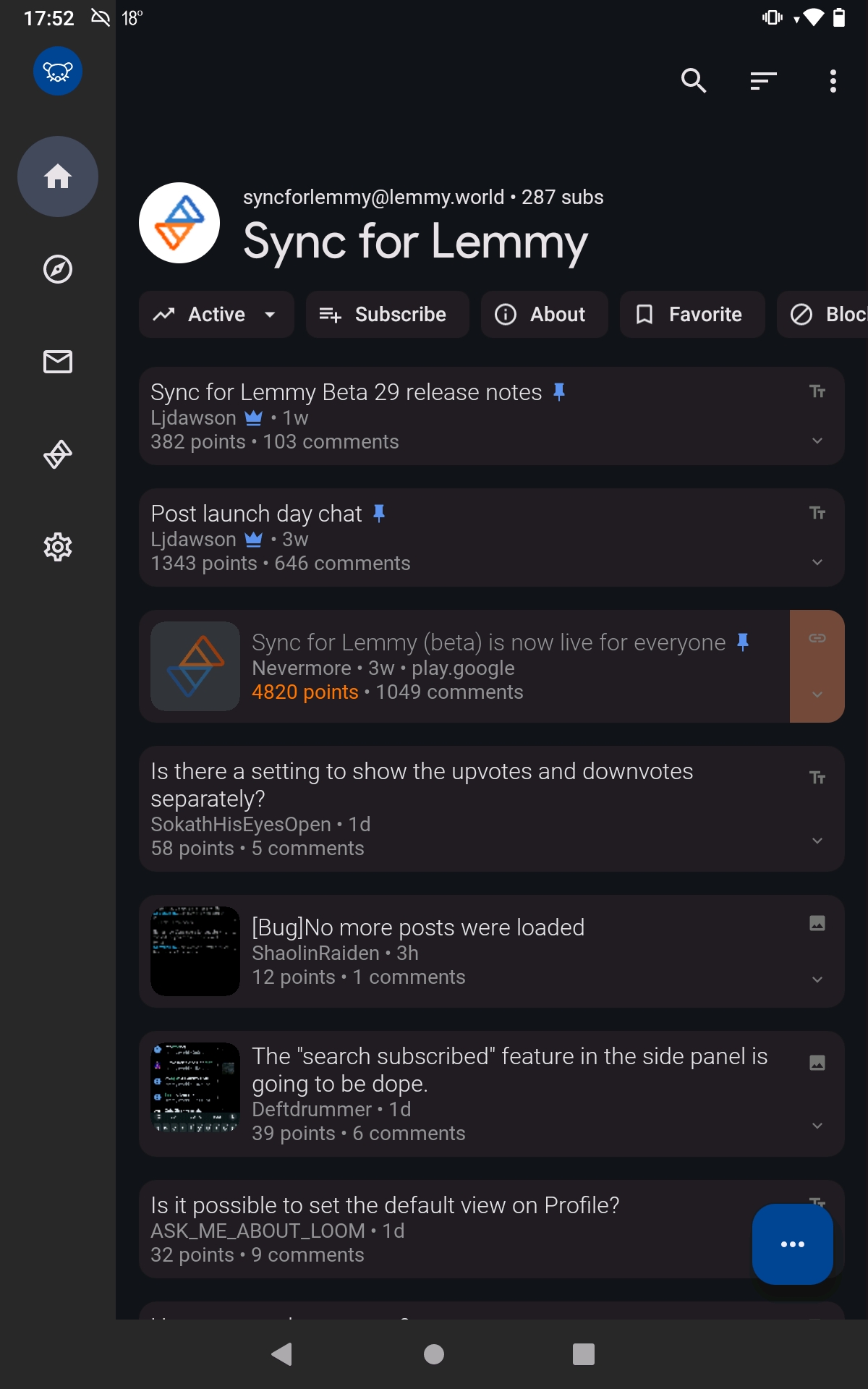
I didn't like it either. Luckily you can disable it in settings; Settings shortcut: General > Expanded Toolbar
Oh! Problem solved, thanks!
IIRC that space is a standard design attribute of Android's "Material You"
Previously on Sync, that space was used for subreddit banners, but I'm not sure if many Lemmy communities use a banner.
Designers, smh. Gimme a tiling Lemmy manager with maximum efficiency via keyboard only bindings.
You carry a keyboard everywhere you take your phone?
I thought the sarcasm would be obvious but I guess not.
It's the internet. sarcasm can get lost easily and I'd wager, lemmy has a higher percentage of autistic people than the average population. I mean I didn't catch it as sarcasm.
So you can reach the top one-handed
Why ... are you using lemmy... one-handed? ( ͡° ͜ʖ ͡°)
I see we really did bring the Reddit jokes to Lemmy
I see we also brought the reddit superiority complex.
Lenny face on lemmy. Heh.
A bit of space is nice sometimes, especially around titles
That's a lot more than "a bit," and spacing above titles only really makes sense when there's content above it. This just suffocates the space available for the scrollable content.
All part of material design

One of my favorite things about the app is how it always conforms so perfectly to whatever Google's design guidelines are at the time. Makes it feel coherent, like it really belongs on the phone.
IMO it's a non-problem, because it's not permanent, it dissapears if you start scrolling and enables you to reach it with your thumb
Sync for Lemmy
👀
Welcome to Sync for Lemmy!

Welcome to the official Sync for Lemmy community.
The rules for posting and commenting, besides the rules defined here for lemmy.world, are as follows:
Community Rules
1- No advertising or spam.
All types of advertising and spam are restricted in this community.
Community Credits
Artwork and community banner by: @MargotRobbie@lemmy.world
