4
submitted 2 years ago* (last edited 2 years ago) by Zeus@lemm.ee to c/imaginarystarships@lemmy.world

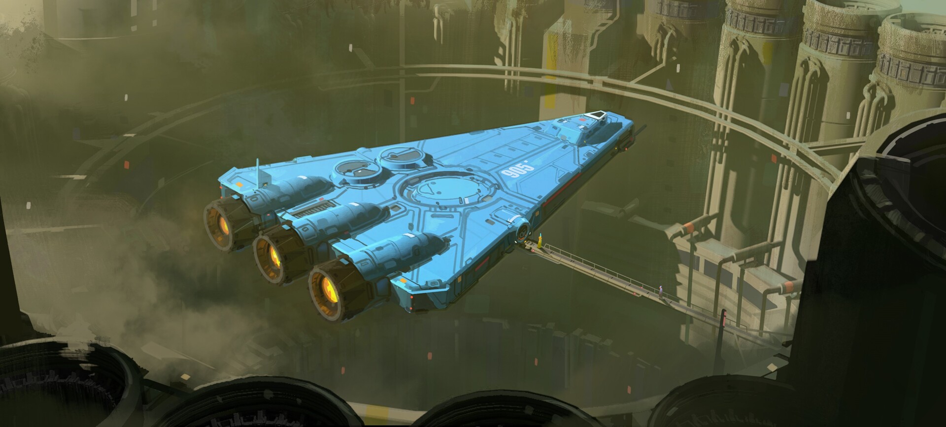
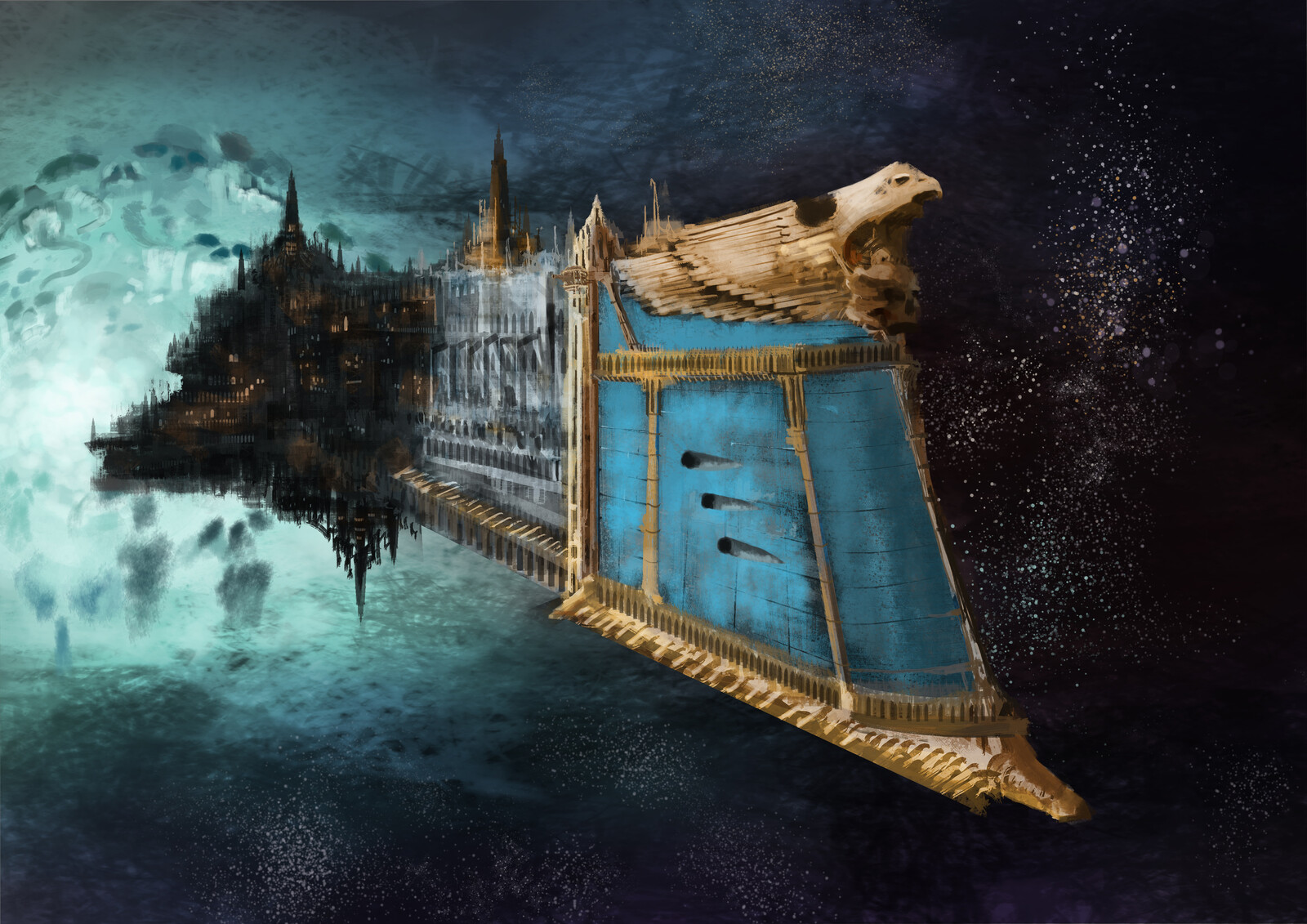
such a nice shade of blue. i like ships that have a bit more of an interesting palette than silver or white (like the freighters in ftl)

artstation site || artstation page || instagram source

artist's artstation site || artstation page || artstation rss feed

transcript

a flat blue triangular ship with three rear booster engines hovers above a round hole in the earth surrounded by pumping stations. it is attached to a long gantry, across which walk two people

[-] Zeus@lemm.ee 14 points 2 years ago

the ! is the prefix to make an autolink on lemmy

think r/ on reddit, or # on mastodon (sort of)

2
[-] Zeus@lemm.ee 17 points 2 years ago

holy hell this is massive

thank you for your work db0

[-] Zeus@lemm.ee 17 points 2 years ago

the same way that removing a headphone jack is courageous, i guess

3

detail view

something a bit more conventional, i think

Practice between assignments

source || artstation site || artstation page

32
submitted 2 years ago* (last edited 2 years ago) by Zeus@lemm.ee to c/newcommunities@lemmy.world

i haven't wanted to spam this place with every "imaginary" lemmysphere; but this will be for announcements related to said "federated network of imaginary communities" - a grandiose name for various "themed art" communities. new imaginary communities will be posted there, as well.

!imaginarydirectory@lemm.ee
markdown link

there are also some other imaginary communities that haven't been posted here (for the same reason), so i'm collecting them all into this post

3
submitted 2 years ago* (last edited 2 years ago) by Zeus@lemm.ee to c/imaginarystarships@lemmy.world

i love these giant starships within the atmosphere evidencing how large they are

used as the cover of a.e. van vogt's "the secret galactics" and justin leiber's "beyond humanity"; as well as various others

(image source)

4
"Armada" by Kentaro Kameda (cdna.artstation.com)

artstation site || artstation page

is this technically a starship? i'm not sure. but it calls itself one, and i like it; so i'm posting it

[-] Zeus@lemm.ee 14 points 2 years ago* (last edited 2 years ago)

filter overlays reduce contrast, and wash out colours darker than the filter colour - quick mock-up:

colour tester image with normal and multiply blend mode orange overlays

(notice how dark greys and black are actually brighter than without the filter)


in answer to the original question, op, i'm not sure there is one. i don't think android allows changing display properties such as temperature without root unfortunately

2
submitted 2 years ago* (last edited 2 years ago) by Zeus@lemm.ee to c/imaginarystarships@lemmy.world
2
111
submitted 2 years ago* (last edited 2 years ago) by Zeus@lemm.ee to c/lemmyapps@lemmy.world

cross-posted from: https://lemmy.toldi.eu/post/86113

edit: i'm not the dev. i just like the app, and am just posting it here for exposure

Hello everyone!

I've finally released Eternity on the google play store. Note that this is not compatible with the existing releases as this build has a different signature.

Thanks for your support and looking forward to your feedback!

6
Powerful by David Revoy (cdna.artstation.com)
submitted 2 years ago* (last edited 2 years ago) by Zeus@lemm.ee to c/imaginarywitches@lemmy.dbzer0.com

source || artstation site || artstation page

now, i'm not entirely sure that's supposed to be a portal; but it looks like one and this is such a cute concept i just had to post it

artist's website || artwork site[^1] || youtube?

[^1]: there's several more in a similar style here

4
Colony No. 8 by Ming Yee Sheh (cdna.artstation.com)

Hummm.... As SpaceX said, there's only 6 months left to colonize Mars, by then we all known Elon Musk will declare independence and wage war to all mankind. Luckily Japan is building the first Gundam recently, I guess there's always hope in the dark

artstation site || artstation page

[-] Zeus@lemm.ee 15 points 2 years ago

ah, but[^1] if you donate a kidney you go to the top of the queue

you're losing one when you don't need one, and receiving one when you do

insurance salesman here[^2], just in case that might have gibt unnoticed

[^1]: to the best of my knowledge

[^2]: obviously not

2
"SW" by Yuri Hill (cdnb.artstation.com)

i imagine i can guess what "sw" stands for. i wonder if it's a ploy to avoid disney's lawyers?

artstation site artstation page

[-] Zeus@lemm.ee 15 points 2 years ago

well actually, i did recently make a backup acct. on lemmy.dbzer0.com...

[-] Zeus@lemm.ee 14 points 2 years ago* (last edited 2 years ago)

this seems like something best solved with a bookmarklet

let me see if i can knock one up quickly


okay, i got a bit distracted, sorry it took so long

javascript:(function() {window.location="https://duckduckgo.com/?"+window.location.toString().match(/q=.*?(\&|$)/g);})()

alternative code block

javascript:(function() {window.location="https://duckduckgo.com/?"+window.location.toString().match(/q=.*?(\&|$)/g);})()

just drag that into your bookmarks bar, then click it when you're on a google search page (please message me with any questions or bugs, i wrote this in five minutes with an online regex tester)

also, thank you for this post - i'd never thought of doing this, but it's a good idea


edit 2: okay, lemmy-ui currently has a bug with ampersands. please replace & in the script with just an "&"

[-] Zeus@lemm.ee 16 points 2 years ago* (last edited 2 years ago)

get well soon!

[-] Zeus@lemm.ee 17 points 2 years ago* (last edited 2 years ago)

i hated material ew as soon as it was announced. so much padding everywhere, and so little contrast - to paraphrase the incredibles: if everything's orange^[other colours are available, i just like orange], nothing is. your eyes will adjust to it. i want actionable items to stand out, not be a slightly lighter shade of the same colour. it also looks rather like a fischer-price my first phone interface

i must say, if an app (for example, jerboa) uses material 3, i usually try to look for an alternative


some examples:

with material design, it's clear what's a header, what's a footer,^[look at the lack of contrast on that "new post" button] and what each button's state is.

with all the padding, there's also less space; leading to less functionality

with material ew, it's much harder to tell at a glance what each app is, one has to scrutinise the icon rather than just tell at a glance by colour

i also really dislike monet; the way it pulls this horrible washed out sickly pastel colour from a wallpaper and washes it over the entire app. if i just pulled one accent colour, and applied that to, say, the header and main action button, i'd like it a lot more


original comment
another thread in the same post

[-] Zeus@lemm.ee 19 points 2 years ago* (last edited 2 years ago)

i don't hate webp. i think png is better, but i think webp is fine

but i really don't want google to have more control over how i browse the internet.^[especially given how they've recently shown that they will abuse their monopoly] let's maybe use an image format that isn't owned by them, perhaps

[-] Zeus@lemm.ee 18 points 2 years ago* (last edited 2 years ago)

i don't think there can be. tumblr's draw isn't any features it has (apart from maybe homepage customisation, but you get that with a website) it's the features it lacks (algorithms, etc). and it's the community, which was curated by a lot of coincidences at the right time.

you'd need to get everyone to up and move at once, with the ability to reblog posts from old tumblr. i think it's unreplicatable

[-] Zeus@lemm.ee 17 points 2 years ago

the qt one is much better. on kde i can use a portal to make gtk apps use it; i don't know if there's a way to do that on cinnamon, but it may be worth looking into

view more: ‹ prev next ›

Zeus

0 post score
0 comment score
joined 2 years ago
MODERATOR OF