slin

joined 1 year ago
[–] slin@feddit.de 3 points 5 months ago

They also released Gameboy and DS and 3DS, where did they flop?

[–] slin@feddit.de 30 points 6 months ago

What? The "land of the free"? Whoever told you that is your enemy

[–] slin@feddit.de 1 points 6 months ago (1 children)

What are the conditions on Xbox? Shouldn’t it be easier to port from Windows to Xbox, they have this ID@Xbox indie program, I don’t know much about it.

[–] slin@feddit.de 1 points 6 months ago (3 children)

I love Stanley Parable, I played the original when it released on PC but switched to console gaming since then, where I played the Ultra Deluxe.

Is a console release planned for your game?

[–] slin@feddit.de 4 points 6 months ago (1 children)

The update reset my post and comment widgets to the default, was that intentional?

[–] slin@feddit.de 69 points 7 months ago* (last edited 7 months ago) (2 children)

this is a Safari message to disable its advanced filtering protection, which can slow down sites.

The developer of StopTheMadness suggests to disable it completely in Safari settings:

https://lapcatsoftware.com/articles/2023/10/7.html

[–] slin@feddit.de 4 points 8 months ago (1 children)

The Xbox, Xbox 360, Xbox One X and Xbox Series X were the best console hardware I ever owned, so please Microsoft don’t stop making great Xbox consoles.

[–] slin@feddit.de 4 points 8 months ago

I still hope they do another 2D RPG.

[–] slin@feddit.de 2 points 8 months ago* (last edited 8 months ago) (1 children)

Arctic was released on the AppStore and the TestFlight gets weekly updates and it’s really great.

Memmy, Avelon and Bean seem to have been abandoned.

[–] slin@feddit.de 3 points 9 months ago
[–] slin@feddit.de 4 points 9 months ago* (last edited 9 months ago) (1 children)

I am a media designer, but not a specialized artist or illustrator. However, I could try to create an icon, even if it does not end up being used.

[–] slin@feddit.de 11 points 9 months ago (1 children)

Rocket League

1
submitted 10 months ago* (last edited 10 months ago) by slin@feddit.de to c/arctic@lemmy.world
 

Thanks for the recent 0.3 update!

This app is awesome and I want to support it, but I can’t use buymeacoffee because I don’t have a credit card.

Also curious when there will be an official AppStore release, since this app is pretty solid.

The only thing missing for me personally that I can think of are really minor customization options (like hiding voting arrows in feed/post view since I use gestures or the ability to collapse posts. Like the stuff we got used to by using Apollo.), but else Arctic rocks and I really love the smoothness and polished design.


cross-posted from: https://lemmy.world/post/8708556

Arctic v0.2.7 is out

Arctic v0.2.7 is out on TestFlight. This update is focused on backend optimization and push notification features.

Community Notifications

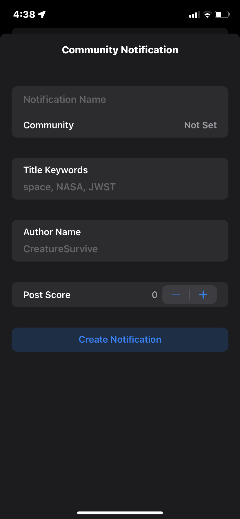
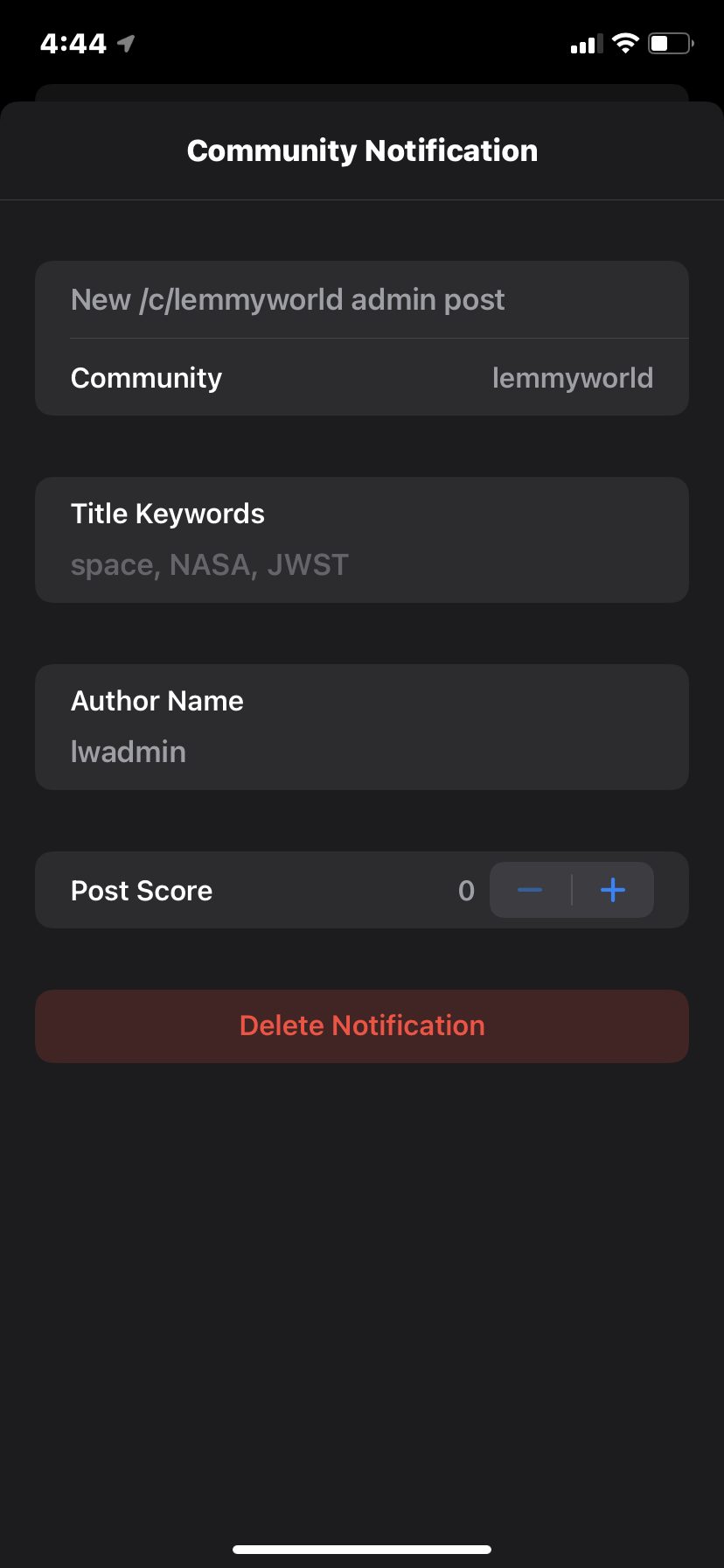
You can now setup notifications for individual communities. Notifications can by filtered by post keywords, post author, and post score. In the coming releases I will add support for more filtering options. To list a few, filter by phrase rather than keyword, upvote/downvote rather than just score, multiple authors, comment count, pinned(stickied) posts, etc. I’ll also be adding support for temporary notifications,community notifications that will automatically expire after a set amount of time.

Account Notification Options

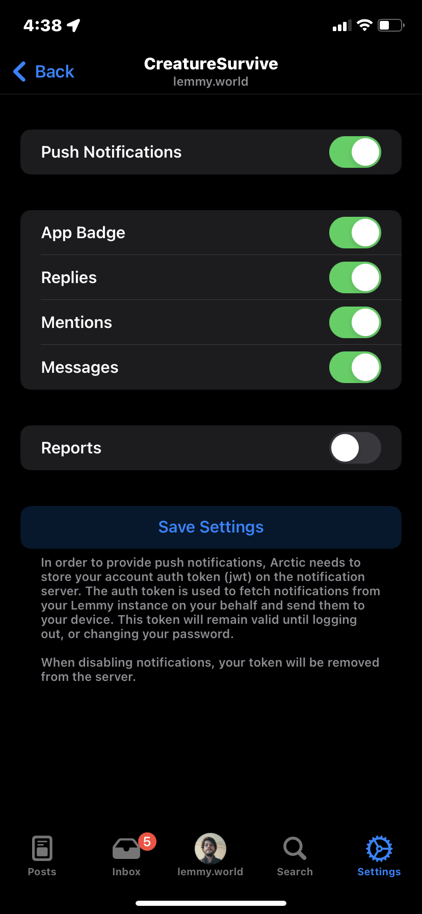
Account notifications can now be toggled by type, you can toggle notifications for: badges, replies, mentions, and messages. This also adds support for mods/admins. You can enable mod notifications for new post/comment reports, and admin notifications for new user registration applications. note that user application cannot currently be viewed within Arctic.

Community Jump

You can now tap the title in any posts feed and quickly jump to a different community using the community selector.

Backend Improvements

Arctics Lemmy API wrapper has now been extracted into a swift package (Swimmy) for improved maintainability and so it can be utilized as a shared code base for Arctics Push Notification server. In doing so, I also added support for Combine allowing for improved error handling with the API.

Arctics Server

I’ve migrated Arctics notification server to a new hosting provider. With the new provider, I may be able to offer all notification options as a free service provided I can sustain off of small donations. This would be ideal, as I never wanted to paywall any features in Arctic. I’ve also setup getarctic.app a new home for Arctic. The website is quite barebones at the moment, but I will be updating it as my time allows.

As always, thank you to everyone for helping test Arctic, and providing feedback. I know new features have slowed in the last few releases. Going forward I’ll be working on polishing the current feature set in hopes of an AppStore release in the next couple of weeks.

v0.2.7 full change-log

  • Added Community Notifications
    • Setup notifications for any community
    • Configure filtering options (author, keywords, score, more filters coming soon)
    • Add unlimited watchers
  • Added support for granular account notification options
    • Badges (Application notification badge)
    • Replies (Comment and Post replies)
    • Mentions (User mentions)
    • Reports (Moderator reports)
    • Applications (Admin user registration applications) (Arctic does not currently support showing applications in the app)
  • Updated the community selector to default to subscribed communities
  • Added typing suggestions when searching communities in the community selector
  • Added support for displaying thumbnails in push notifications
  • Added support for stripping markdown elements in push notifications
  • Added community jump to the Posts Feed, tap the title in the navigation bar to quickly jump between communities
  • Added Changelog to settings
  • Migrated API backend to a package (Swimmy) shared between Arctic and Arctic's push notification server
  • Fixed issue on iOS 15 where the Post feed search bar could overlap elements of the navigation bar**

Links

Previews:
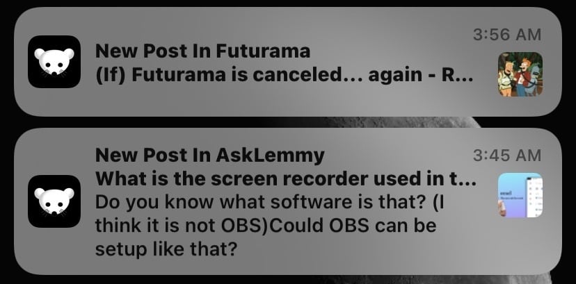
Notifications Preview Notification Settings Account Notification Settings Community Notification Settings Community Notification Settings


Thanks for the enhanced search tab, but I noticed that you can not search inside a community or am I missing something?


The info widget looks a bit out of place when it is moved to the left or right side, since its icons are always center-aligned.

Could you implement that the info widget icons are automatically left-aligned when the info widget is moved to the left side, and right-aligned when it is moved to the right side?

Or a manual way to chose their alignment.

 
7
Feature requests (feddit.de)
submitted 1 year ago* (last edited 1 year ago) by slin@feddit.de to c/mlemapp@lemmy.ml
 
  • grey text (easier on the eyes, especially in night mode at night); like post preview text in feed
  • full height posts without post preview (headline view is too small)
  • compact posts setting for general post view/display; similar to compact comments (community and user name only 1 line instead of 2, smaller avatar image, …)
  • mark as read on scroll/open
  • remember settings (post view size, show/hide read) per community

Thanks for all your work, these are just a few suggestions.

41
submitted 1 year ago* (last edited 1 year ago) by slin@feddit.de to c/mlemapp@lemmy.ml
 

The recent update re-arranged the buttons and put the comment/post time in the center of the view, which is a bit distracting/unbalanced IMO.

I re-arranged the buttons and made them in a darker grey than pure white (comment text), so the comment text is more in focus. I also removed the clock-icon as it is unnecessary IMO (it adds no value since the time is already clearly visible).

I would personally remove the buttons entirely and just keep the vote count and time at the top bar, but I can see that not everyone is a fan of minimalism UI. Maybe we can get that as an optional compact comment view.

(This is just a mockup, I am a designer but not a dev. I also submitted this via TestFlight feedback.)

2
submitted 1 year ago* (last edited 1 year ago) by slin@feddit.de to c/mlemapp@lemmy.ml
 

Thanks for all your work with the new update!

I currently have “show community icons” disabled, but they are shown in my feed, but don’t shown in the compact view at all no matter what I select.

Will you add/update customizable settings in the app and add new ones in the future? The new update made the UI a bit busy for me with all the colours and buttons, it would be awesome to be able toggle UI elements like in the first version of the app, eg disable the big voting buttons (only colour the counter).

I would also suggest moving the comment counter next to the voting counter instead of next to the comment time and moving the buttons (share, save, …) behind the ellipsis button, like Apollo.

The current comment view feels a bit overloaded but compressed compared to the previous view, where you had one section for comment text and one section for the meta (account name, voting, time, …). That moves the focus from the actual comment text to all the meta and buttons. Now you have a section with username and time, a section with comment text and another section with comment meta buttons; compared to the previous minimalistic approach of Mlem.

view more: next ›