this post was submitted on 01 Nov 2024
317 points (98.5% liked)
Data Is Beautiful
8473 readers
1 users here now
A place to share and discuss data visualizations. #dataviz
founded 4 years ago
MODERATORS
you are viewing a single comment's thread
view the rest of the comments
view the rest of the comments


Apart from a couple of countries, the percentages are small. The graph is distorted as it's not showing the full 100%
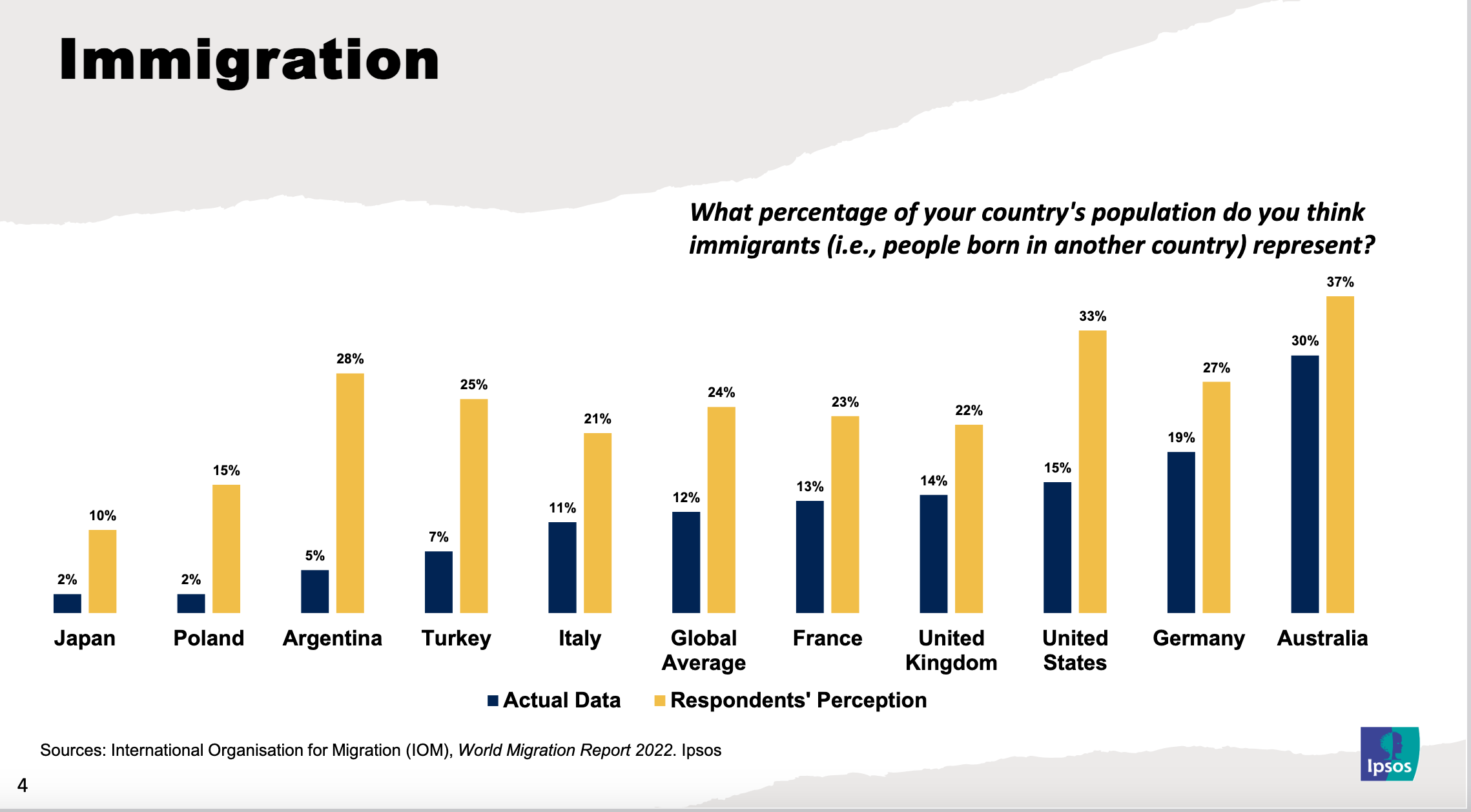
Looks like most people, in most countries, are pretty close to accurate.
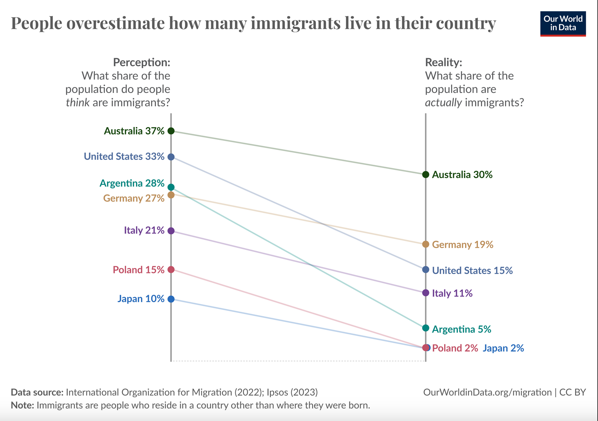
Alternative view (directly from the source):
IMO being off by around 10% or more is still quite the leap.
Poland's perception being off by 7x is pretty wild.
10% off isn't bad for a casual onlooker at their community. That's 90% accurate.
Right, but those estimates aren't 10% off, but closer to at least 10 percentage points off – percent and percentage points are not the same thing.
Even Australia is ~23% off, and eg. Germany is 42% off, the US is 120% off, UK is 57% off, and eg. Poland is a whopping 650% off
People don't give precise percentages though when surveyed. They might round to typical fractions like 1/4, 1/3, or they might round to 10 or 20 percent.
Nobody is saying "hmm, I estimate that it would be approximately 37 percent".
Of course the wisdom of the crowd does wonders for smoothing those coarse estimates, but still, if the crowd is +/- 10 of the real percentage value, I'd say they're pretty much on the money.
Anyway, Poland, wtf.
Oh yes absolutely, people would definitely just "eyeball" their estimate and the percentages we see in the graphs are population (well, sample) level averages, but I'd still say that the differences between these average estimates and actual reality are by and large much worse that "on the money". To illustrate, if the estimate for some country was eg. 30% and the real proportion 40%, the relative error – off by a factor of 1.33 – would be smaller than if the estimate is 12% and the real value 2% – off by a factor of 6 – even though both have a 10 point error.
So eg Poles' and Argentinians' estimates are both 12 percentage points off, but because Poland's immigrant population is smaller that means that they overestimated its real size by 650% and so their estimate was 7.5x higher, but Argentinians were "only" off by 460% / 5.6x. 'Strayans were off by 7 points, but their relative error was only around 23%, which is still almost a 1/4 error and their estimate looks like it was the best out of these. The average global error was 100%, so on average people think there's 2x as many immigrants as there actually are, and characterizing that as "pretty much on the money" is, well, maybe a bit generous
Depends, yer example presupposes 100%
However, being off by adding an extra 10%, when the immigrant population is around 10%, makes it 50% accurate, at best
Yeah as much as I love to call people out for their racist bullshit, the results are surprisingly close to the mark. I was expecting the gap to be much wider. At least for the English speaking countries.