this post was submitted on 23 Nov 2024
528 points (94.4% liked)
Comic Strips
12753 readers
4117 users here now
Comic Strips is a community for those who love comic stories.
The rules are simple:
- The post can be a single image, an image gallery, or a link to a specific comic hosted on another site (the author's website, for instance).
- The comic must be a complete story.
- If it is an external link, it must be to a specific story, not to the root of the site.
- You may post comics from others or your own.
- If you are posting a comic of your own, a maximum of one per week is allowed (I know, your comics are great, but this rule helps avoid spam).
- The comic can be in any language, but if it's not in English, OP must include an English translation in the post's 'body' field (note: you don't need to select a specific language when posting a comic).
- Politeness.
- Adult content is not allowed. This community aims to be fun for people of all ages.
Web of links
- !linuxmemes@lemmy.world: "I use Arch btw"
- !memes@lemmy.world: memes (you don't say!)
founded 1 year ago
MODERATORS
you are viewing a single comment's thread
view the rest of the comments
view the rest of the comments

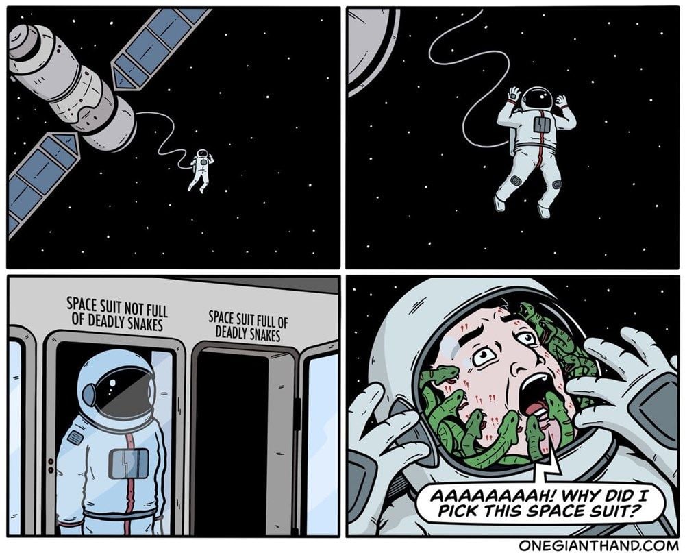
Why did this comic make me look at panel 4 before panel 3?
Same, I think it's just too exciting to ignore
All of the reasons already mentioned, but also, your brain is hardwired to pay more attention to a face, and to a face expressing emotion even more in particular.
The first two panels establish a pattern that your brain subconsciously keys in on. At a glance even without registering the specific images and text, your brain instantly knows that panel 3 doesn’t fit in the pattern.
I think it's the use of color. The snakes really stand out because they're green and the rest of the colors are very muted.
Honestly, it works better with the two panels swapped.
I agree. Maybe the creator was betting people would see it in the weird order