this post was submitted on 25 Jun 2023
69 points (100.0% liked)
Lemmy Plugins and Userscripts
2528 readers
1 users here now
A general repository for user scripts and plugins used to enhance the Lemmy browsing experience.
Post (or cross-post) your favorite Lemmy enhancements here!
General posting suggestions:
- Preface the submission with the type of enhancement - ex: [UserScript].
- Include a screenshot of the enhancement in use (where possible)
- Indicate the requirements for use (eg, greasemonkey, stylus, etc.)
Thanks!
founded 2 years ago
MODERATORS
you are viewing a single comment's thread
view the rest of the comments
view the rest of the comments
 -
-
So nice ! I was trying to make one to expand the page and use this 40% left-right margin on my screens, Thank you !
Here are my personal adaptations:
- Commented font-size for titles: I didn't like having them as small as the text
CSS code
.
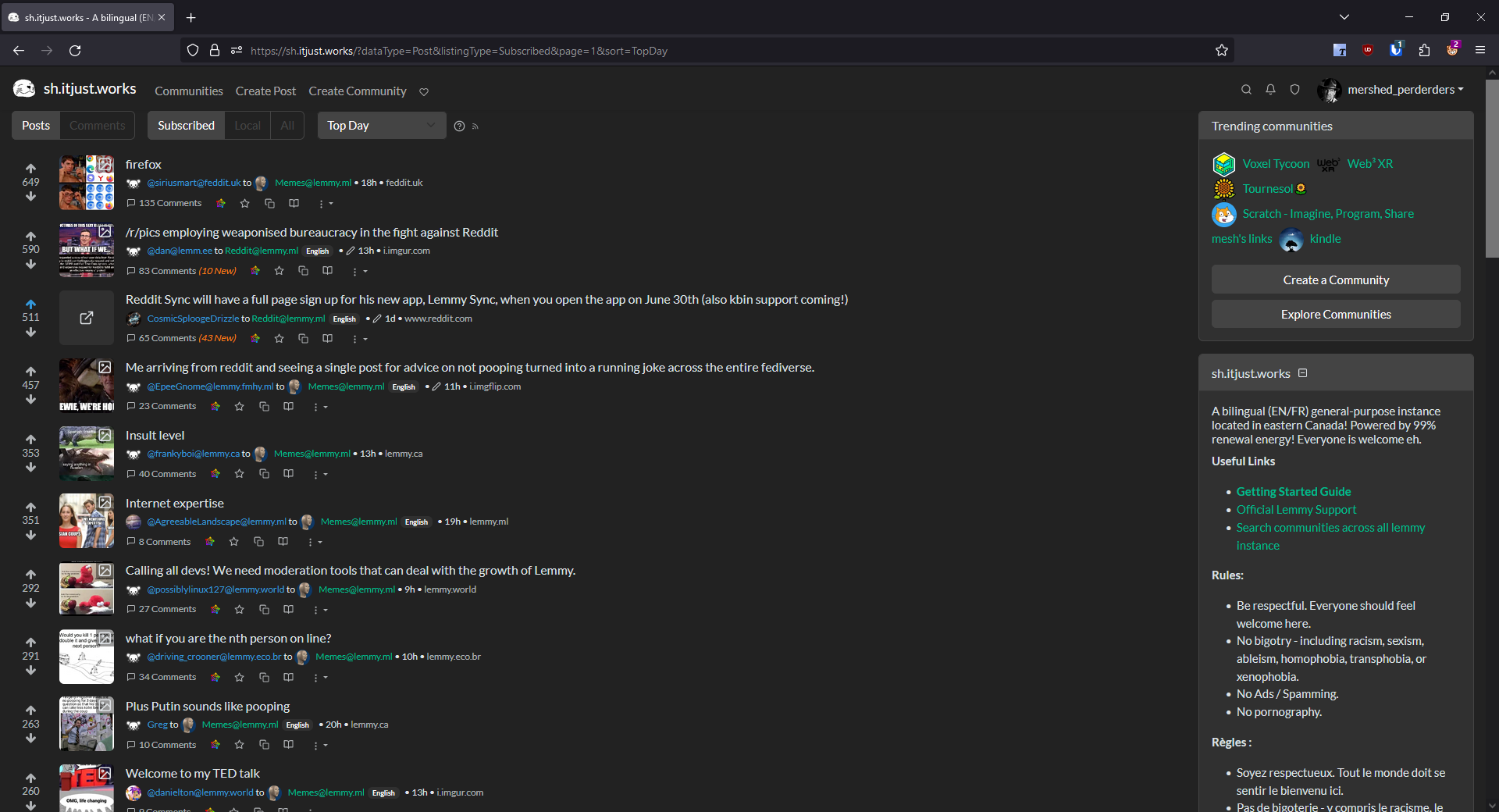
- Added a class for posts without image or links to have a thumbnail without the gray background, to dissociate them from links (that are from my point of view, too similar looking to text only posts)
- Also changed how I display images in thumbnail (I prefer to see the whole image resized down with no crop, even if hardly anything may be readable on the thumbnail)
CSS code
Screenshot
(Notice the visible difference between the link and the post without link)
These are nice.
I have thought about making the h5 font-size a user customizable parameter. You are not the only one who prefers the larger font size for titles. It's easy enough to incorporate - I'll experiment and see if there is a way to do it that preserves the variable between script updates.
I also like what you did with the text posts, particularly the scale-down parameter. My preference is preserving the visual outline of the thumbnail area for consistency.
Maybe something like:
CSS code