this post was submitted on 11 Feb 2024
72 points (100.0% liked)
Always the Same Map
611 readers
5 users here now
Its always the same map.
founded 3 years ago
MODERATORS
you are viewing a single comment's thread
view the rest of the comments
view the rest of the comments

See my comment above.
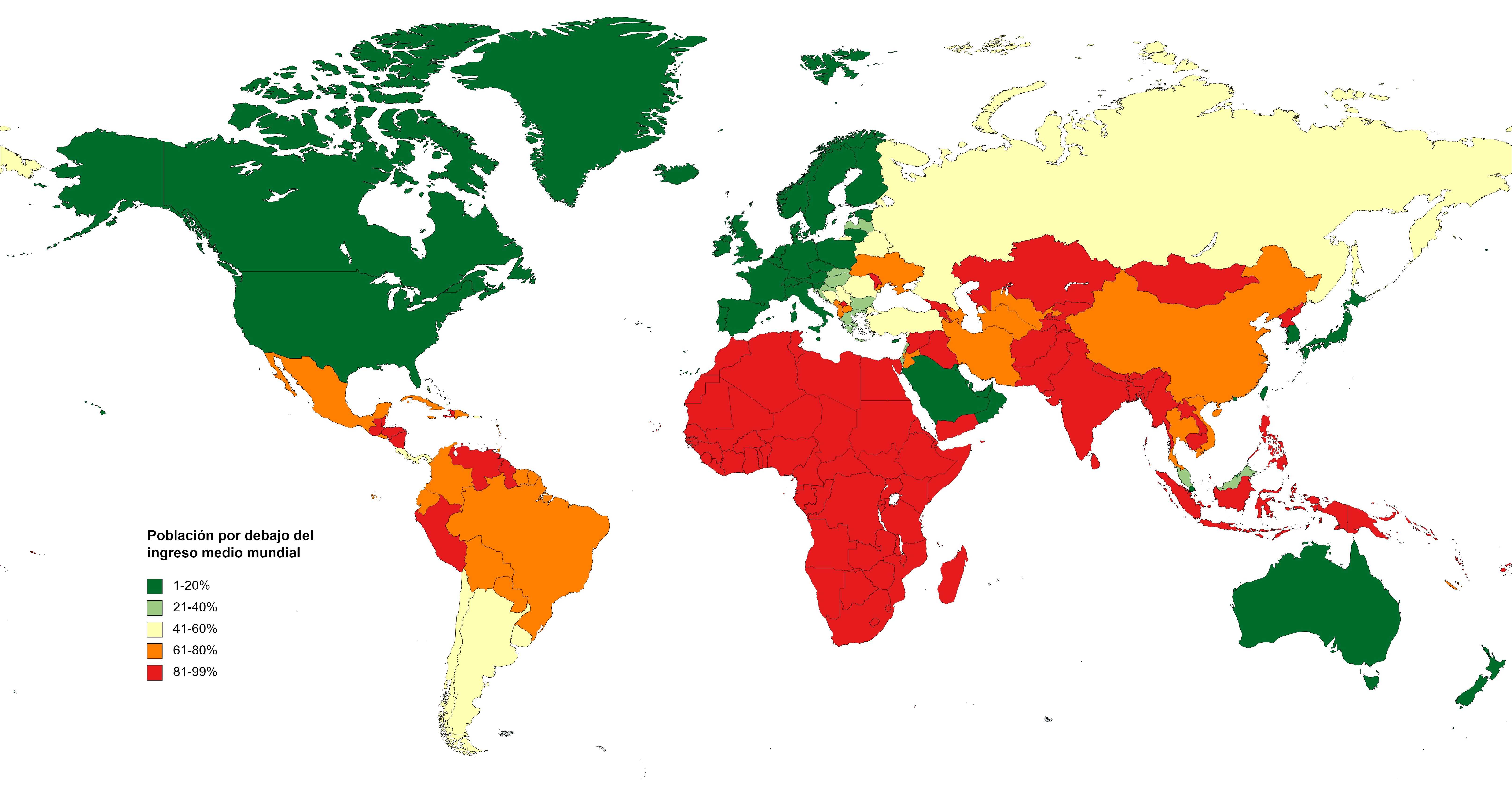
You are merely arguing against the presentation of the data on the map, not the methodology of the data or the conclusions made from the data.
PERCENTAGE OF THE NATIONAL POPULATION BELOW WORLD AVERAGE INCOME OR CONSUMPTION
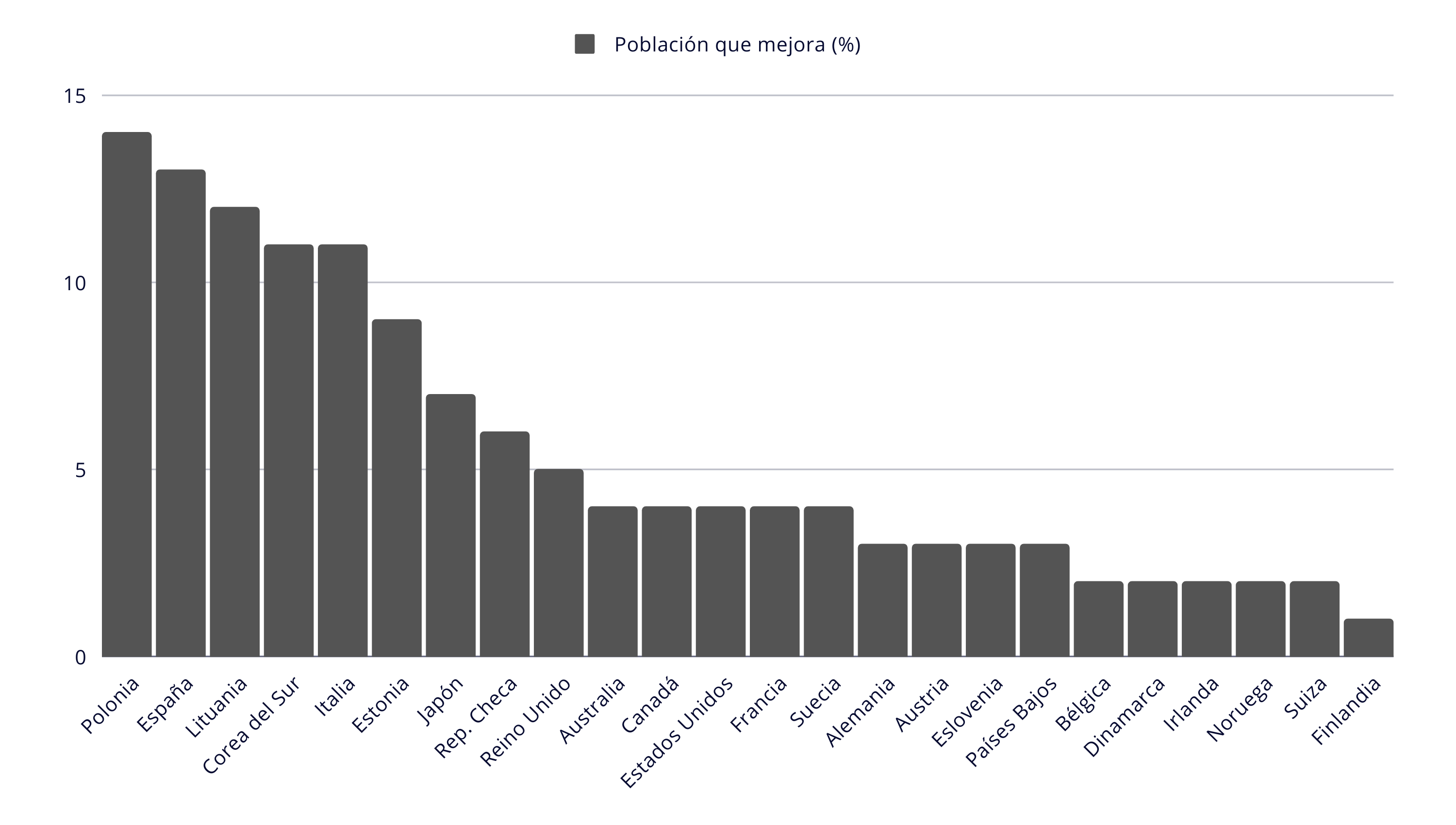
In this image found in the article I sourced the map from, it is made perfectly clear that Poland, with a population of 15% earning below the world average, is obviously vastly different than that of Switzerland of around 2%. In other words, proportionally, there are 7.5x more people in Poland that live with wages below the world average.
It is purely arbitrary that the author made the cutting off point for the legend 20%, when it could easily be in 10%, which would seperate Poland and Lithuania (but not Estonia) from Switzerland. The author could also have based it on quartile ranges (which would defeat the nature of this analysis).
Yes, it lacks granularity. Also, statistics for wages in Poland are hugely falsified, as mentioned in my other post so you could probably add at least 5-10% to the above graph.