this post was submitted on 02 Apr 2024
1342 points (96.9% liked)
Memes
50713 readers
683 users here now
Rules:
- Be civil and nice.
- Try not to excessively repost, as a rule of thumb, wait at least 2 months to do it if you have to.
founded 6 years ago
MODERATORS
you are viewing a single comment's thread
view the rest of the comments
view the rest of the comments

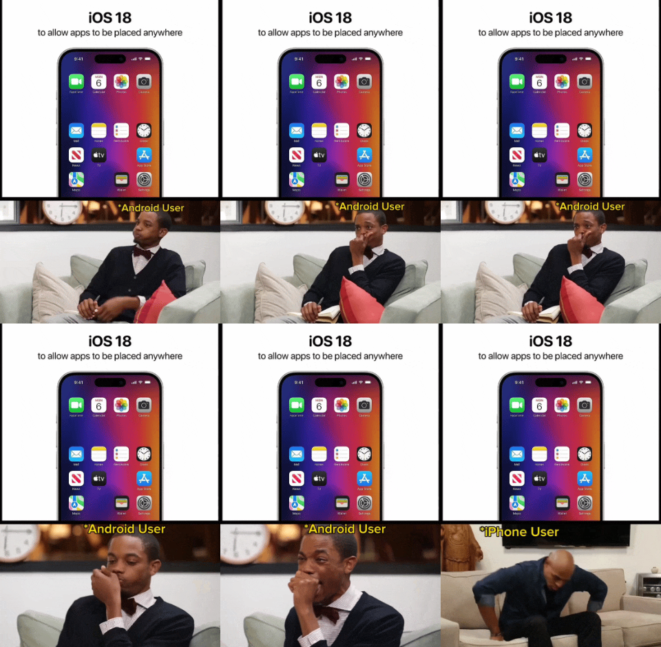
This was not allowed before. Until just recently, the technology didn't exist to place icons anywhere in the grid. They would automatically smoosh up into orderly rows starting at the top-left with no gaps between icons. Apple is continuing to develop cutting edge innovation, though, and now you will be able to leave entire rows and columns empty, or any specific icon space you choose!
Seems like a trivial programming task even my junior noob ass can handle.
Actually it’s because apps aren’t neutrally buoyant in the OS, they naturally float to the top
Dear god, someone needs to make a physics based home screen. It would be utter hell. When you move, it all gets tossed around.
Auto rotate works on all angles...
Widgets are now 3d boxes and you have to tilt your phone down and flip it until they face you.
Particle simulation home screen
There's probably a live wallpaper for that.
I mean apps icons that are rigid bodies that are simulated
Oh oh. Gotcha. Imagine not being able to make an emergency phone call until it settled down.
Or making it by doing rageshake
No wonder it took so long, must've been a nightmare to get every different app neutral, what with their differing weights.
They had to invent whole new algorithms to he able to give the binaries of all apps the exact same Hamming weight