this post was submitted on 30 Apr 2024
14 points (100.0% liked)
art
22383 readers
176 users here now
A community for sharing and discussing art, aesthetics, and music relating to '80s, '90s, and '00s retro microgenres and also art in general now!
Some cool genres and aesthetics include:
- outrun
- vaporwave
- mallsoft
- future funk
- city pop
- synthwave
- laborwave
If you are unsure if a piece of media is on theme for this community, you can make a post asking if it fits. Discussion posts are encouraged, and particularly interesting topics will get pinned periodically.
No links to a store page or advertising. Links to bandcamps, soundclouds, playlists, etc are fine.
founded 4 years ago
MODERATORS
you are viewing a single comment's thread
view the rest of the comments
view the rest of the comments


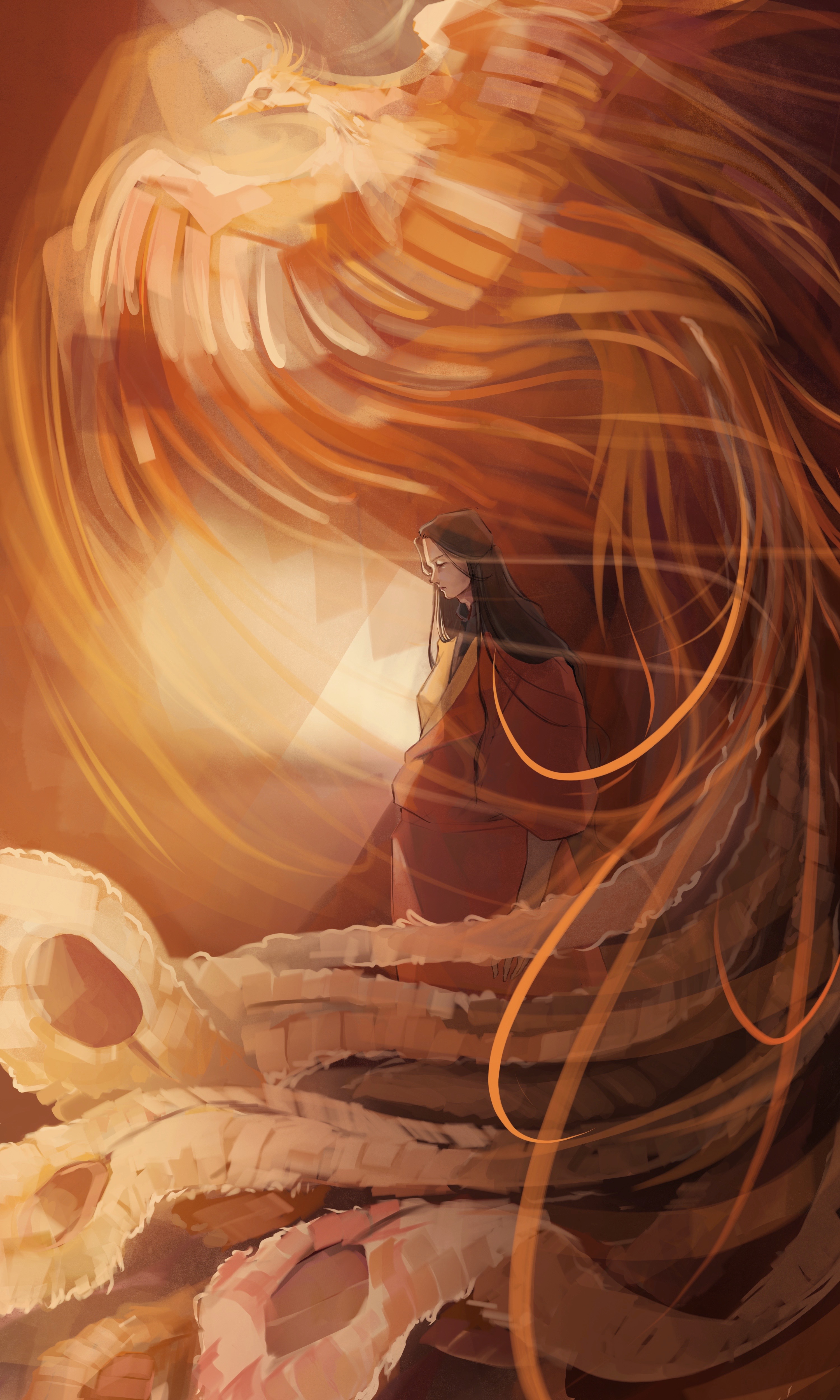
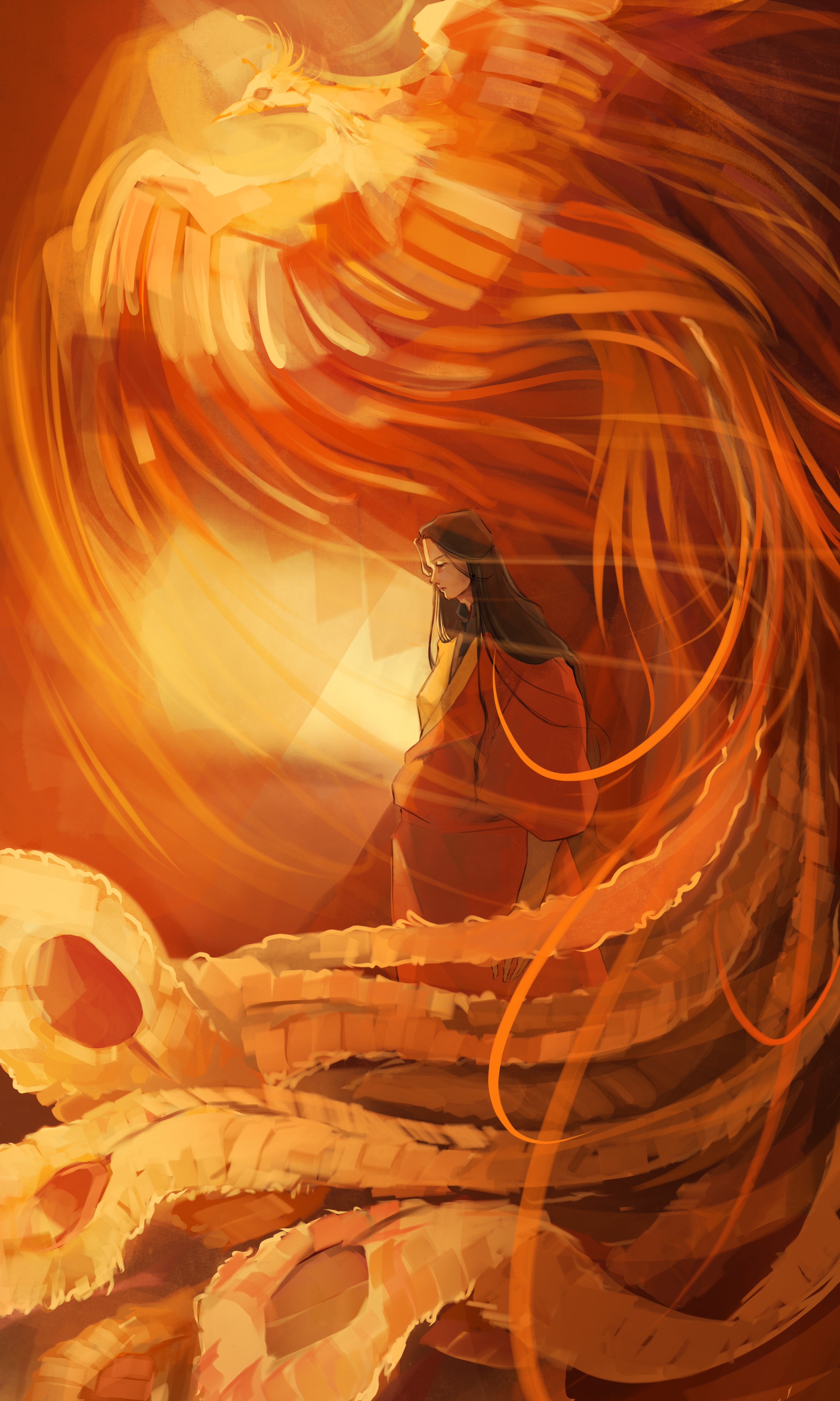
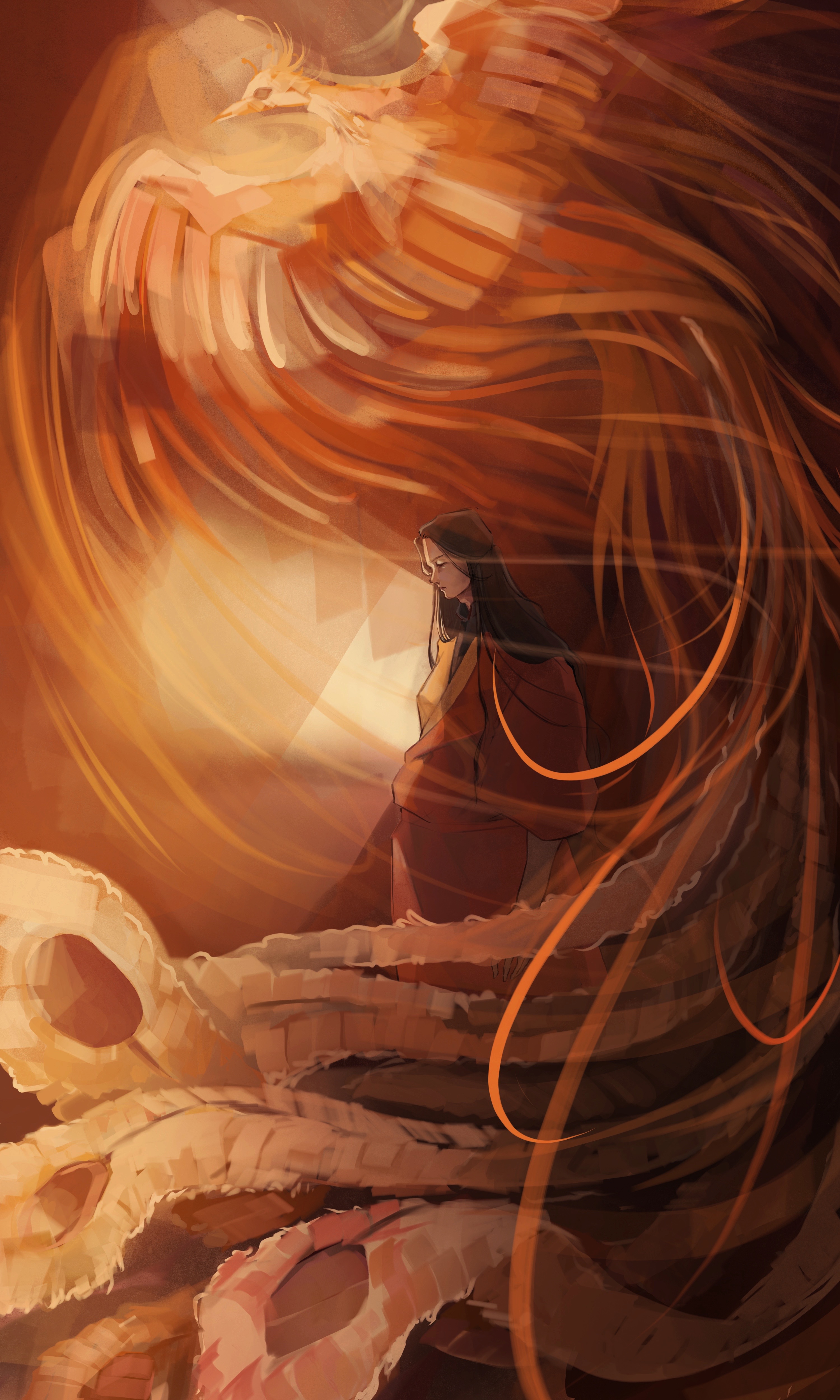
Of the ones presented, 2.... But I think having the high saturation around the man/center of the piece and lower on the phoenix (so man and background 2, phoenix closer to how you have it in 1) will help most of these in general. The natural value of a hue will have the most saturation, but the closer you get to white and black the more saturation of a hue will be condensed as indistinguishable—so to blow out the pheonix, go with more desaturated lights instead of super-saturated color.
Looking good.