politics
Welcome to the discussion of US Politics!
Rules:
- Post only links to articles, Title must fairly describe link contents. If your title differs from the site’s, it should only be to add context or be more descriptive. Do not post entire articles in the body or in the comments.
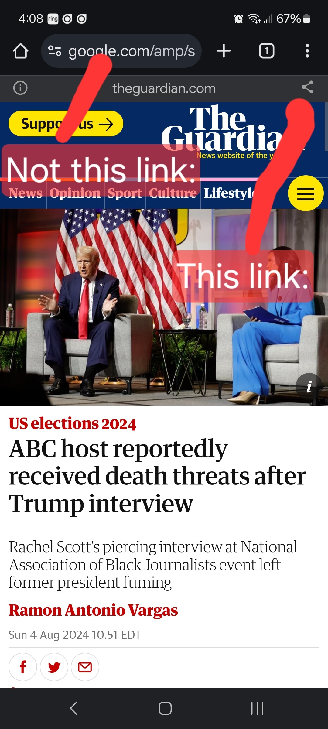
Links must be to the original source, not an aggregator like Google Amp, MSN, or Yahoo.
Example:

- Articles must be relevant to politics. Links must be to quality and original content. Articles should be worth reading. Clickbait, stub articles, and rehosted or stolen content are not allowed. Check your source for Reliability and Bias here.
- Be civil, No violations of TOS. It’s OK to say the subject of an article is behaving like a (pejorative, pejorative). It’s NOT OK to say another USER is (pejorative). Strong language is fine, just not directed at other members. Engage in good-faith and with respect! This includes accusing another user of being a bot or paid actor. Trolling is uncivil and is grounds for removal and/or a community ban.
- No memes, trolling, or low-effort comments. Reposts, misinformation, off-topic, trolling, or offensive. Similarly, if you see posts along these lines, do not engage. Report them, block them, and live a happier life than they do. We see too many slapfights that boil down to "Mom! He's bugging me!" and "I'm not touching you!" Going forward, slapfights will result in removed comments and temp bans to cool off.
- Vote based on comment quality, not agreement. This community aims to foster discussion; please reward people for putting effort into articulating their viewpoint, even if you disagree with it.
- No hate speech, slurs, celebrating death, advocating violence, or abusive language. This will result in a ban. Usernames containing racist, or inappropriate slurs will be banned without warning
We ask that the users report any comment or post that violate the rules, to use critical thinking when reading, posting or commenting. Users that post off-topic spam, advocate violence, have multiple comments or posts removed, weaponize reports or violate the code of conduct will be banned.
All posts and comments will be reviewed on a case-by-case basis. This means that some content that violates the rules may be allowed, while other content that does not violate the rules may be removed. The moderators retain the right to remove any content and ban users.
That's all the rules!
Civic Links
• Congressional Awards Program
• Library of Congress Legislative Resources
• U.S. House of Representatives
Partnered Communities:
• News
view the rest of the comments
What are some examples of well drawn congressional maps?
Good (left)
Bad (right).
Wow what an amazing graphic, I fully understand the issue with one picture.
It's a classic infographic which has been floating around the internet for a long time. Hopefully you're not trolling and did learn something - because more people need to understand the concept.
Because otherwise you end up with districts like this one in Texas which purposely segments the community to alter the votes in one's favor:
Texas 2nd district
Fun fact about Gerrymandering, it was named after former Massachusetts governor and founding father Elbridge Gerry - https://en.wikipedia.org/wiki/Gerrymandering
You might appreciate the Ugly Gerry font.
Every letter of the alphabet represented by an actual gerrymandered districts outline!
https://leoburnett.com/work/ugly-gerry
Oh holy hell, hope never seen that before - absolutely insane
I like this graphic but I wish it didn't use red and blue. I feel like this would be more effective in showing republicans how bad districting hurts everyone if it was green and yellow or orange and purple.
I agree. However, I think most republicans completely understand the implications of political gerrymandering, and embrace it with enthusiastically open arms.
Both bad. A good one has 3 districts going blue, 2 red. Just because something looks clean on a map doesn't mean good. See video as to why.
You're not wrong but in the example the "good" one at least respects the majority. That's the point of the illustration, that a minority can be a majority with bad gerrymandering, and I think the image illustrates that just fine.
The "Blue Wins" District Map is objectively worse than the "Red Wins" Distract Map as it has no politically opposed Districts, effectively silencing 40% of the Precincts. The "Red Wins" Distract Map is certainly skewed but is superior because it doesn't silence its opposition.
In short what that picture is calling "Good" represents the same dissent silencing behavior that people are rightly mad at Conservatives about. "Fair Representation", as presented in the article, looks a lot more like "Red Wins" and almost nothing like "Blue Wins".
You're objectively stupid.
These may be enjoyable to peruse. Michigan has good maps. Colorado. Just tick Congressional, Sort by state, Final Maps then scroll down and look for graded ones.
https://gerrymander.princeton.edu/redistricting-report-card
https://projects.fivethirtyeight.com/redistricting-2022-maps/