this post was submitted on 22 Apr 2025
57 points (96.7% liked)

Fuck AI

2539 readers
1211 users here now

"We did it, Patrick! We made a technological breakthrough!"

A place for all those who loathe AI to discuss things, post articles, and ridicule the AI hype. Proud supporter of working people. And proud booer of SXSW 2024.

founded 1 year ago
MODERATORS
 
(page 2) 50 comments
sorted by: hot top controversial new old
[–] Kolanaki@pawb.social 3 points 4 days ago (1 children)

"I created" and "with AI" is the newest oxymoron.

load more comments (1 replies)
[–] notarobot@lemm.ee 2 points 4 days ago (2 children)

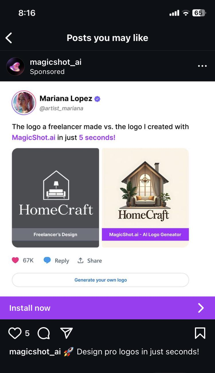
The one on the right is prettier (not necessarily better. I've read some comments by people that know more than I do with some valid points). However, to create the image on the right, they probably fed the AI the image from the left, made by a designer.

[–] undeadotter@sopuli.xyz 0 points 3 days ago (1 children)

Honestly, from a design perspective I do think the one on the right is actually better in some respects. Yes, it wouldn't scale well, there's too many colours, it's too busy, but it has some good points. The font choice draws you in more, with less space between the letters making it easier to read at a glance and the 'f' creating interest. And the house is actually united with the text, whereas in the left image it feels completely disconnected.

I would be pretty disappointed if I'd paid for a logo and I got the left image tbh, it's not very interesting or memorable. Yes, fuck AI, but I'm not sure this is the best comparison because both logos suck in different ways.

load more comments (1 replies)
[–] scathliath@lemmy.dbzer0.com 2 points 4 days ago (2 children)

Imagine the printing costs of putting variations of the right on all your products? Just the color variety alone would add to the production costs.

[–] RogueBanana@lemmy.zip 1 points 3 days ago

And will look like shit even if you manage to do it. Imagine that on a cushion cover after an year of use.

[–] phneutral@feddit.org 1 points 4 days ago* (last edited 4 days ago)

Reminds me of German Designer Kurt Weidemann who redesigned the Logo of German train company Deutsche Bahn in the 90s. He inverted the colors, got rid of one outline — and still saves the company millions over the years because of the paint that is saved putting the logo on all trains. All while modernising the typography, but remaining true to the brand.

This is what design is about — everything else is decoration.

[–] classic@fedia.io 2 points 4 days ago (2 children)

What is up with the weird soft look that so many AI images have?

[–] Catoblepas@lemmy.blahaj.zone 2 points 4 days ago (1 children)

It’s probably trained on a fuckton of Thomas Kinkade paintings, just statistically, since his output was so huge. He also had that kind of lighting going on, so it wouldn’t surprise me if that’s just baked into AI image generation now.

[–] classic@fedia.io 1 points 4 days ago

Interesting. Never heard of him, but immediately recognized the style

[–] antonim@lemmy.dbzer0.com 1 points 4 days ago (1 children)

It's spontaneously pleasant to see for most people, and I believe that's why it was favoured in the training process of the various image generators.

[–] classic@fedia.io 0 points 4 days ago (1 children)

TIL what people find pleasant is kinda creepy

load more comments (1 replies)
[–] paperlibrarian@lemm.ee 2 points 4 days ago

The Dunning-Kruger tool.

Mariana Lopez should have at least said which freelancer she got the sample from. What an insult to their work.

[–] CaptDust@sh.itjust.works 2 points 4 days ago

Logo on the right is what you give a marketing team so they can tell you the 600 ways it won't print right, cost too much to display, and ultimately rework it into logo on the left.

[–] captain_aggravated@sh.itjust.works 1 points 4 days ago (1 children)

I've seen so many commercials where a realistic scene fades into the stylized logo that that's what my mind went to.

The left is a better logo, fewer fine details, easy to silk screen, easy to laser print, hell you could make a branding iron and burn it into wood.

[–] homesweethomeMrL@lemmy.world 1 points 4 days ago

Sometimes I think the AI bubble is about people who don't understand computers being put in a kind of purgatory where they have to work out why everything is wrong and bad.

[–] Fingolfinz@lemmy.world 1 points 4 days ago

Spoken like someone who has no clue about graphic design

[–] spankmonkey@lemmy.world 1 points 4 days ago* (last edited 4 days ago)

The one on the left is superior for a massive number of reasons.

Simple and easy to print, make copies of documents without becoming illegible, and other paperwork related reasons.

Easy to recognize at a glance. The one on the right is really hard to make out at a small size. Just a bland beige blob.

There is a reason most familiar logos are monochrome or only a few colors, and simplicity is one of them. The one on the right looks like overly bust clipart.

The one on the left is a couch inside a house with a lamp, all of which make sense together. The plants overlap the wall and there is a chandelier over the couch on the right one. Who puts a chandalier over a couch?

Ugh, I know it is obviously awful but I had to get it out.

[–] MudMan@fedia.io 1 points 4 days ago

AI generated art is the new "cousin who knows Photoshop".

This is fine, and mostly benign.

[–] vikingtons@lemmy.world 1 points 4 days ago (1 children)

so sayeth artist_mariana lmao

[–] Catoblepas@lemmy.blahaj.zone 2 points 4 days ago

She’s an artist the way I’m a chef when I go to a restaurant and order food.

[–] usualsuspect191@lemmy.ca 0 points 4 days ago (2 children)

I do prefer the AI font choice unfortunately

[–] Grass@sh.itjust.works 1 points 4 days ago* (last edited 4 days ago)

when it somehow produces coherent letters, the fonts to be an average of what we are used to seeing on every similar logo so they generally have the right feel.

I'm not a huge fan of the current ai crap but i would like if it was possible to output typable fonts in standard formats. for logos I would want it to be able to produce editable vector graphics but the only attempt at that I've seen made what should be a solid single shape as a million some odd blobs jigsawed together, so editing manually would require redrawing all of it. currently I'd be better off following some youtube tutorials for how to use inkscape or something.
[–] yes_this_time@lemmy.world -1 points 3 days ago (1 children)

The kerning is better in my opinion. That f is nice.

[–] ZDL@ttrpg.network 0 points 3 days ago

Except that it looks more like a blackletter "s" to me.

load more comments
view more: ‹ prev next ›