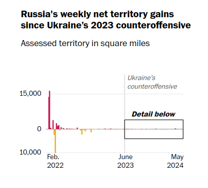
This graph is golden. How I'd long for a time machine to show this graph to every annoying redditor talking about how Zelensky would march on Moscow with their "spring counteroffensive" 8 months ago.

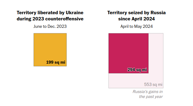
This other one is also a great visualization. I've been in small cities with less than 1 million inhabitants with more territory than that.
If anything, this makes Russia's new gains sound very unimpressive, if one can only think of war in terms of Paradox game map painting. Clearly that's not how it works, but I won't opine on how the war really is going because I haven't done enough research.
Could this war perhaps be over this year? I wonder how it'll affect USA elections or the inevitable riot upon Confirmation Day if it ends before then.