I'm reading good things about Tiresias, which also has the benefit of being designed for people with impaired vision.
this post was submitted on 05 Sep 2024
10 points (100.0% liked)
Disability and Accessibility
889 readers
1 users here now
All things disability and accessibility related, and advocacy for making those things better.
See also this community's sister subs Feminism, LGBTQ+, Neurodivergence, and POC.
This community's icon was made by Aaron Schneider, under the CC-BY-NC-SA 4.0 license.
founded 1 year ago
MODERATORS
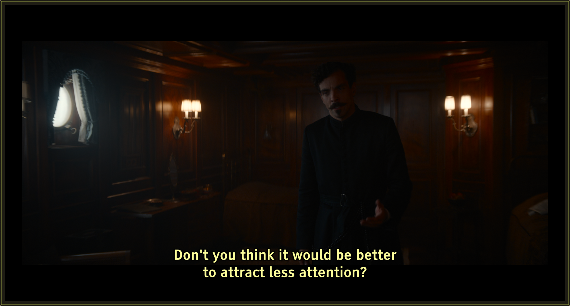
i like them yellow bc it feels easier on my eyes, plus i have the sensation whatever movie is playing instantly becomes more profound.
I took to heart your suggestion of yellow, and I think you're totally right.
This is the result with Tiresias Infofont Z Bold, 42pt, #FDFD9A lettering with 2.5px #000000 borders. I think it might be a winner.
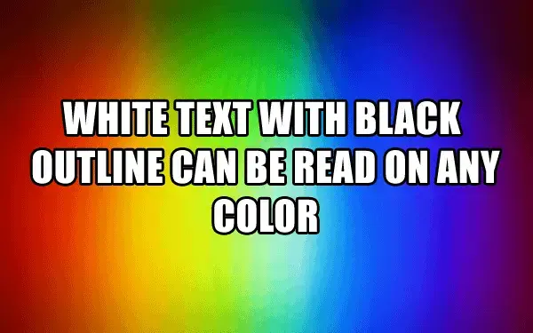
Alt text: the words "white text with black outline can be read on any color" is superimposed on a rainbow gradient, demonstrating the point