Main
THE MAIN RULE: ALL TEXT POSTS MUST CONTAIN "MAIN" OR BE ENTIRELY IMAGES (INLINE OR EMOJI)
(Temporary moratorium on main rule to encourage more posting on main. We reserve the right to arbitrarily enforce it whenever we wish and the right to strike this line and enforce mainposting with zero notification to the users because its funny)
A hexbear.net commainity. Main sure to subscribe to other communities as well. Your feed will become the Lion's Main!
Good comrades mainly sort posts by hot and comments by new!
 State-by-state guide on maintaining firearm ownership
 Domain guide on mutual aid and foodbank resources
 Tips for looking at financials of non-profits (How to donate amainly)
 Community-sourced megapost on the main media sources to radicalize libs and chuds with
 Main Source for Feminism for Babies
 Maintaining OpSec / Data Spring Cleaning guide
 Remain up to date on what time is it in Moscow
view the rest of the comments


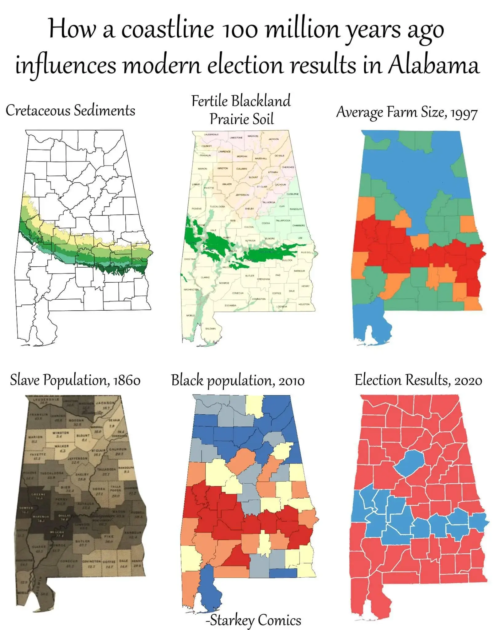
There are more farms in the north though.
https://alabamamaps.ua.edu/contemporarymaps/alabama/agriculture/number_farms_07.jpg
Yes, farms will be in areas that can sustain farms, that is a tautology, not an insight. That's why the correlation breaks down. If farms = slavery = democratic majority, then all agricultural areas in the US would be democratic. They are not. It's vulgar materialism. Someone is working backwards from the conclusion and being sloppy with the details.
We're pattern seeking creatures. Someone created a pattern for us to follow. Because the pattern seems to follow in the correct order, we accept the pattern. But the correlations are ultimately specious. The data points are picked with purpose. The map at the end doesn't make sense if you consider all the actual farmland in Alabama. But the author isn't trying to be accurate, they're trying to make a point about history. But their point isn't proved by the thing they're using to make it.
Yes, we are products of history and our environment. This infographic doesn't really do a good job of saying that though. It's just presents wrong information in a way that makes people draw a simplistic conclusion that can be construed as scientific history.
The point is that plantations lead to large farms, because in many cases the land holders kept the land and switched to sharecropping instead of slavery. I would be curious to see the data but I suspect that the smaller northern farms are newer and were perhaps not viable until fertilizers.
But they're not newer than slavery, which is why the slavery map has density in the north. That matters to the ultimate point that fertile soil = large farms = slaves = high black population = democratic majority. Because in this case it's fertile soil = not as large farms = slaves = low black population = republican majority.
How can the size of the farms be relevant if both large and not large farms result in different black populations and therefore party majorities? In this case the most relevant statistic to the party is race. The proximity to agriculture means nothing outside of 'people live near agriculture and some of them may be democrats'