this post was submitted on 11 Apr 2024
220 points (96.6% liked)
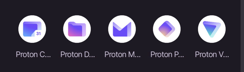
Proton

6614 readers
6 users here now

Empowering you to choose a better internet where privacy is the default. Protect yourself online with Proton Mail, Proton VPN, Proton Calendar, Proton Drive. Proton Pass and SimpleLogin.

Proton Mail is the world's largest secure email provider. Swiss, end-to-end encrypted, private, and free.

Proton VPN is the world’s only open-source, publicly audited, unlimited and free VPN. Swiss-based, no-ads, and no-logs.

Proton Calendar is the world's first end-to-end encrypted calendar that allows you to keep your life private.

Proton Drive is a free end-to-end encrypted cloud storage that allows you to securely backup and share your files. It's open source, publicly audited, and Swiss-based.

Proton Pass Proton Pass is a free and open-source password manager which brings a higher level of security with rigorous end-to-end encryption of all data (including usernames, URLs, notes, and more) and email alias support.

SimpleLogin lets you send and receive emails anonymously via easily-generated unique email aliases.

founded 2 years ago
MODERATORS
 

That the labels for the apps get truncated so you can only read "Proton" plus the first letter of the app. I'm only able to distinguish based on the icons which isn't great because Pass and Drive are similar colors, and Pass and VPN, and Drive and Calendar are similar shapes.

all 44 comments
sorted by: hot top controversial new old
[–] mynamesnotrick@lemmy.zip 51 points 1 year ago (1 children)

Now that you mention it... Yeah! I rename the icons to just "Mail, Calendar, Etc..."

[–] nul9o9@lemmy.world 13 points 1 year ago

On the other hand, when I install a file manager from Fdroid. It's renamed to something generic that's hard to tell apart from the factory installed apps.

[–] Bolt@lemmy.world 25 points 1 year ago (1 children)

Not sure what the screenshots are from, but is it not possible to rename the icons for legibility?

[–] akilou@sh.itjust.works 16 points 1 year ago (2 children)

Wow, I didn't know you could do that. I've always used the Pixel stock launcher but just recently installed Lawn Chair. Don't know if every launcher allows you to rename or not.

So when I rename they re-sort alphabetically so I'm renaming to "P Calendar", "P Mail" etc to keep them together. It's a little clunky but solves my problem

[–] dukethorion@lemmy.world 4 points 1 year ago

Did the same.

[–] LinusSexTips@lemmy.world 2 points 1 year ago

I've been using Niagara Launcher on my S10 / P7P with only a handful of icons on my home screen.

The majority of programs I swipe up for a search bar with keyboard. I find it much faster than swiping homepages / folder to dig up a program to launch.

[–] thirstyhyena@lemmy.world 13 points 1 year ago

Just as annoyed as I'm with Google's branding icon designs.

[–] wesker@lemmy.sdf.org 11 points 1 year ago* (last edited 1 year ago) (2 children)

The icons can be hard to distinguish, on the fly.

[–] independantiste@sh.itjust.works 4 points 1 year ago (1 children)

Yeah I noticed this as well, they are too similar and sometimes I open the wrong one by accident

[–] wesker@lemmy.sdf.org 1 points 1 year ago (1 children)

I am always doing this with Proton Mail and Calendar.

I do it more with calendar and drive, both squares of similar sizes

[–] space@lemmy.dbzer0.com 3 points 1 year ago

What would you like to use today? The proton square? The proton rhombus? Or the proton triangle?

[–] JackGreenEarth@lemm.ee 9 points 1 year ago (1 children)

On many launchers you can enable two lines for labels, so you don't have to manually rename them.

[–] lemmyingly@lemm.ee 2 points 1 year ago

And you can rename the labels. Or remove them completely and just rely on the app icons.

[–] dukethorion@lemmy.world 5 points 1 year ago

Some icon packs still include the old Proton Mail lock icon 😀

[–] asininemonkey@lemmy.world 4 points 1 year ago (1 children)

Yet another reminder of why I love the Niagra launcher so much.

[–] RvTV95XBeo@sh.itjust.works 20 points 1 year ago (1 children)

This app may share these data types with third parties

Location, App info and performance, and Device or other IDs

This app may collect these data types

App activity, App info and performance, and Device or other IDs

Why?

[–] Canadian_Cabinet@lemmy.ca 2 points 1 year ago

Yeah, especially seeing how on others like Lawn chair I can edit the name myself

[–] kia@lemmy.ca 3 points 1 year ago

Generally an issue I have with a lot of apps unfortunately.

[–] nosnahc@lemmy.world 3 points 1 year ago

A new note app is incomming !....

[–] chethan@lemmy.world 3 points 1 year ago* (last edited 1 year ago)

My solution - Screenshot of a phone with icon labels turned off

[–] maxxxxpower@lemmy.ca 2 points 1 year ago (1 children)

I'm not seeing the issue on Android. Unless it's my GUI default text size being smaller...?

[–] Broken@lemmy.ml 1 points 1 year ago

Same here. My android icons all have full names. I haven't messed with icon or text sizing at all.

[–] reddig33@lemmy.world 2 points 1 year ago (1 children)

Im trying to figure out why the icons all need a white circle behind them.

[–] akilou@sh.itjust.works 3 points 1 year ago (2 children)

All of my icons are circles. Are yours not?

[–] morrowind@lemmy.ml 3 points 1 year ago

As with all your other questions, it depends on your Launcher

[–] reddig33@lemmy.world 0 points 1 year ago* (last edited 1 year ago) (1 children)

I was just commenting about how it’s half-assed design to just slap an existing icon against a white background and call it a day. Compare to the lawnchair icon, locus, or even the Lyft icon in your screenshot. You find the names annoying, I find the design laziness annoying. Companies do it on iOS as well (including Apple).

[–] Jakeroxs@sh.itjust.works 2 points 1 year ago* (last edited 1 year ago)
[–] spiderman@ani.social 2 points 1 year ago

idk why they shoved it right in the start, i mean i just want to check my mails man, if i want to check out proton drive or other stuff i will access them from the side bar or menu. kinda annoying move.

[–] Steve@communick.news 2 points 1 year ago

I'm more a visual person. The icons are all I look at.
But all the first letters are unique. So that should work well enough, no?

[–] clarfgg@lemdro.id 1 points 1 year ago

Maybe you could rename the icons through your launcher? I think Nova lets you do it. That does kinda suck tho :(

[–] EmperorHenry@infosec.pub 0 points 1 year ago

I don't really have any apps on my home screens or my desktop pages.

I have them into groups on mobile and I just pull them up from the start menu on desktop

[–] honk@programming.dev -1 points 1 year ago

Laughs in iOS