People's Liberation Font
this post was submitted on 28 May 2024
27 points (100.0% liked)
Comradeship // Freechat
2447 readers
60 users here now
Talk about whatever, respecting the rules established by Lemmygrad. Failing to comply with the rules will grant you a few warnings, insisting on breaking them will grant you a beautiful shiny banwall.
A community for comrades to chat and talk about whatever doesn't fit other communities
founded 4 years ago
MODERATORS
The doves font story is really cool, thanks for sharing
That is true.
Doves font needs a paid license. So if you don't pay, and use it on anything public-facing, you can be sued (I'm guessing).
I just use it to print my own books sometimes (if it suits the book)
Cool! I just hate copyright, licensing and all that.
Sans serif: Workplace Sans, Ubuntu, Open Sans, IBM Plex, Orpheus Sans (greek), Neohellenic Sans (greek)
Serif: Baskerville, Garamond, Times New Roman, Didot (greek) and Bodoni (greek)
Monospace: DejaVu Sans Mono, Ubuntu Mono, Fantasque Mono
Fixed: Terminus, Spleen
Decorative: too many to list here
fuck Microsoft but cascadia code goes hard
I'll try it my editor. Thanks.
papyrus or comic sans
You joke (probably) but they've done studies and not only is comic sans one of the most legible fonts, but people tend to remember more information if they read it in comic sans.
I certainly remember the names of every business logo I have seen that uses it. For one reason or another (probably because I am like "Ha, you fools!").
There is school near my house that uses it too. The letters have been etched out of metal too!
Papyrus is a neat decorative font.
Comic Sans is awful and annoying IMO.
Long time Terminus fan, but I found a new love: Spleen

I really wish there existed a scalable/vector (TTF/OTF) version of it. Bitmap fonts are usually good only for UI elements, not really suitable for print.
Bitmap fonts are usually good only for UI elements,
And terminals. The idea behind Spleen is that it can be read on tiny terminals/screens, that's why there's a 5x8 version. If you have a small LCD screen attached to a Raspberry Pi for example then Spleen is a good font to use.
Yes, in fact I first saw Spleen when I checked out OpenBSD. I think it uses that font by default in its terminal. It looks slicker than Terminus.
hah that's where I saw it too. OpenBSD was booting and I thought to myself the font looks very sleek and sci-fi, it reminded me of Star Trek Deep Space 9 for some reason (no idea why DS9 specifically).
As a Terminus fanboy, I love it! Thanks for sharing!
My pleasure!
my fav coding font ;) https://dtinth.github.io/comic-mono-font/
coding is my passion
it's fun when it's not a job I find :)
Are you serious? Asking because people tend to joke about comic sans often.
Oh I'm totally serious on this one, I find it's weirdly aesthetically pleasing as a coding font.
- Iosevka
- Anomaly Mono
- Monocraft / Miracode
- Tamsyn / Tamzen
- Cozette
- sqaps/sqreep/3x6
- Raize
- Spleen
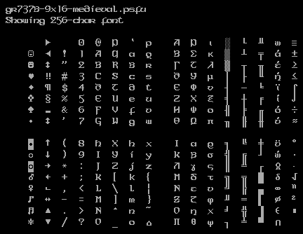
- gr737b-9x16-medieval (See screenshot here)
- Vollkorn
- Libertinus
Bonus: CoronaFaceImpact (Interact here)
Do you perchance have the italic and bold italic variant of this font? Looks nice on the ereader.
There doesn’t appear to be a version of this font that is purely italic or bold–italic.
I wish they had more examples of actual usage.
Lol, this post reminded me I never set up my fonts in VSCodium. Fixed!
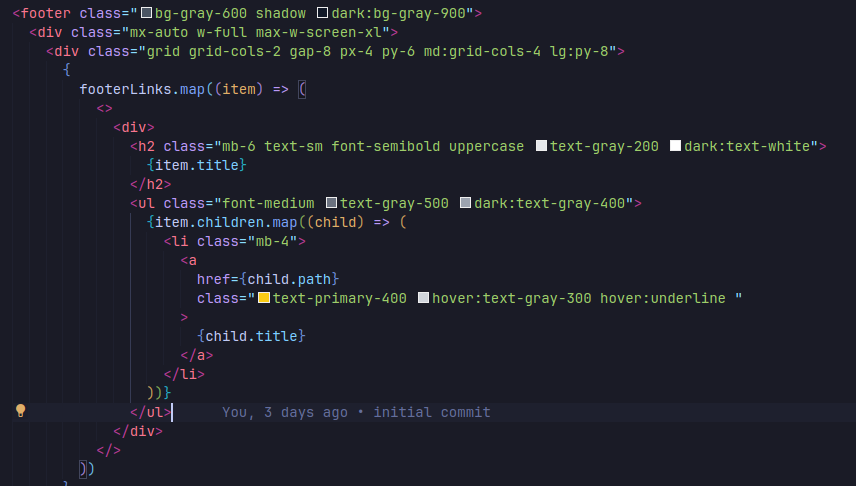
For programming, I use JetBrains Mono. I saw it on a post on /r/programmerhumor once and sort of fell in love with it. Using it with a Tokyo Night theme in VSCodium(officially) and it's really nice. Here's a quick screenshot with some JS and HTML to get an idea:
For Sans, I really like both Roboto and SegoeUI but any of the top fonts on FontSource are nice. I'm using Poppins for a website now but I don't like how it looks with heavier weights. It's pretty thick. The CSS framework I am using has Inter as it's first font and then falls back to the usual suspects. So Inter is starting to grow on me just for readability. Might switch back to it from Poppins to makes my life easier. I also like Montserrat because I'm basic. Lato, not so much. Also Arial and Helvetica are nice fallbacks.
For Serif, I'm not super picky but like you said, anything "newsy-looking" is probably good. I for some reason like Roboto Slab. I donno what the difference is between Serif and Slab though, if any.
Slab fonts are usually meant for displaying or printing in larger sizes. Like news headines, billboards etc.
Heck, that's probably good to know. Regular serif is cool too lol.
monofonto, aka the pipboy font
Fira Code and JetBrains Mono
Lexend. It's a font designed with research to have variable widths to aid legibility.
There's even an Arabic+Latin version called Readex Pro. There's a really cool article documenting how they adapted variable widths to the unique connected structure of Arabic writing.
Both are freely available on Google Fonts.
Lexend. It’s a font designed with research to have variable widths to aid legibility.
It's cool, but I personally prefer Atkinson Hyperlegible Font for that usecase
IBM 3270
Williams Caslon for the e-reader and New Heterodox Mono for the vs code.
Century Supra looks quite snazzy as well, I must say.
Let me know if you want the ttf files for it. It renders well on ereaders too.
All the fonts I have mentioned are free and open source! They're all licensed under the OFL license. I hope you like my suggestions :)
My favorite Serif fonts
My favorite Sans-serif fonts
My favorite Display fonts
My favorite Monospace fonts
VAG Rounded and basically any cursive font.
I forgot to add Noto Sans Tagalog