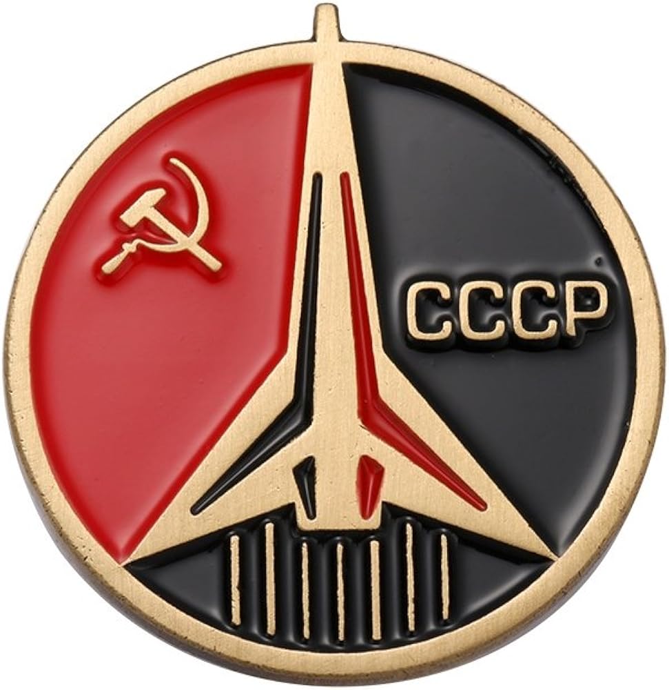
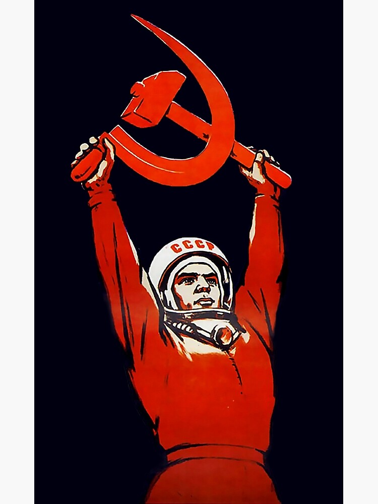
The soviet space program had some awesome logos/imagery:

Ask Hexbear is the place to ask and answer ~~thought-provoking~~ questions.
Rules:
Posts must ask a question.
If the question asked is serious, answer seriously.
Questions where you want to learn more about socialism are allowed, but questions in bad faith are not.
Try !feedback@hexbear.net if you're having questions about regarding moderation, site policy, the site itself, development, volunteering or the mod team.
The soviet space program had some awesome logos/imagery:


Those were happier times. 
The DDR goes hard, but also a fan of Angola, despite them not being (as) communist anymore. Really hits that decolonial message.
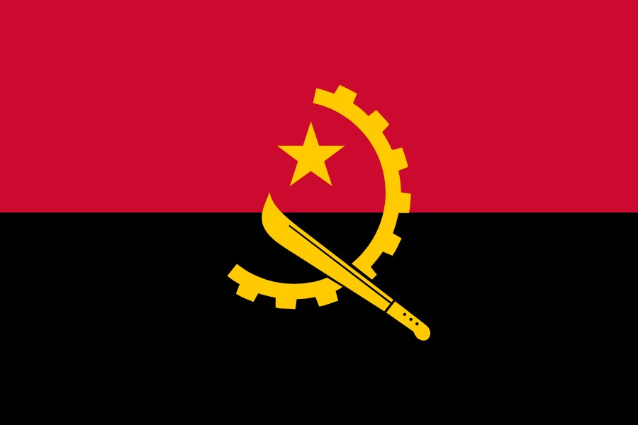
I was gonna post this image. It's Steampunk af.
I've always really liked this flag aesthetically, just wish it was the flag of a communist country instead of a liberal one that lives on exporting fossil fuels 😑
They have their problems (mostly due to the civil war and then the SU's collapse), but there's still Communists and Socialist factions in the MPLA, and hopefully with them pivoting to China and the economy finally stabilising we can see some progress there. I like to think they're trying in good faith.
They have recently improved their record of LGBT rights which is a clear positive as well.
The DPRK hammer and sickle, I love the addition of the calligraphy brush.
The symbol on the Mozambique flag
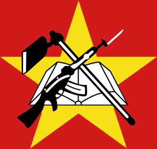
Beat me to it, this one goes extremely hard.

:gui-cute:

Transhammer gendersickle.

Transhammer 40k.

Transhammer gendersickle
Which would also make a great band name.
I like the one with the paintbrush intersected between the hammer and sickle. It speaks of an even wider and more intersectional solidarity that banishes some of the crude reductionist lumpenprole shit that can derail movements.
We also have an emoji for that, 
true!
i just wanted an obnoxiously large one lol

Red star is bold & classic
Hammer and compass 
A girl once saw me wearing a Fahrenheit 451 pin badge and asked if it was a communist symbol (in her defense she was sitting quite a bit away and had never heard of the book so it just looked like a red, orange and yellow symbol to her with a number on it) so now thats my favourite communist symbol
Can you share a pic of it here?
Couldn't find my original one but here's an image of it I found on the internet
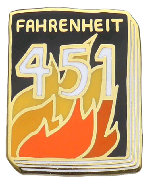
Irl the colours were a bit redder than they are in this screenshot though

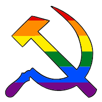
 I'm a simple guy. I like the classics
big fat red star on front of a Locomotive.

dancing skeleton
I really like the SACP's black star with the red and gold trim. There's like a hundred renditions of it but the main one they use, the hammer and sickle is just too skinny IMO.
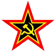
For some reason, the Communist Party of Venezuela's symbol is a rooster, and think it's kinda cute
 mostly because it's mine
You made it?
Yes
Can't believe noone's said sabo-tabby yet

the canadian communist party has a kinda cool look to it
the flag of the kscm is fun to watch wave

What is kscm?
Czech communists
The Internationale
Which is that one?